Purpose: The Principles Viewpoint in ArchiMate is used to define and model the principles that guide an enterprise’s decisions and actions. It enables architects to capture and communicate the fundamental values and beliefs that shape an organization’s strategy, culture, and behavior. By doing so, the Principles Viewpoint helps to ensure that all stakeholders have a common understanding of the principles and can make informed decisions based on them.
Core Concerns: The core concerns of the Principles Viewpoint include defining and documenting the principles, their relationships to other architectural elements, and their impact on the enterprise. The Principles Viewpoint helps to ensure that the principles are aligned with the enterprise’s goals and objectives, and that they are consistent with its vision, mission, and values. Additionally, it helps to ensure that the principles are integrated into the enterprise’s architecture and that they are applied consistently across all areas of the organization.
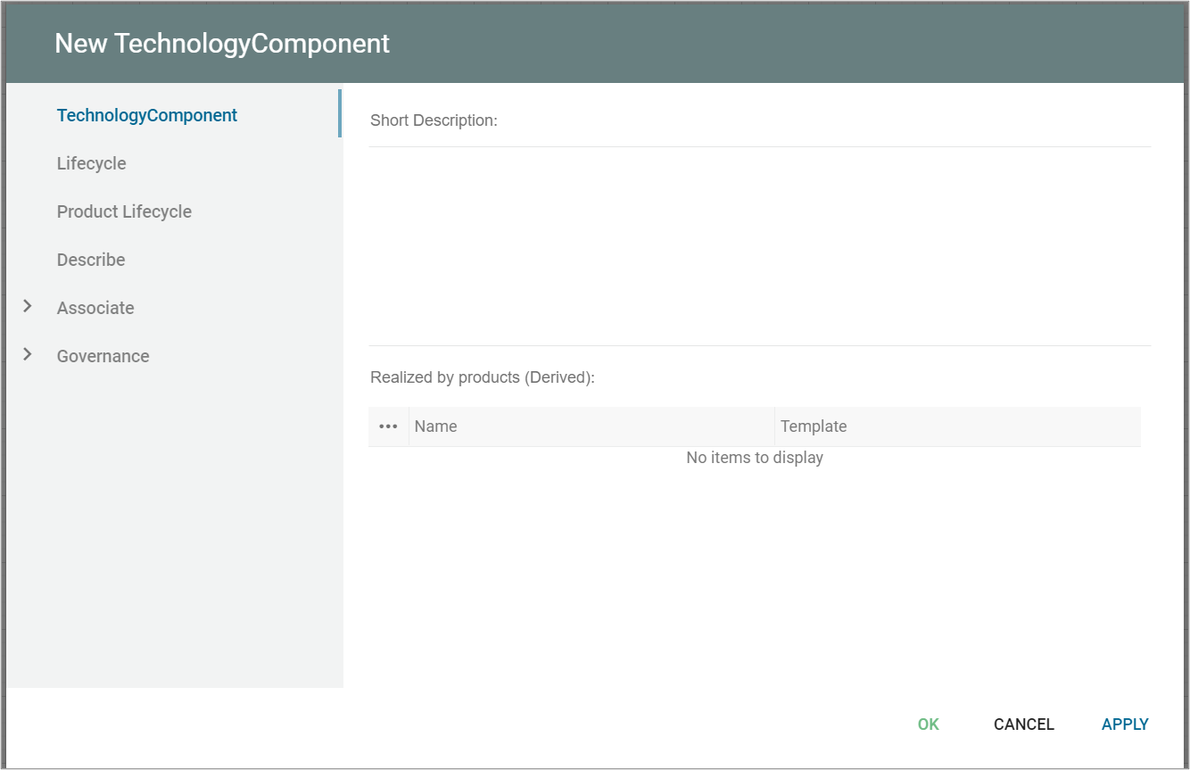
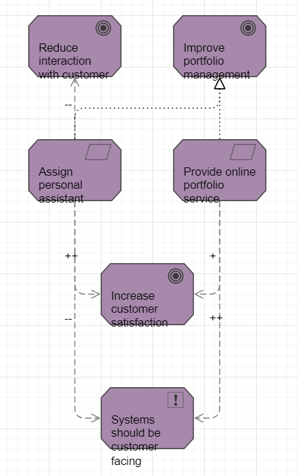
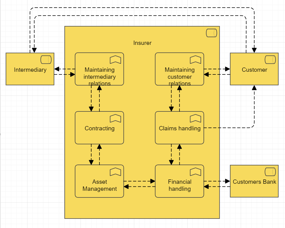
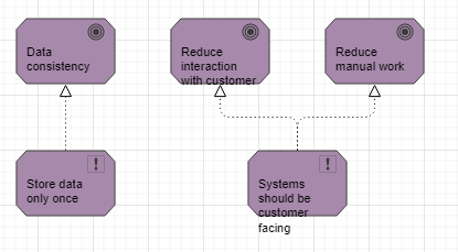
Example:
Overview: The Principles Viewpoint is a perspective in the ArchiMate enterprise architecture modeling language that focuses on the principles that guide an organization’s decisions and actions. Principles are high-level statements that capture an organization’s values, beliefs, and goals, and they provide a framework for decision-making and action. In the Principles Viewpoint, principles are represented as rectangular shapes with labels that describe their meaning and purpose. Relationships between principles are shown as lines connecting the principles, with labels that describe the nature of the relationship.
The Principles Viewpoint includes several concepts for modeling different aspects of principles, including:
- Principles: A principle is a high-level statement that captures an organization’s values, beliefs, and goals. Principles can be modeled to show their meaning, purpose, and impact on the enterprise.
- Relationships: Relationships between principles can be modeled to show the dependencies, conflicts, and synergies between them. This helps to ensure that the principles are consistent and aligned with the enterprise’s goals and objectives.
- Impacts: The impact of principles on the enterprise can be modeled to show how they influence decision-making and action. This helps to ensure that the principles are integrated into the enterprise’s architecture and that they are applied consistently across all areas of the organization.
Overall, the Principles Viewpoint is useful for defining and modeling the principles that guide an enterprise’s decisions and actions. It provides a common understanding of the principles and ensures that they are aligned with the enterprise’s goals and objectives. By doing so, it helps to ensure that the enterprise operates in a consistent and coherent manner and achieves its strategic objectives.