Purpose: The Application Structure Viewpoint in ArchiMate is used to model the structure and organization of applications and their components within an enterprise architecture. The viewpoint helps to provide a clear understanding of the relationship between the applications and their components, as well as how they interact with other architecture domains such as business and technology. This enables architects to design and manage the application architecture effectively.
Core Concerns: The core concerns of the Application Structure Viewpoint include modeling the structure and organization of applications and their components, their interactions and dependencies, and the technology infrastructure that supports them. By focusing on these core concerns, the Application Structure Viewpoint can help identify opportunities for improving the architecture’s efficiency, reducing complexity, and creating value for the organization. It also facilitates communication and collaboration among stakeholders, providing a common understanding of the application architecture and its interdependencies with other domains.
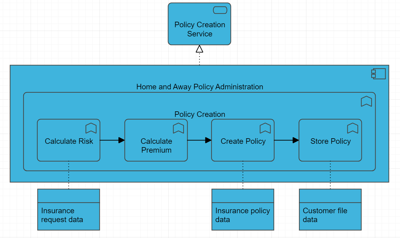
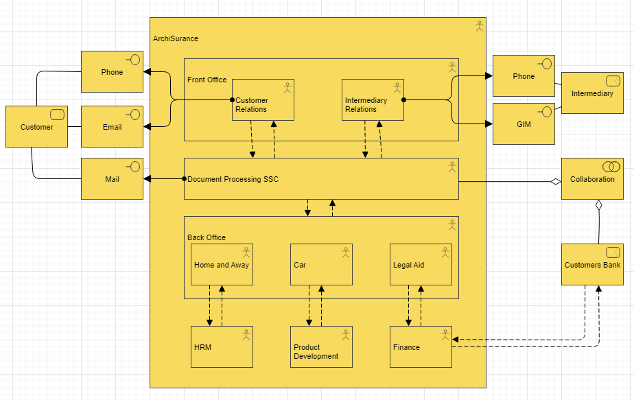
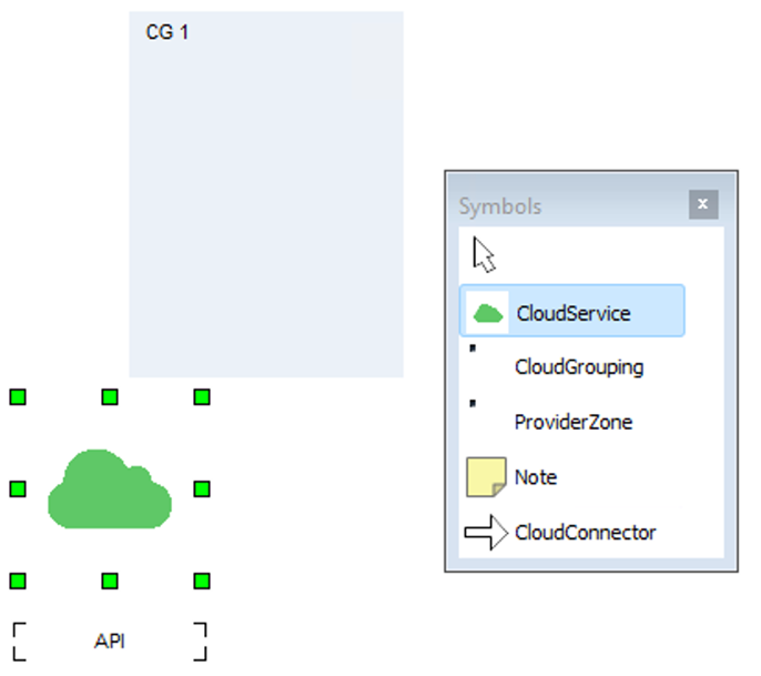
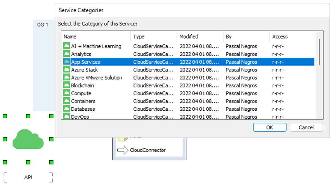
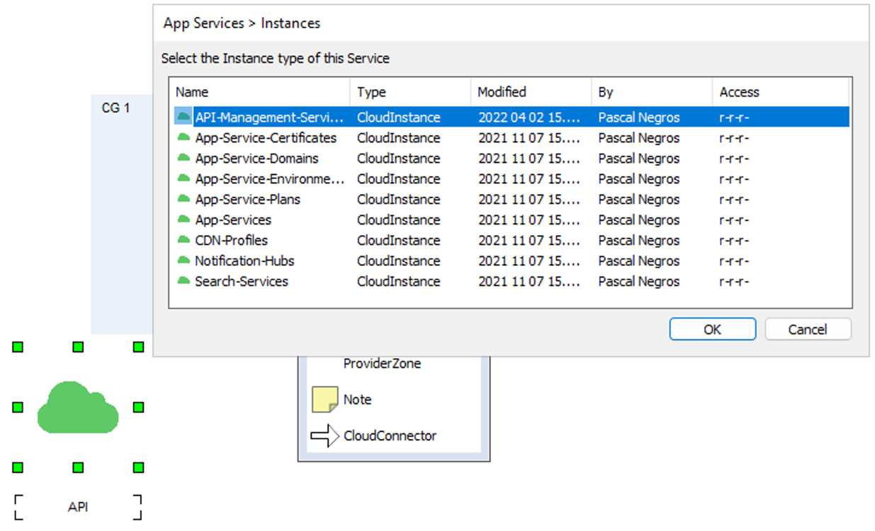
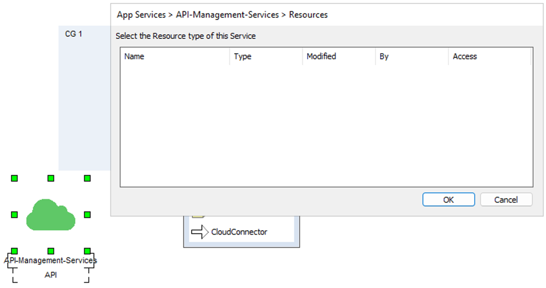
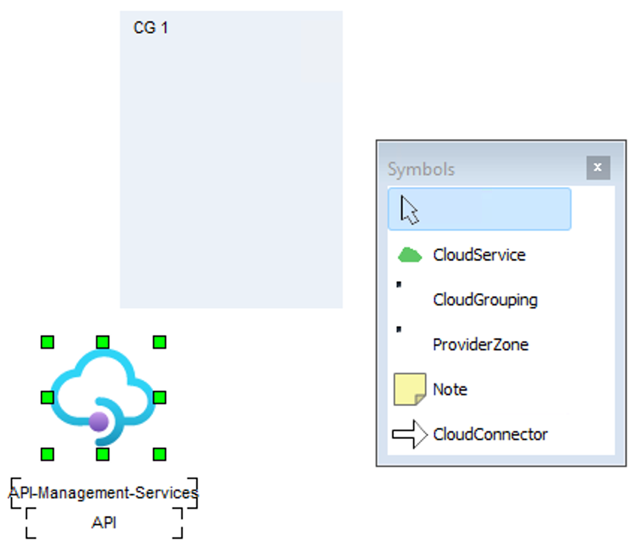
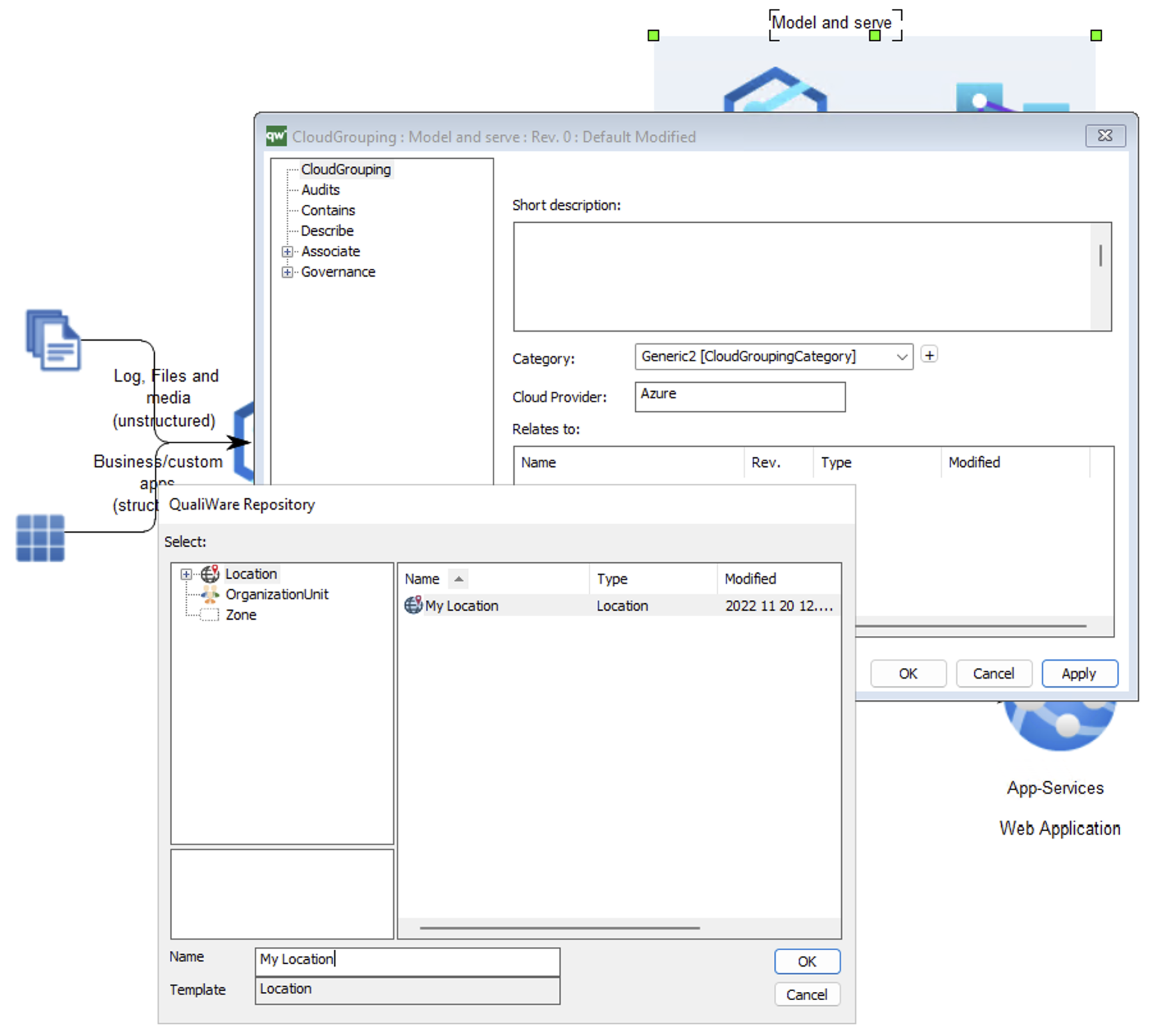
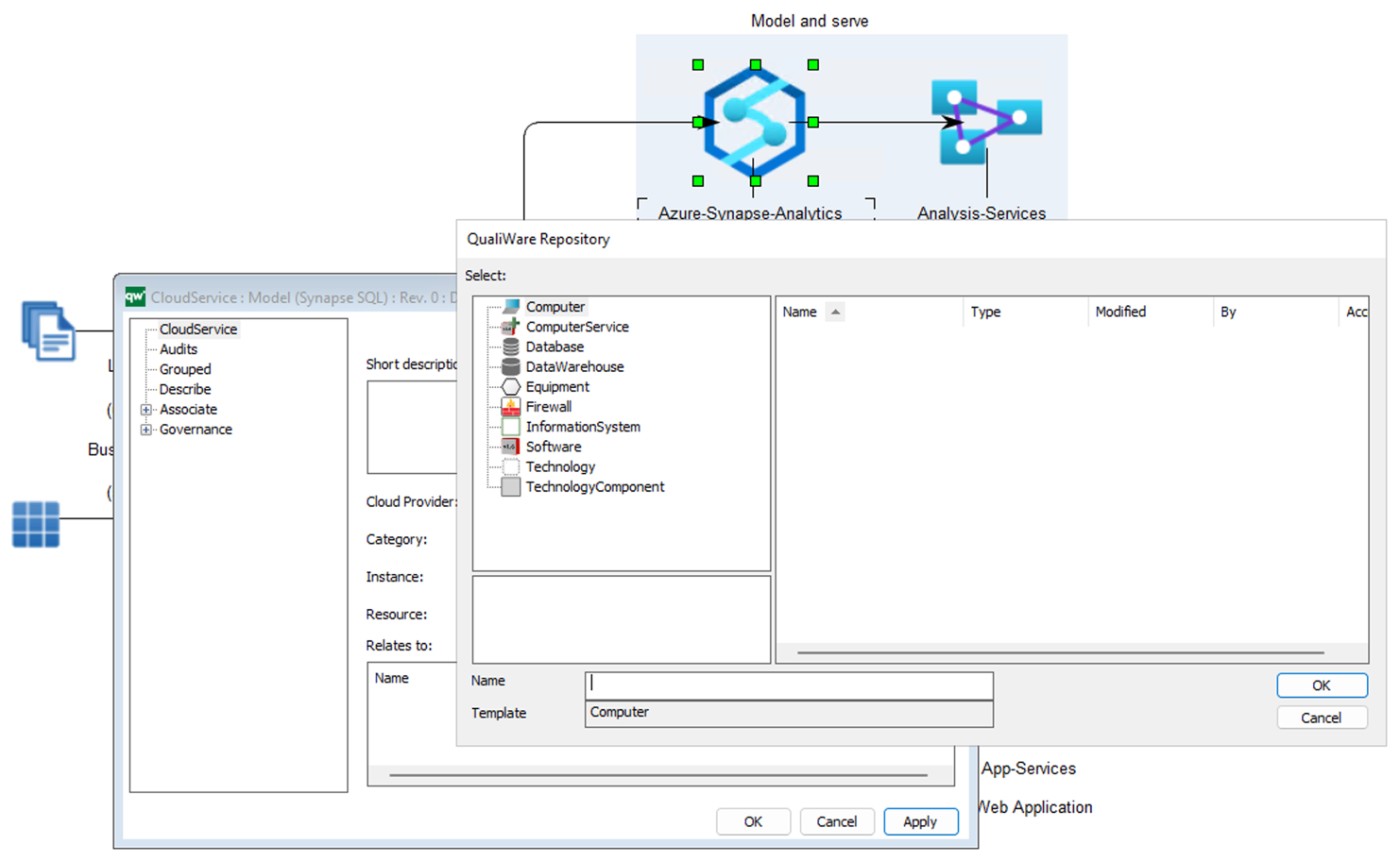
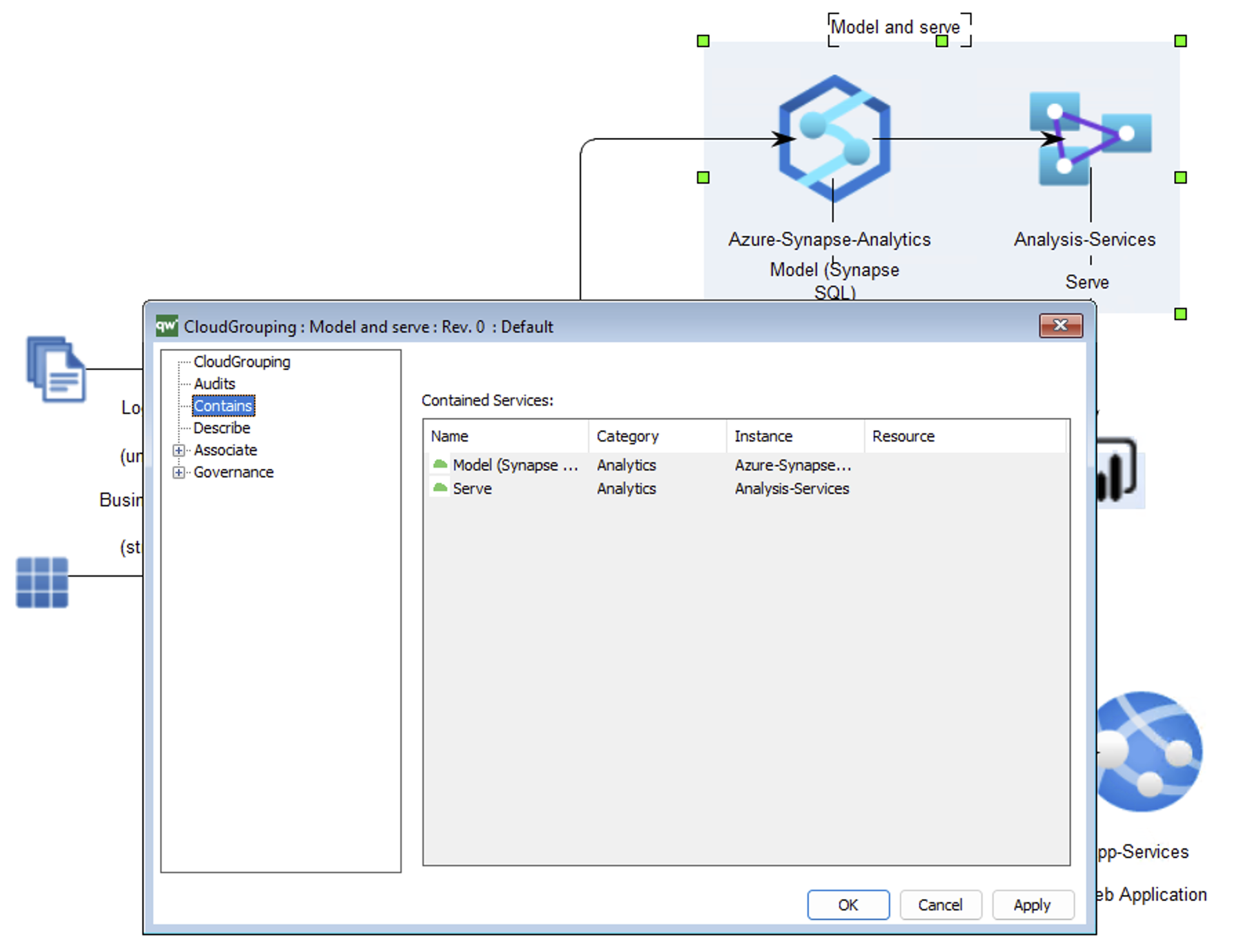
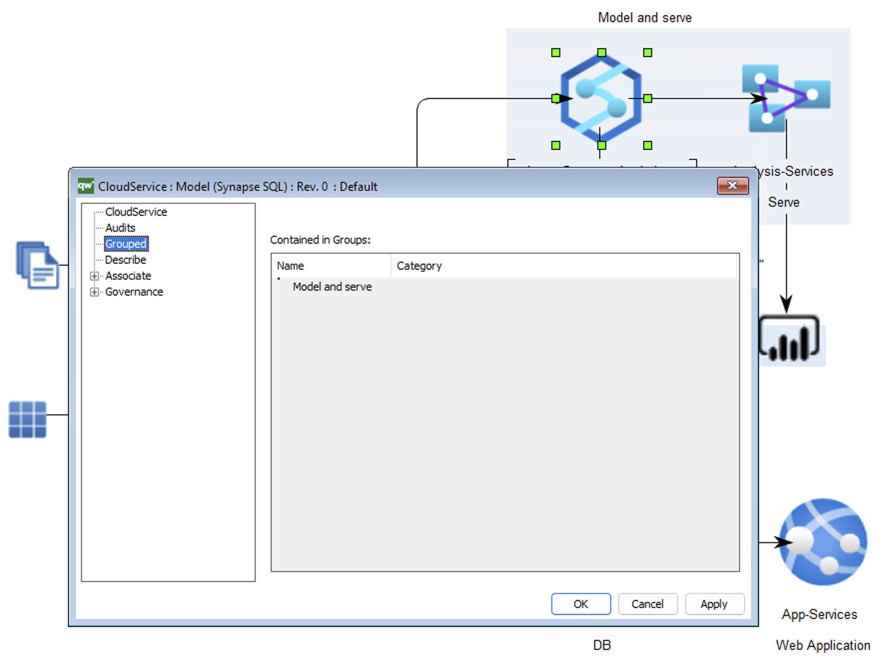
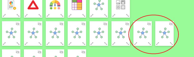
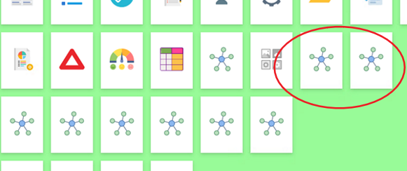
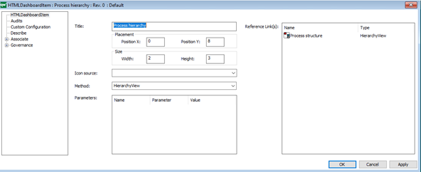
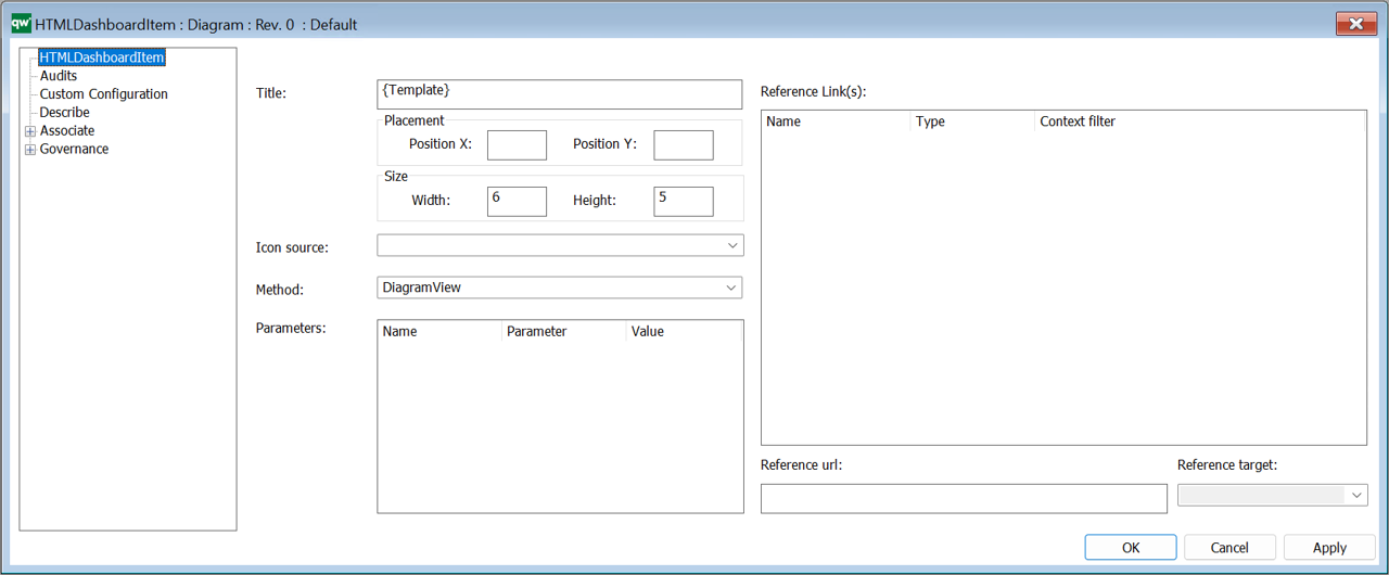
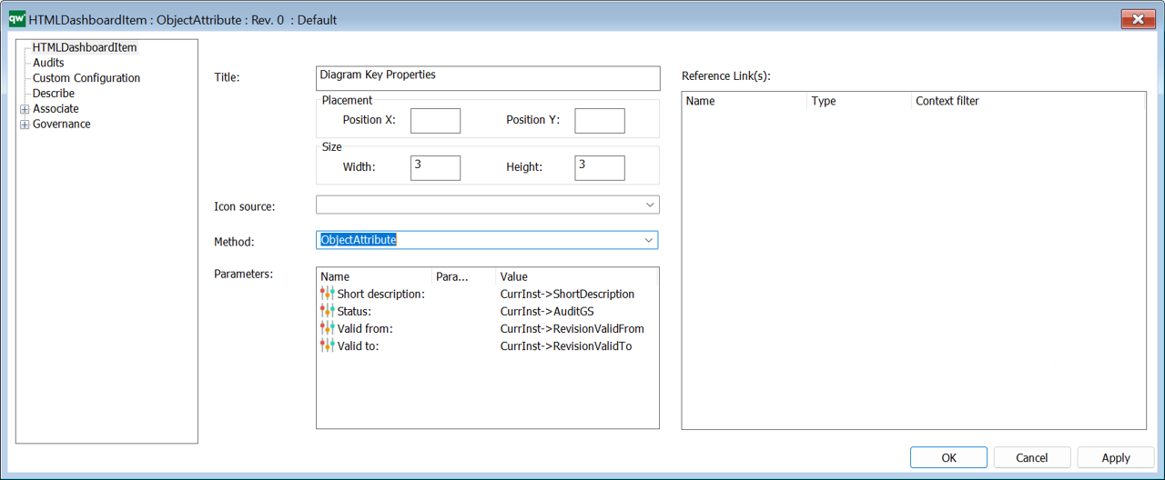
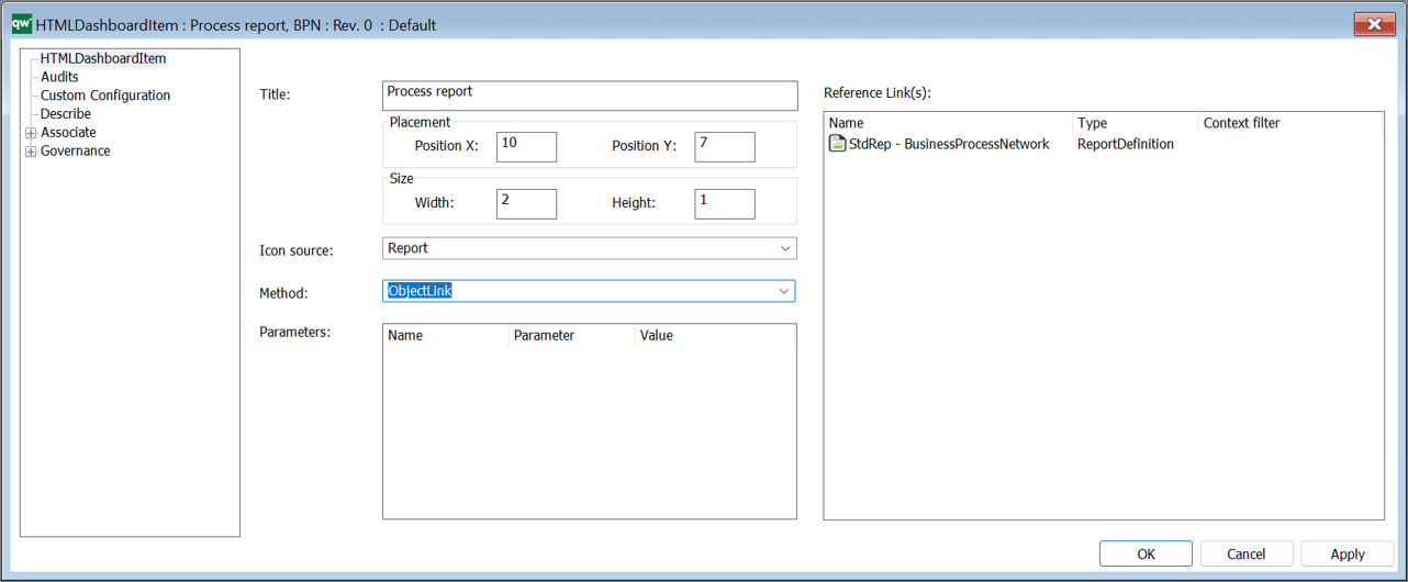
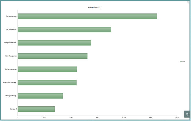
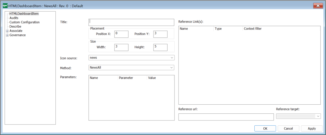
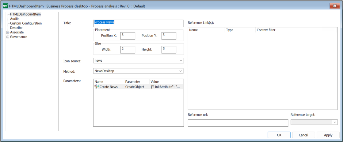
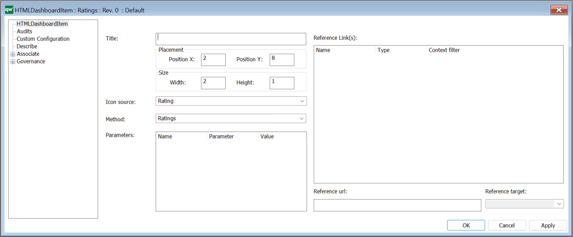
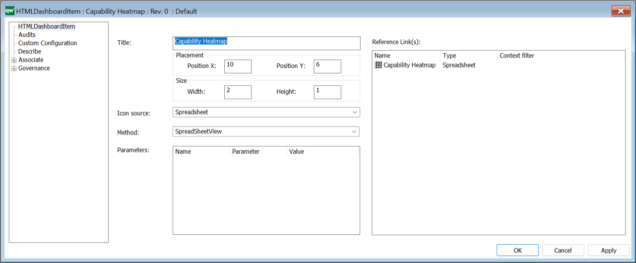
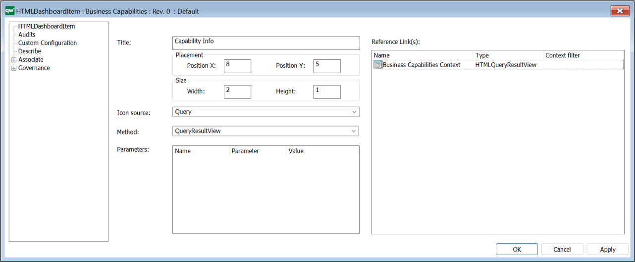
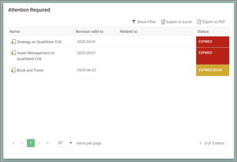
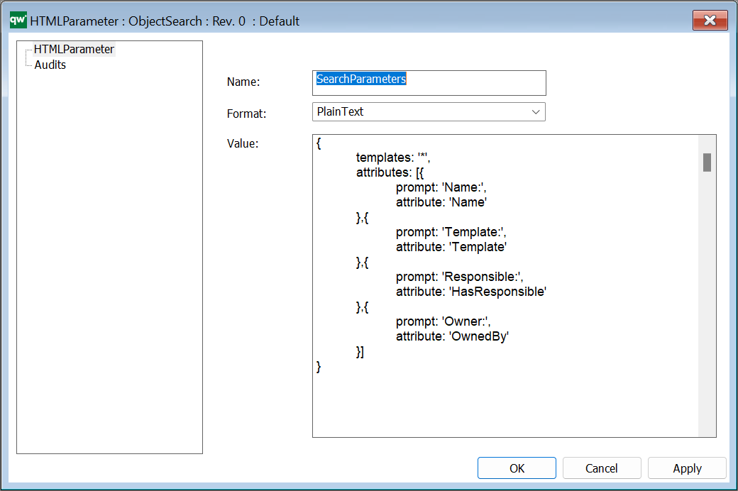
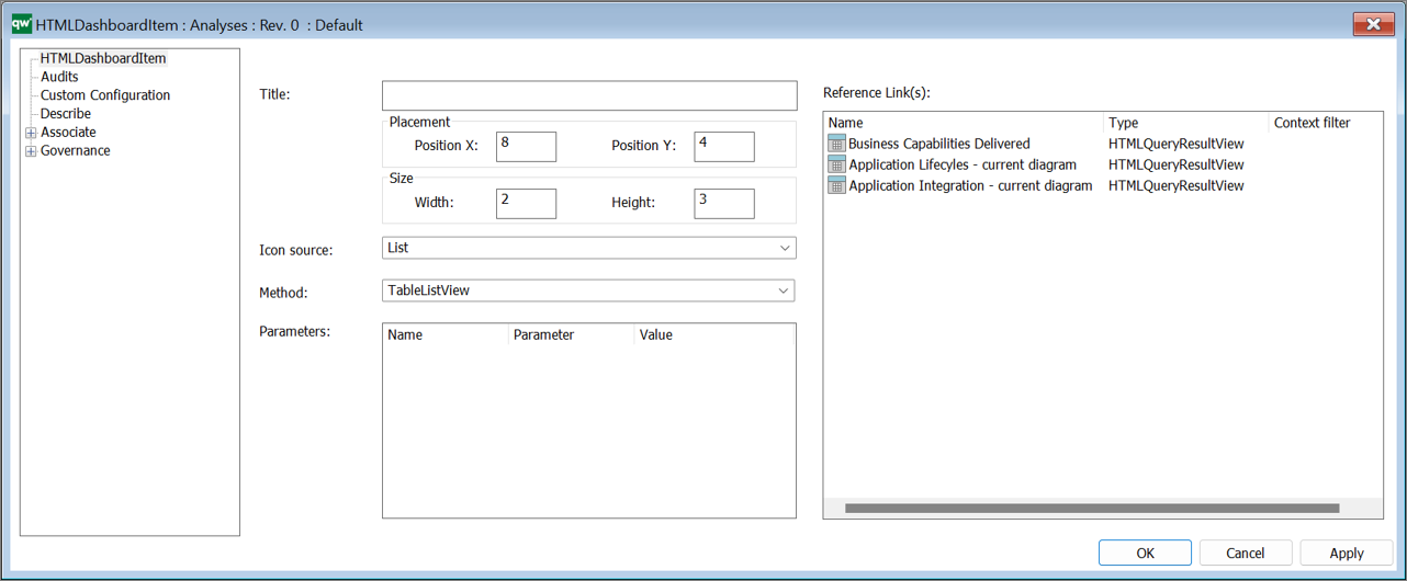
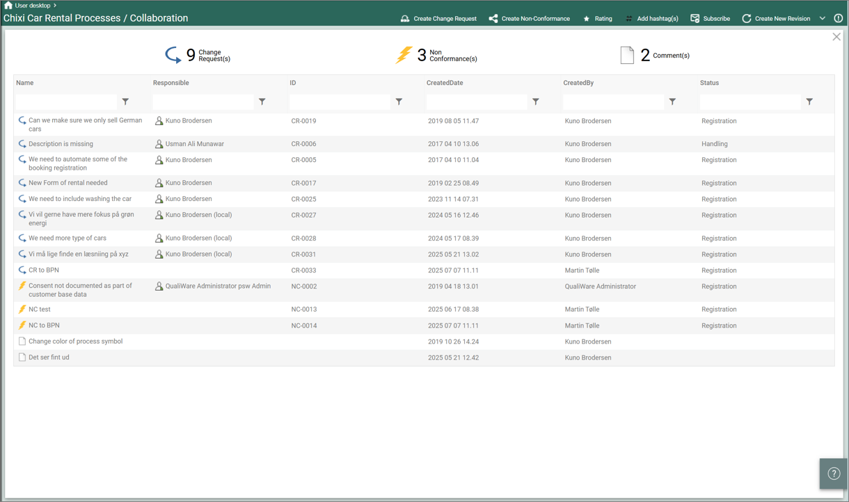
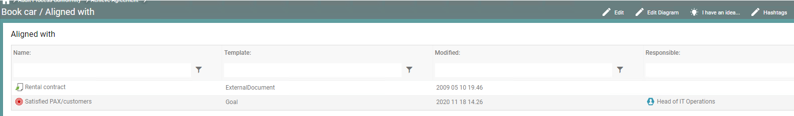
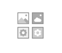
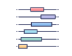
Example:
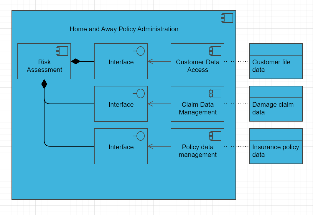
Overview: The Application Structure Viewpoint is a perspective in the ArchiMate enterprise architecture modeling language that focuses on the structure and organization of applications and their components. The viewpoint defines the different elements that make up the application structure and their relationships.
In the Application Structure Viewpoint, applications are represented as rectangular shapes with labels that describe their functions and capabilities. The components of an application are represented as smaller shapes within the application shape, such as modules, libraries, and services. Relationships between applications and their components are shown as lines connecting them, with labels that describe the nature of the relationship.
The Application Structure Viewpoint includes several concepts for modeling different aspects of the application structure, including:
- Applications: Applications are the primary elements of the application structure, representing the software systems that are used to support business processes. Applications can be modeled to show their functions, capabilities, and relationships with other applications and components.
- Components: Components are the parts of an application that provide specific functionality. Components can be modeled to show their relationships with other components within the same application, as well as their dependencies on other applications and components in the architecture.
- Interfaces: Interfaces are the points of interaction between applications and their components. Interfaces can be modeled to show the data and functionality that is exchanged between applications and components, as well as the technology infrastructure that supports them.
- Dependencies: Dependencies are the relationships between applications and their components that are required for the application to function properly. Dependencies can be modeled to show the relationships between different applications and their components, as well as the technology infrastructure that supports them.
Overall, the Application Structure Viewpoint is useful for modeling the structure and organization of applications and their components, as well as their interactions and dependencies with other architecture domains. It enables architects to design and manage the application architecture effectively, and to identify opportunities for improving its efficiency, reducing complexity, and creating value for the organization.


