The ServiceFunction is part of the DORA reporting (see DORA Desktop) used to describe the Service Functions as part of the reporting.

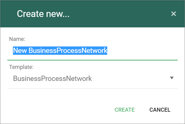
Templates and model types in the QualiWare platform.
The ServiceFunction is part of the DORA reporting (see DORA Desktop) used to describe the Service Functions as part of the reporting.
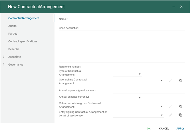
The Contractual Arrangement is part of the DORA reporting (see DORA Desktop) used to manage the different Contracts.
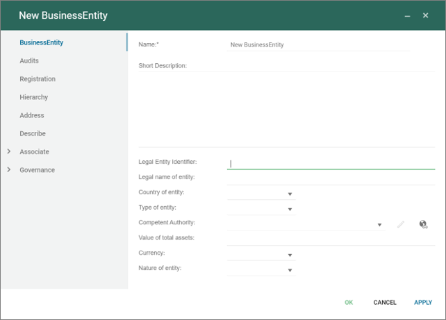
The Business Entity is part of the DORA reporting (see DORA Desktop) used to manage the different business entities part of the reporting.
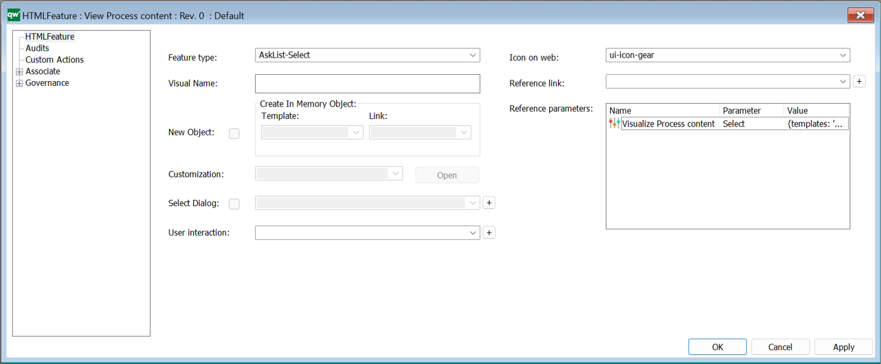
The HTMLFeature is used to configure different settings in the Web-front end.
The template can be used to pre-defined features (such as the Smart Importer or PowerPoint Generator) and other advanced customized features (JSScripts).
A subset of the Features can be configured.
The following (configurable) feature types are available:

In addition there is a Custom type that can be used to insert customised features.
There are 3 different types of AskLists features available, (used in the Getting Started Tile in the Desktop):
All of them have the same configuration and behavior. When clicked on the web front end, an ask list will be shown
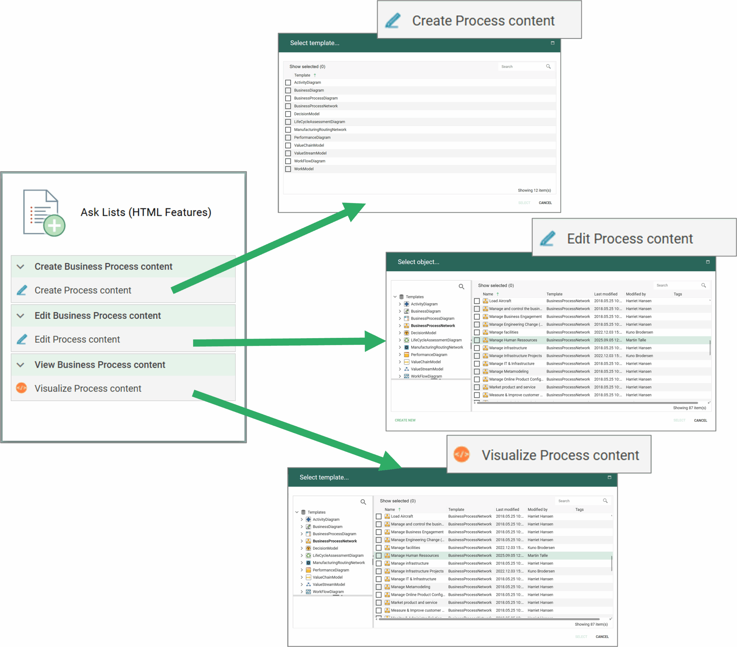
When a template is selected each of the types will have a different behavior:

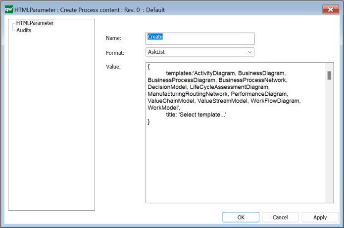
The content (List of templates) in the Ask List is defined by the referene parameter in the Feature, using a HTMLParameter object.
The Ask List will contain the templates listed in Value field, and contain the title as defined in the string.

This type enables the hashtag feature in the ContextMenu in the Repository Explorer, to work with hashtags related to the object.

The ReferenceLink is used to link to external references and include them as link in HTMLDashboardItems (used in the Getting Started Tile in the Desktop).

The item will link to the reference link in the object inserted in the Reference link field. This could be an ExternalDocument, where the link is inserted in the File Details.
The WebForm is used to create new object, e.g. as a part of a ContextMenu in the Repository Explorer.

The example above creates a new object (ChangeRequest) and link it to the existing object with the link “Concern”.
The WebForm can also be used as a part of a HTMLContentBox in a HTMLDashboardItem on a Dashboard.

The HTMLContentBox contains a HTMLFeature (WebForm) and a link to a HTMLQueryResultView.
The content box shown on the web front-end as a part of a DashboardItem (example from the EDGY Enterprise Desktop).

This type is used in the Repository Explorer in the ContextMenu to open the diagram in the webmodeler.

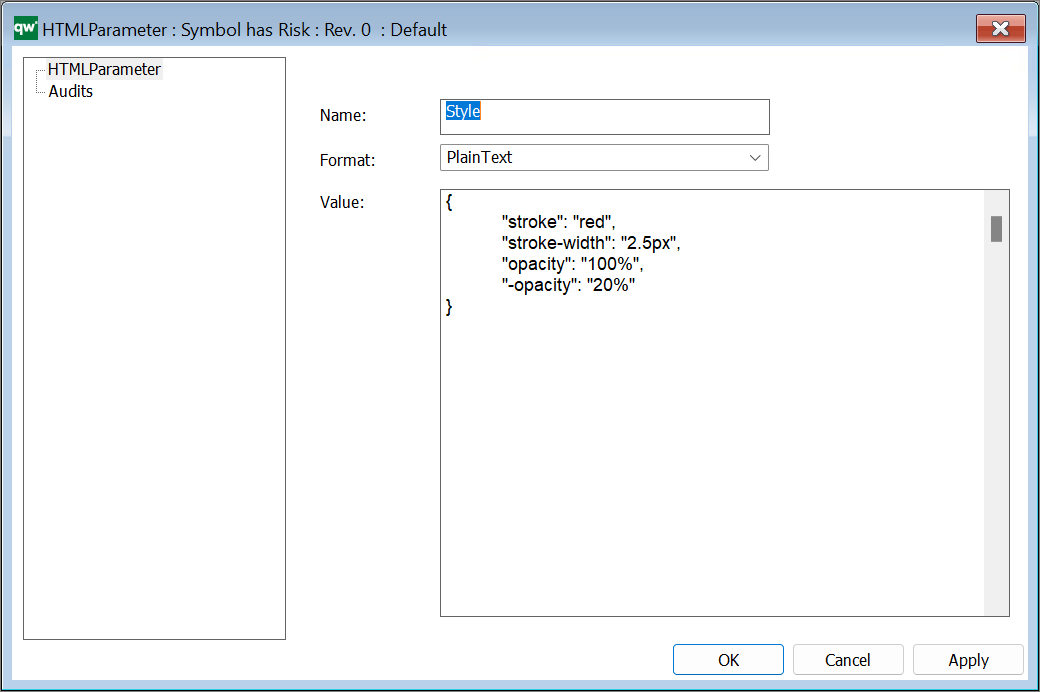
The HTMLParameter is used to specify parameters in relations to various HTML settings:
In the example below the style of the objects (in the underlying highlight query) is specified, a long with the opacity of the complentery object, i.e. the objects not included in the underlying query.
In the example below the style of the objects (in the underlying highlight query) is specified, a long with the legend and position of the legend. The parameter {} are refering to parameters in the underlying query.
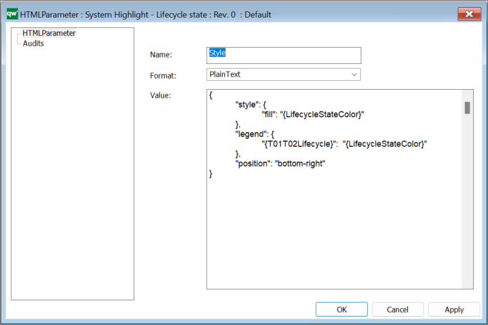
The parameter shown above is related to the Multiple highlight functionality that was introduced in QualiWare 10.9.
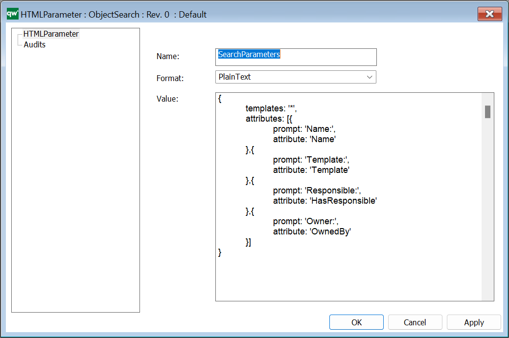
In the example above “*” has been inserted as search criteria for the templates, it is possible to configure the template list by inserting Template names, seperated with ‘,’ to focus the search, e.g.
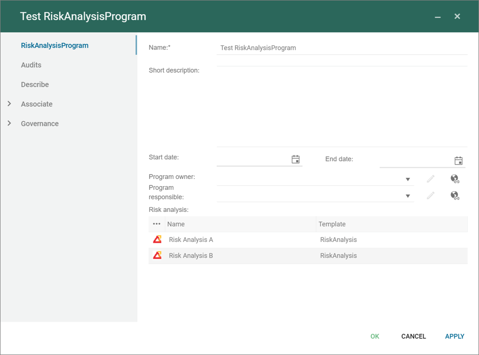
A Risk Analysis Program grouping Risk Analysis in a program that can be planned, similar to an AuditProgram planning a group of QualityAudits.
The risk analysis program is part of the Risk Management Desktop and the Composable Business Desktop introduced in QualiWare 10.10.
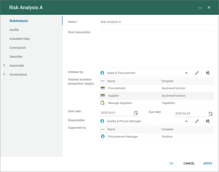
A Risk Analysis can be seen as the equivalent of a QualityAudit focusing on analysing risk associated with one or more objects/business perspective, and capturing the conclusion of the analysis.
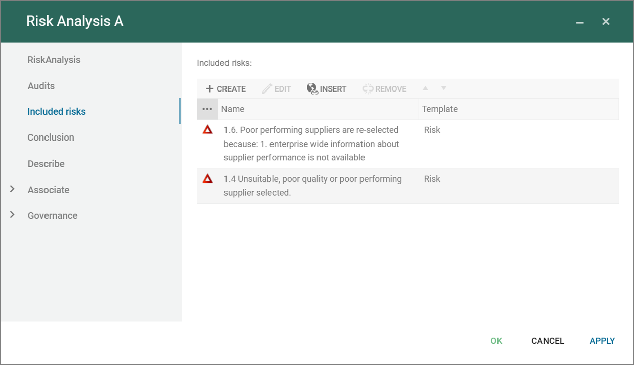
A risk analysis can also include risks in the repository.
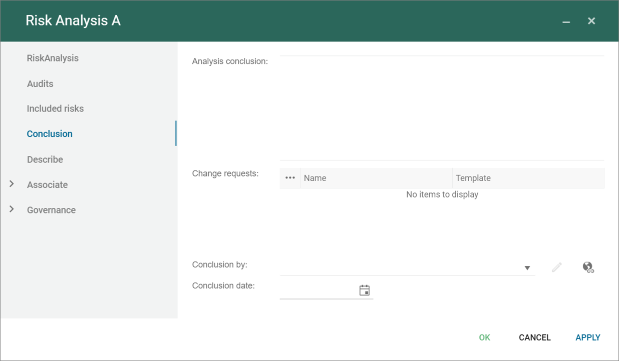
A Risk Analysis can be planned and be a part of a RiskAnalysisProgram.
The risk analysis is part of the Risk Management Desktop and the Composable Business Desktop introduced in QualiWare 10.10.
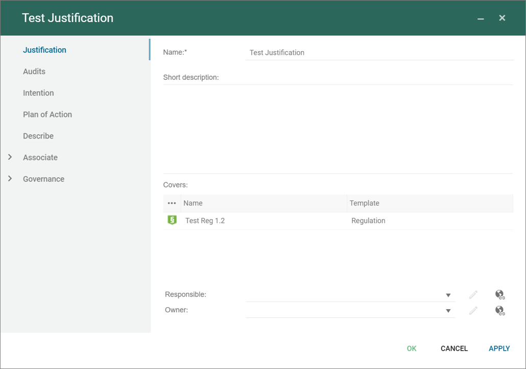
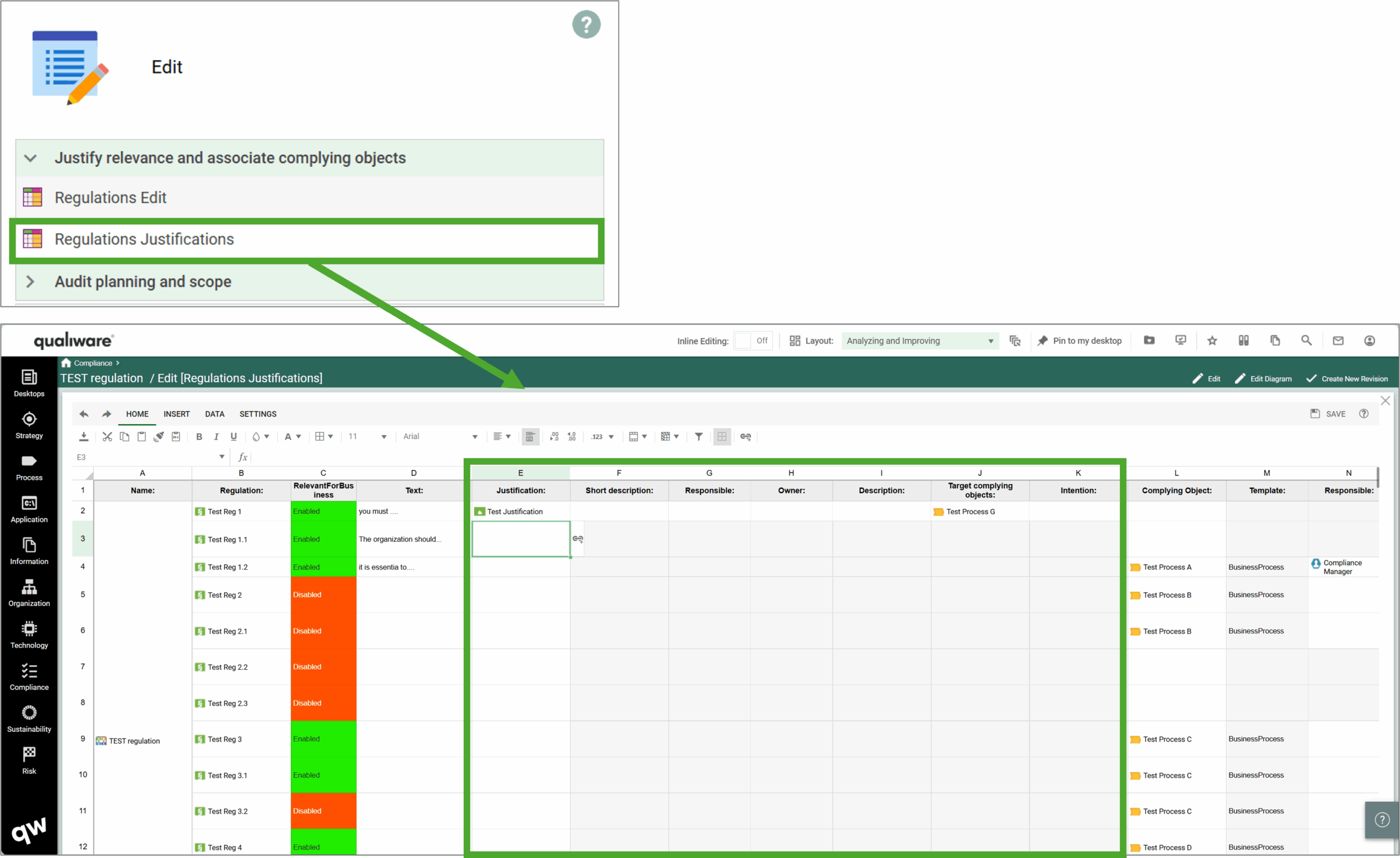
The template can be used to document the Justification a compliance choice, e.g. either why a regulation is relevant or if it is not relevant for business.
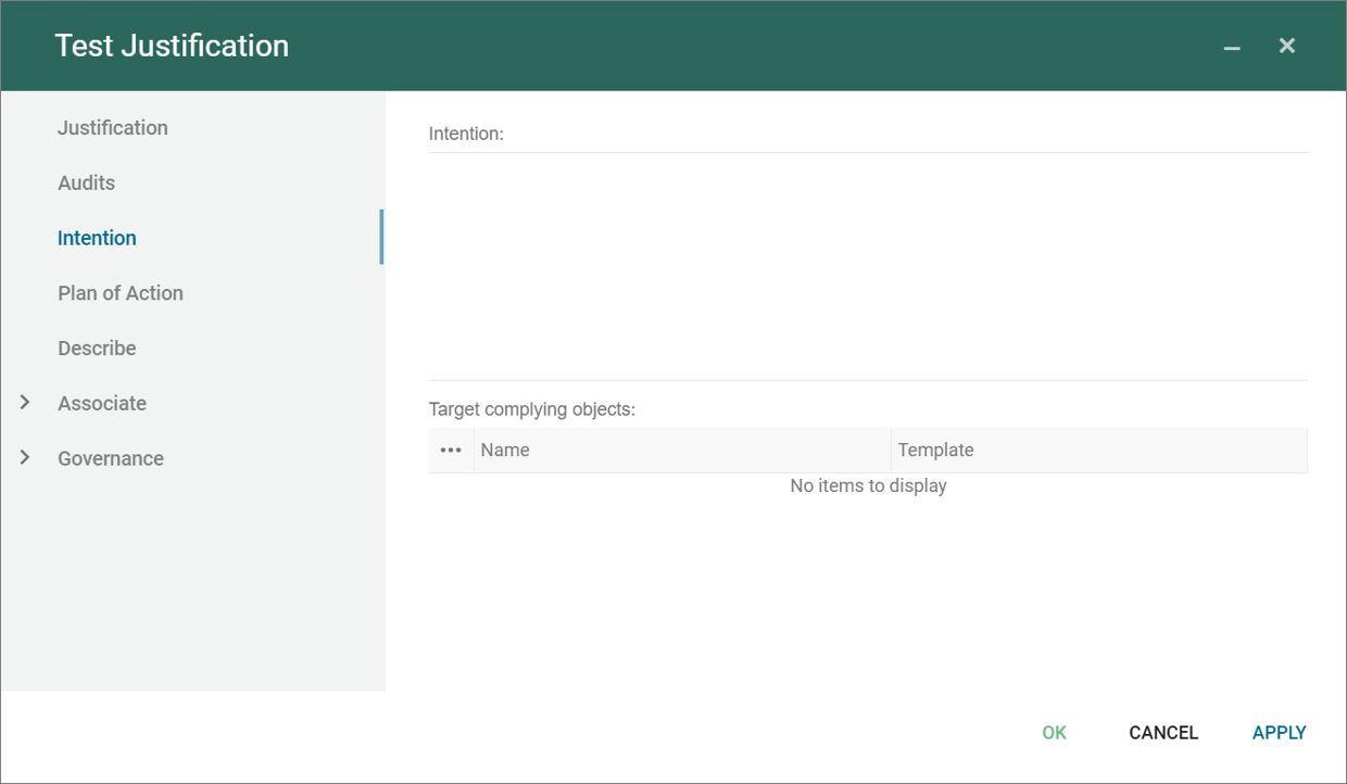
In relation to work with a new regulation in an organization, you can start with making a justification, and document the intention of what needs to be done, and link to target complying objects.
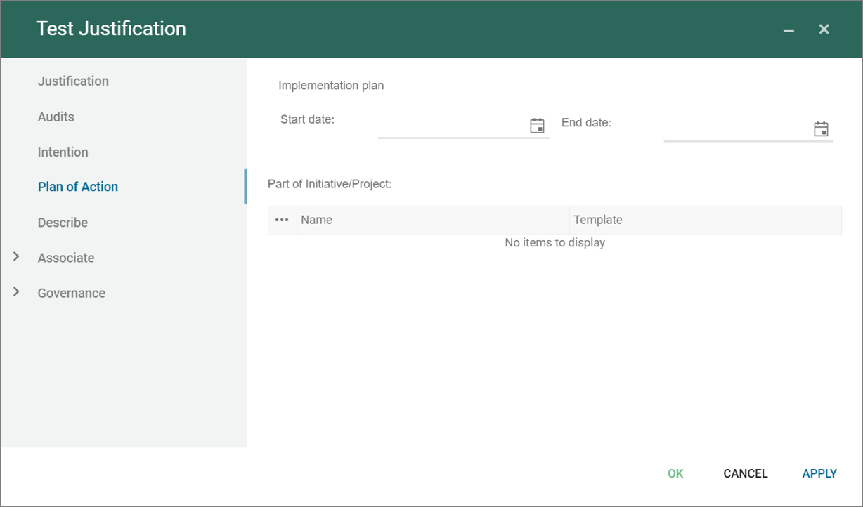
You can also document the related plan for implementation, and link/create relevant initiatives/projects.
The justification are part of the standard spreadsheets related to the Analyzing and improving dashboard for regulation diagram.
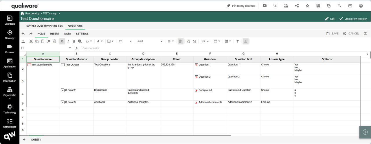
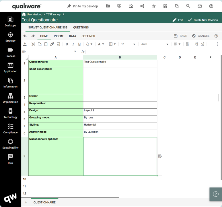
Questionnaires are used in Survey to design the questionnaire.
On the first tab, you can choose between different design, grouping and styling.
On the Questions tab you can set up the questionnaire via questiongroups and their linked questions.
Read more about survey here.
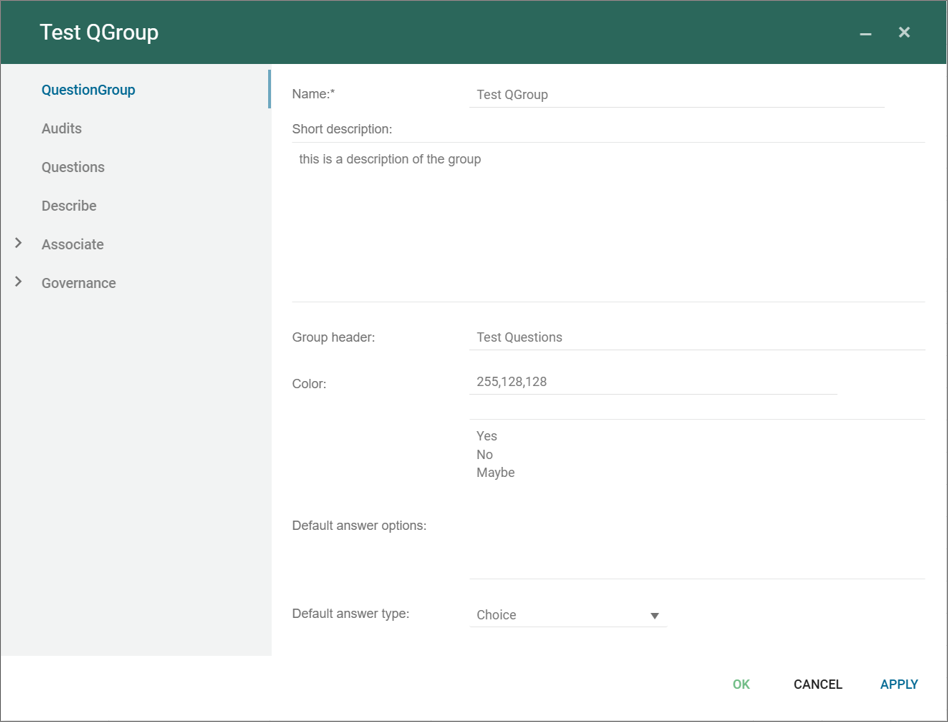
QuestionGroup are used in survey a can contain one or more questions.
Each of the Questions are described in a dedicated Question object.
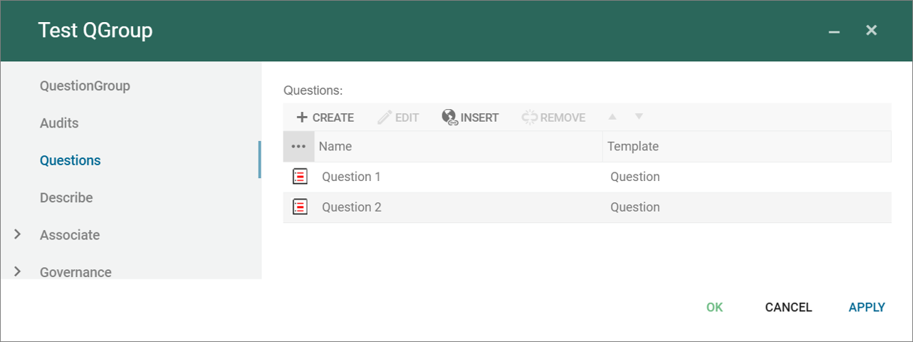
Note the order of the questions in the group will determine the order of the questions in the questionnaire.
Read more about survey here.