HTML Embedded Content

The HTMLEmbeddedContent template is used to embed content on a web page. This content could be e.g. a BusinessChart or a QRV. Inserting a BusinessChart allows for showing statistics related to the current object.


Concerns: The object that contains information about what should be shown.

Url: The URL can be to a file that can use the attributes specified to display content in a special way. E.g. there is a .aspx file that specifies how a BusinessChart is shown.

External: If the content comes from an external source, this should be checked.

Attributes: The attributes to be used by the URL. This can e.g. be the repository ID, configuration ID or object ID.


HTML Document

Description of this template will be available soon.

HTML Dialog Field

A HTML Dialog Field defines a Field in a HTMLDialogLayout. Whereas the layout (size and position) of the Dialog is defined in the Layout, the HTML Dialog Field defines the behavior.

You can configure the field including setting the Field type, the Initial value and mark it as Mandatory/Read only/Hidden.

On the Setting tab, it is possible to specify e.g. the content of a Choice Field Type, i.e. the options available in the dropdown choice list, see example below defining the options for a Risks Significance score.

Similary you insert the available template types in the Settings, for the SingleLink type, e.g. the relationship HasResponsible.

HTML Content Tab

A HTMLContentTab is used to set up content in tab format. Content tabs are used in the HTMLTemplateDefinition, to create dedicated tabs with different types of content (in the Center tab in the Diagram Workspace – Classic Layout).

Title: This will be shown as the title of the tab. If nothing is specified, the name of the HTMLContentTab object will be shown on the tab.

Empty content text: If there is no content to show inside the tab, then this text will be shown.

Content field: This defines the content of the tab. It is possible to either specify a list of attributes to show or to link to other objects that defines the content.

Content field

There are a few different ways to specify the content of the tab, right click in the box to get the available options:

HTML Content Box

A HTMLContentBox is a contained box that holds some information. It can be placed in a side panel or inside a tab.

Collapsible: Defines if the box should be collapsible (Value: checked / unchecked)

Collapsed: Defines if the initial state of the box is collapsed.

Show counter: Defines if the box should display a counter to show how many links it contains. (Value: checked / unchecked)

Hide if empty: Defines if the box should be hidden if there is not content (Value: checked / unchecked)

Empty content text: If there is no content to show inside the box, then this text will be shown.

Title:  This will be shown on the title bar. If nothing is specified, the name of the HTMLContentBox object will be shown on the title bar.

Format: This defines how the information in the box should be shown. Values are Generic, List, Table.

Use Web Query: This defines how the information in the box should be shown. Values are Generic, List, Table.

Use a HTMLWebQuery to define a list of objects to show. This can e.g. be a list of all ExternalDocuments that are related to the current object in a specific way.

Content field:  This defines the content of the box unless a web query is selected. It is possible to specify a list of attributes to show.

  • Name: The content to be displayed.
  • Prompt: A prompt that helps the user understand what the content is.
  • Style:
  • Format: The format of the content of the content box.
    • Values are: CheckList: displays content from the diagram as a checklist. It is possible to select/deselect individual items, and select/deselect all items.
    • Chart
    • Spreadsheet
    • Fieldset
    • Table: displays content in a table format.
    • List: displays content in list format.
    • Gauge
    • Embed
  • Function:
  • Role: You can add a repository role to configure who can see the information.

A HTMLContentBox in inserted in a HTMLTemplateDefintion, in the left or right sidepanel.

A HTMLContentBox can also be used in the HTMLDashboardItems to collect a group of content, e.g. as part of a TableListView

The example to the right shows a HTMLDashbordItem, with multiple collapible HTMLContentBoxes (QualiWare 10.10).

HTML Content Blog

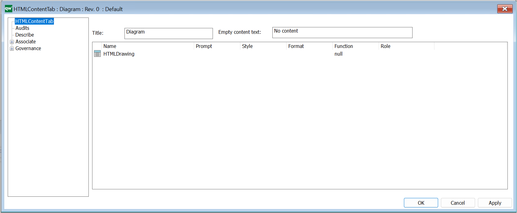
The HTMLContentBlog is used to retrieve information about objects related to the current object that is being viewed by the user. The main difference between HTMLContentBlog and other types of presentation is that HTMLContentBlog displays the information in a blog format.

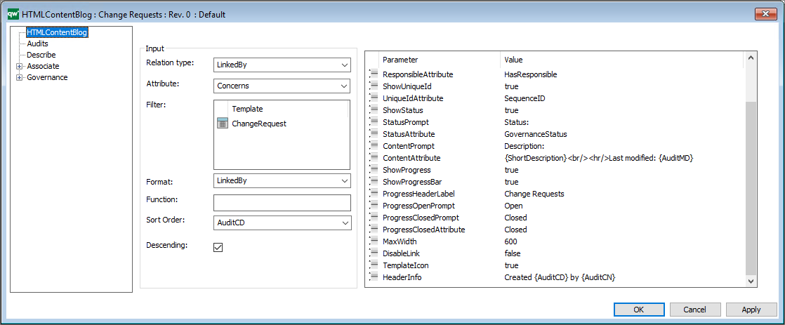
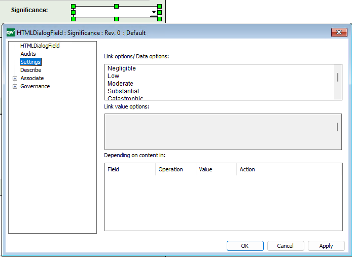
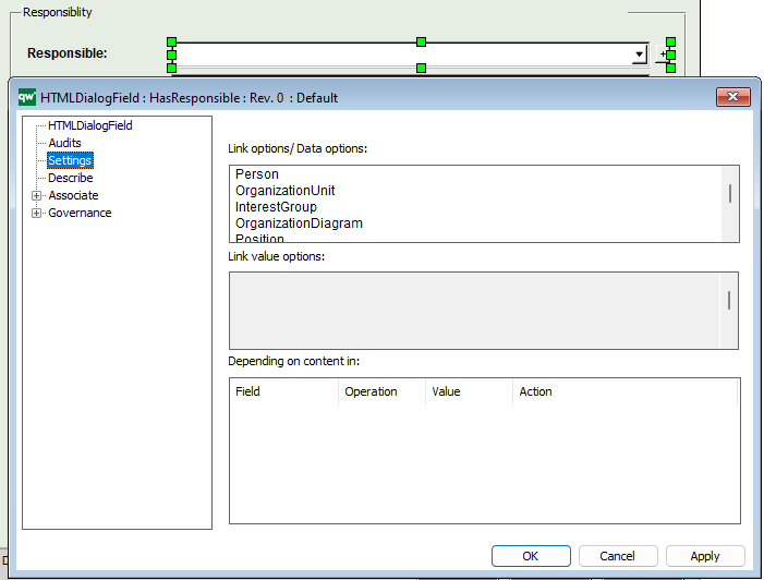
Relation Type: The relation type defines what relation the content blog’s entries should have to the main object.

Options are LinkedBy, Links or Contains.

Attribute: The attribute defines what attribute used to get the relation to the main object.

E.g. for a list of ChangeRequests the relation type would be LinkedBy and the attribute would be Concerns. This will give a list of every linked by object that has the main object at the Concerns attribute.

Filter: Use the filter to provide a list of templates that you want to filter.

Function: Use this to provide a JavaScript function to execute.

Sort Order: Sort Order defines the attributes used to sort the list.

Descending: “true” or “false”. True for descending and false for ascending sort order.


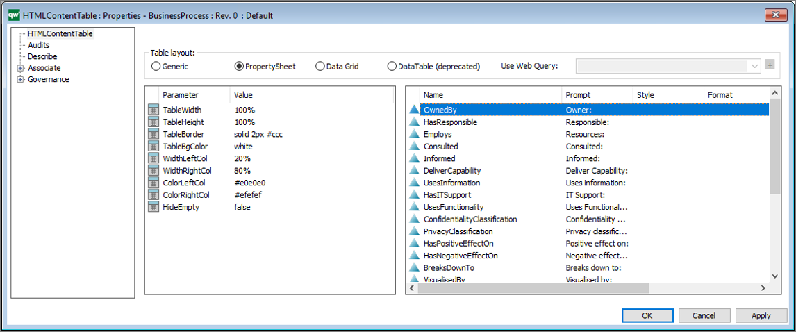
Furthermore, the HTMLContentBlog takes a list of parameters for configuring the presentation.

DisableLink: “true” or “false”. This removes the hyperlink in the object title.
TemplateIcon: “true” or “false”. This displays a small template icon next to the object title.
HeaderAttribute: The attribute that should be displayed in the blog header.
HeaderCaption: The string that will be displayed in the caption header.

It is possible to include Audit information in the string by placing the audit keywords in curly brackets.
E.g. “Created {AuditCD} by {AuditCN}”

The complete list of audit keywords: Name, AuditCN, AuditCD, Audit´MN, AuditMD, AuditAR, AuditCG, AuditEN, AuditGC, AuditGS, AuditGD, AuditGA, Name, ObjID, Revision, Template

ShowResponsible: True / false
ResponsiblePrompt: The prompt that will be displayed in the responsible label.
ResponsibleAttribute: The attribute that should be displayed as being the responsible.
ShowUniqueId: true / false (This will display the sequence number.)
UniqueIdAttribute: The attribute that should be displayed as unique id.
ShowStatus: “true” or “false”. This will display the status of the object.
StatusPrompt: The string that will be displayed in the status label.
StatusAttribute: The attribute that should be displayed as the status.
ContentPrompt: The string that will be displayed in the content label.
ContentAttribute: The attribute that should be displayed as content.
ShowProgress: “true” or “false”. This will enable both progressbar and progress header.
ShowProgressBar: “true” or “false”. This will display the progress bar.
ProgressHeaderLabel: The string that should be displayed as progress header.
ProgressOpenPrompt: The string that should be displayed under progress header in red, indicating open state.
ProgressClosedPrompt: The string that should be displayed under progress header in red, indicating closed state.
ProgressClosedAttribute: The string value of the attribute defined in the StatusAttribute-parameter that should be counted as closed. In this case “Closed” for a changerequest.
MaxWidth: The max width of the content blogs.

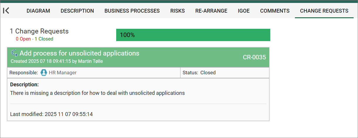
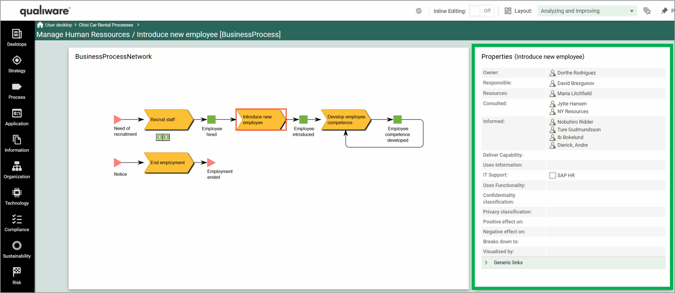
Below in an example of how it looks on the web frontend.

History State

Description of this template will be available soon.

Help Item

Description of this template will be available soon.