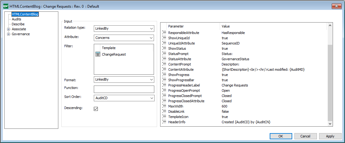
The HTMLContentBlog is used to retrieve information about objects related to the current object that is being viewed by the user. The main difference between HTMLContentBlog and other types of presentation is that HTMLContentBlog displays the information in a blog format.

Relation Type: The relation type defines what relation the content blog’s entries should have to the main object.
Options are LinkedBy, Links or Contains.
Attribute: The attribute defines what attribute used to get the relation to the main object.
E.g. for a list of ChangeRequests the relation type would be LinkedBy and the attribute would be Concerns. This will give a list of every linked by object that has the main object at the Concerns attribute.
Filter: Use the filter to provide a list of templates that you want to filter.
Function: Use this to provide a JavaScript function to execute.
Sort Order: Sort Order defines the attributes used to sort the list.
Descending: “true” or “false”. True for descending and false for ascending sort order.
Furthermore, the HTMLContentBlog takes a list of parameters for configuring the presentation.
DisableLink: “true” or “false”. This removes the hyperlink in the object title.
TemplateIcon: “true” or “false”. This displays a small template icon next to the object title.
HeaderAttribute: The attribute that should be displayed in the blog header.
HeaderCaption: The string that will be displayed in the caption header.
It is possible to include Audit information in the string by placing the audit keywords in curly brackets.
E.g. “Created {AuditCD} by {AuditCN}”
The complete list of audit keywords: Name, AuditCN, AuditCD, Audit´MN, AuditMD, AuditAR, AuditCG, AuditEN, AuditGC, AuditGS, AuditGD, AuditGA, Name, ObjID, Revision, Template
ShowResponsible: True / false
ResponsiblePrompt: The prompt that will be displayed in the responsible label.
ResponsibleAttribute: The attribute that should be displayed as being the responsible.
ShowUniqueId: true / false (This will display the sequence number.)
UniqueIdAttribute: The attribute that should be displayed as unique id.
ShowStatus: “true” or “false”. This will display the status of the object.
StatusPrompt: The string that will be displayed in the status label.
StatusAttribute: The attribute that should be displayed as the status.
ContentPrompt: The string that will be displayed in the content label.
ContentAttribute: The attribute that should be displayed as content.
ShowProgress: “true” or “false”. This will enable both progressbar and progress header.
ShowProgressBar: “true” or “false”. This will display the progress bar.
ProgressHeaderLabel: The string that should be displayed as progress header.
ProgressOpenPrompt: The string that should be displayed under progress header in red, indicating open state.
ProgressClosedPrompt: The string that should be displayed under progress header in red, indicating closed state.
ProgressClosedAttribute: The string value of the attribute defined in the StatusAttribute-parameter that should be counted as closed. In this case “Closed” for a changerequest.
MaxWidth: The max width of the content blogs.
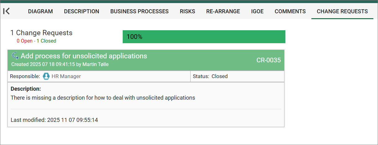
Below in an example of how it looks on the web frontend.


