The HTML template definition defines how and what information is displayed on the web for each template-type.
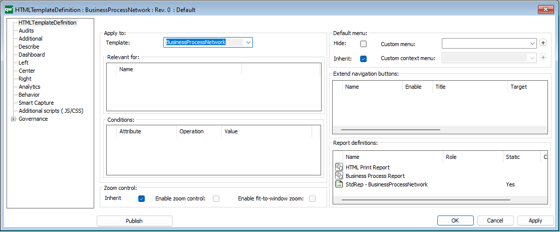
In QualiWare 10.8 a new Dashboard layout has been introduced. You can create one or multiple dashboard(s) for a diagram template-type. The dashboard(s) are associated on the Dashboard Tab:
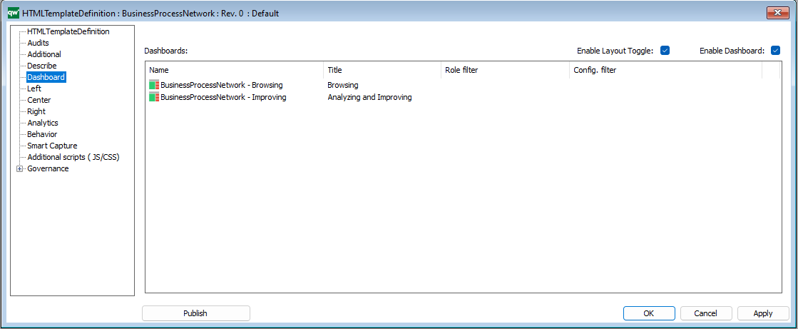
The Dashboard are configured using the templates:
The “Left”, “Center” and “Right” tabs specifies the content on the classic diagram workspace, shown on the example below.
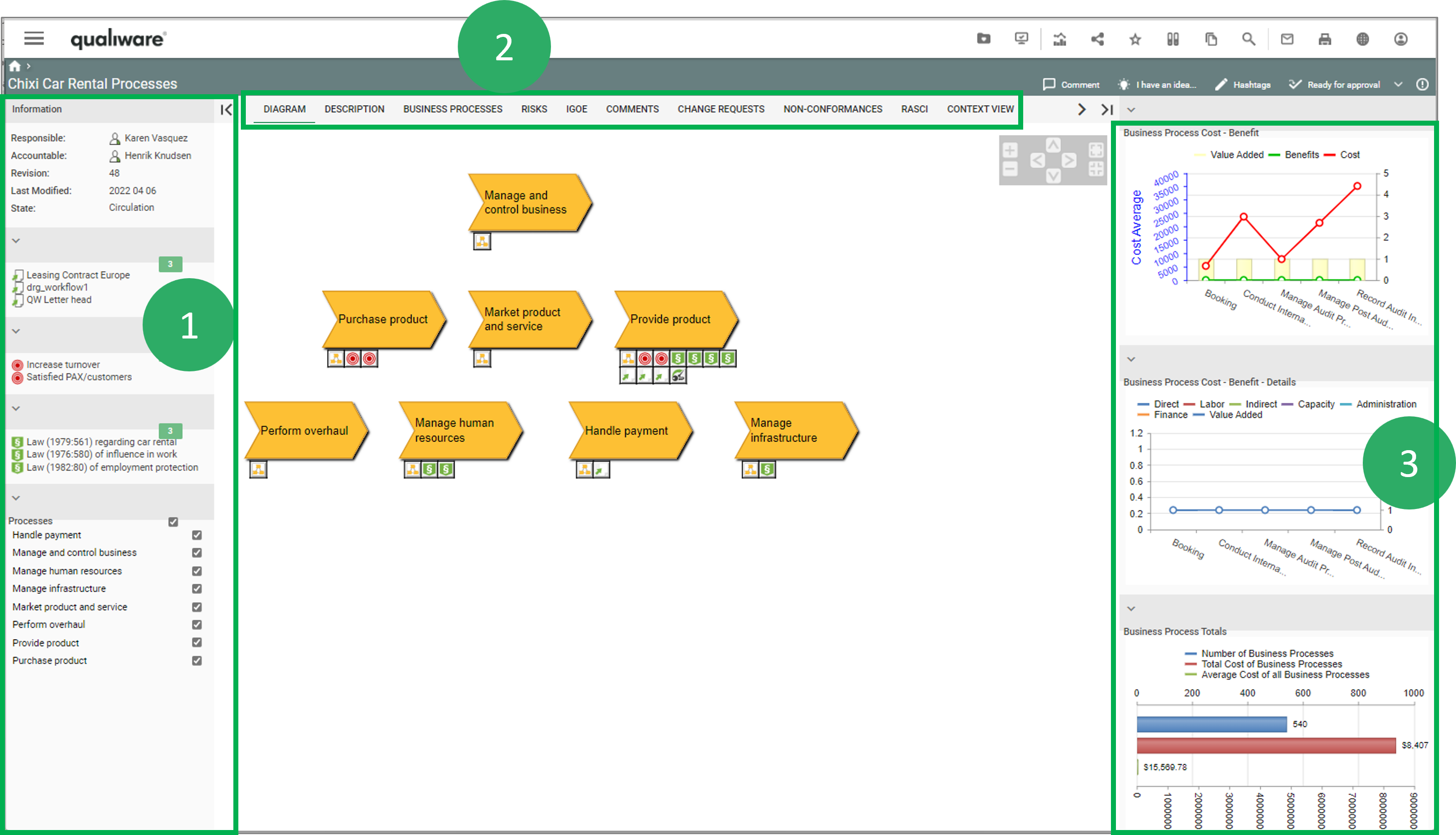
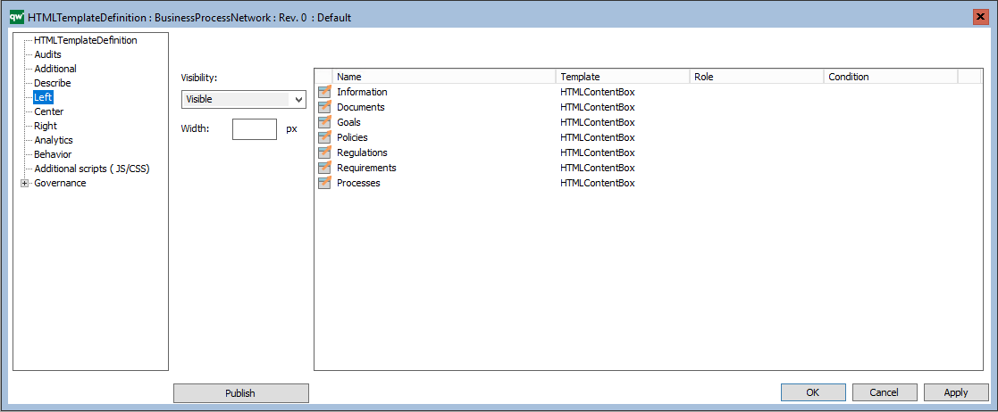
The left window (1) of a diagram workspace is configured on the Left tab, using HTMLContentBox and other HTML-templates:
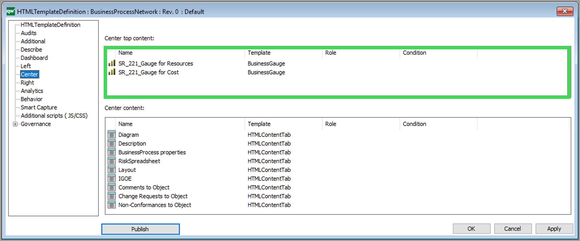
The Center tabs (2) of a diagram workspace in configured on the Center tab, using HTMLContentTab and other HTML-templates :
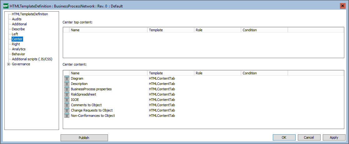
It is also possible to insert analytic content (BusinessGauge) in the Center Top content.
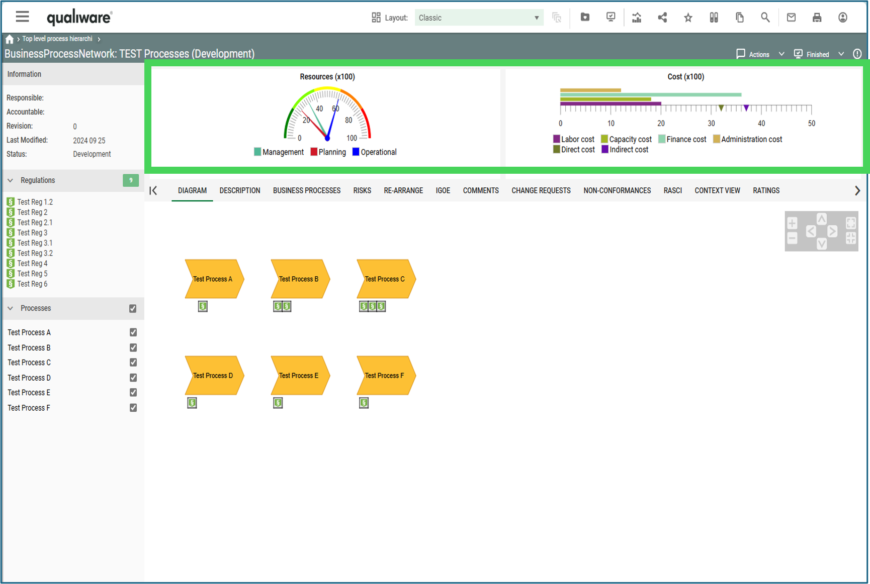
Example of a BusinessProcessNetwork with Business Gauges displayed at the Top Center (as configured in the example above).
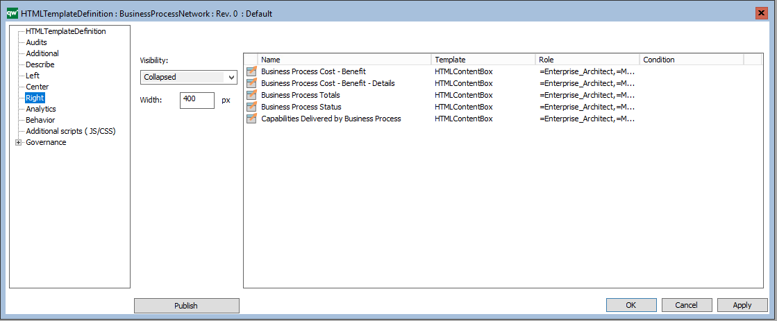
The right window (3) of a diagram workspace is configured on the Right tab, using HTMLContentBox and other HTML-templates :
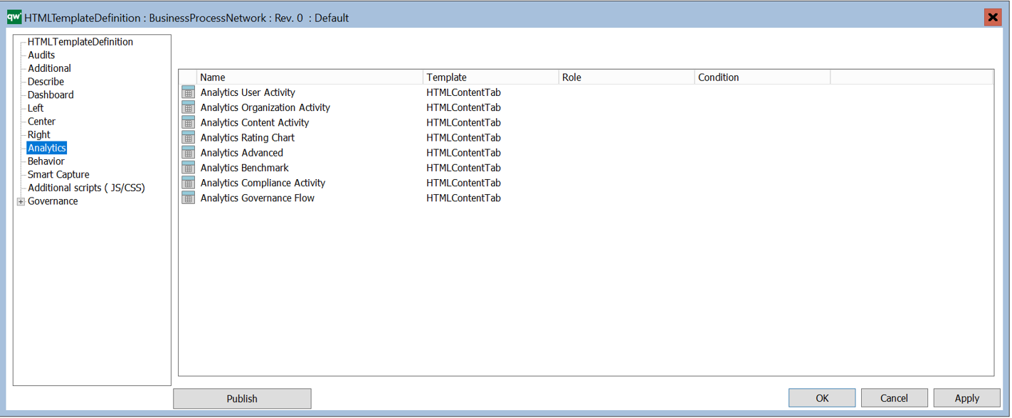
On the Analytics tab, you can configure which “Social Behavior Warehouse” tabs should be available on the model.
The Behavior tab, specifies the behavior of a template, e.g. how should a link to an object of the template behave when clicked.
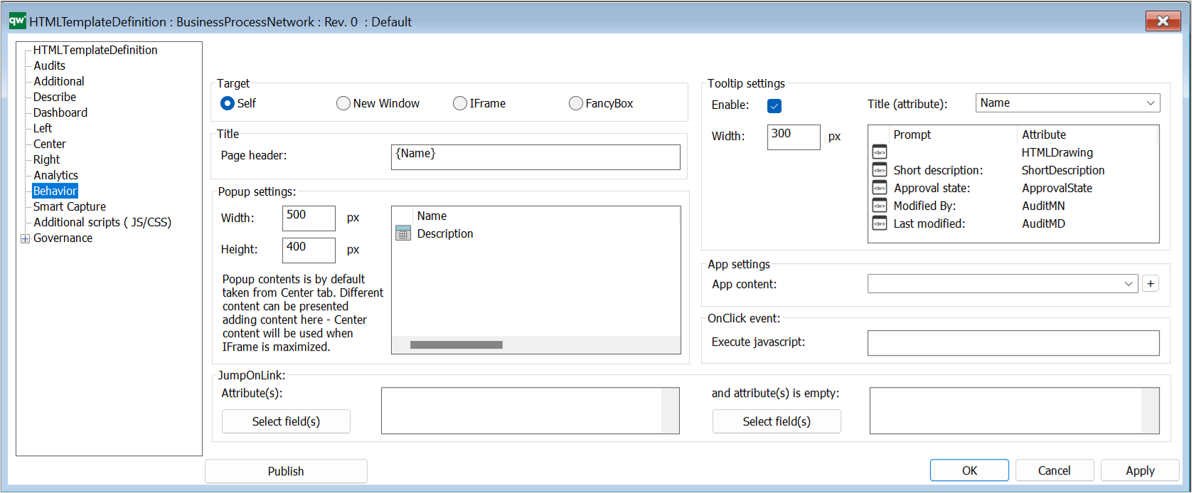
Target: This is how the link will open when clicked.
- Self: This will open the object page in the same browser window.
- New Window: This will open the object page in a new browser window or tab depending on the browser setup.
- IFrame: This will open the object in an iFrame pop-up window using the Popup Settings configuration.
- FancyBox: This will open the object in a Fancybox pop-up window using the Popup Settings configuration.
Title: This specifies what should be shown as the title of the object being shown.
- Page header: The header of the page or popup window of the object. This can be static or dynamic text. Dynamic text is indicated by curly braces and will be evaluated client side in JavaScript.
Popup settings:
- Width: The width of the popup window.
- Height: The height of the popup window.
- Popup content: A list of HTMLContentTables or HTMLContentTabs contains information about what is shown in the popup window. If nothing is specified here, the HTMLPublisher will use the information specified in the Center tab of the template definition.
JumpOnLink: JumpOnLink functionality can be used to forward the user if certain criteria are met. This is typically used when e.g. a BusinessProcess can be broken down in to subprocesses. It allows the user to jump directly to one of the subprocesses without having to open the properties of the BusinessProcess first.
- Attribute(s): This is an attribute that is part of the object that this template definition is for. When the user clicks on the object, this attribute will be used to calculate where the user is taken to on click.
- If the attribute contains exactly one link then the user will be taken to the target of that link when clicking the object.
- If the attribute contains more than one link, then jumping is disabled.
- If more than one jump attribute is defined, then the whole set of resulting links are evaluated. If only one link is available in the set, then jumping happens. If more than one link is available in the set, then jumping is disabled.
- E.g. BusinessProcess can be set up to jump on BreaksDownTo. When the user clicks a BusinessProcess the user will be redirected to the link in the BreaksDownTo attribute (if only one link is available).
- And attribute(s) is empty:
- If the specified attribute is not empty the JumpOnLink functionality will be ignored. The attribute specified here should be different than the attribute for JumpOnLink.
- E.g. BusinessProcess can be set up to jump on BreaksDownTo when ShortDescription is empty. If ShortDescription has content then the BusinessProcess will follow the behavior specified in Target settings.
Tooltip settings: The tooltip is used to display information about the object when a user hovers the object link.
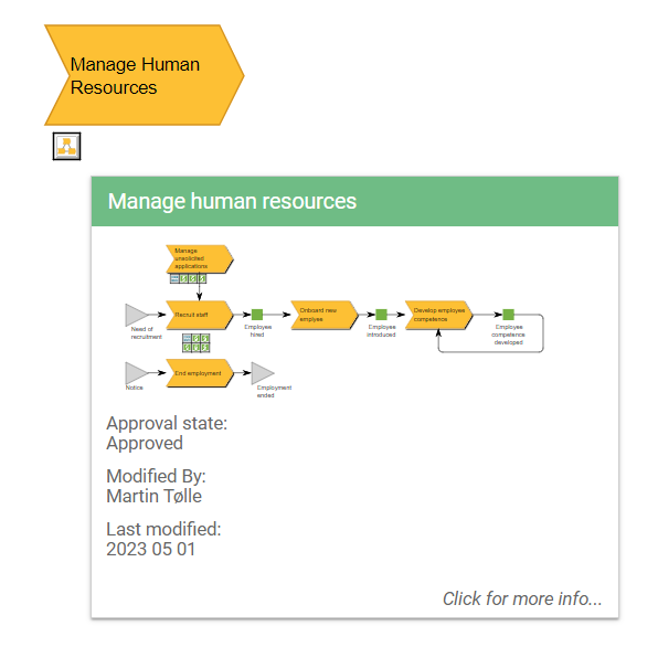 Example of a BusinessProcessNetwork tooltip appearing when a BusinessProcessNetwork is hovered on the web.
- Enable: Enable or disable the tooltip feature.
- Title (attribute): The attribute that should displayed at the top of the tooltip.
- Width: The width of the tooltip window.
- Tooltip content: A list of attributes to be displayed in the tooltip window.
App settings:
- App content: This specified what should be shown in the app. It links to a HTMLContentTable.
- If nothing is specified for the template then the app will look for the settings for DefaultDiagram/DefaultObject template definitions and use those.
- If nothing is specified on the template definition for the template or for DefaultDiagram/DefaultObject the all attributes are shown.
OnClick
- Execute javascript: This can be used to execute a JavaScript function when the object is clicked.
On the Smart Capture tab, you can link Model Generator Settings to the template definition. The settings are used for the table to model feature in the web-modeler (introduced in QualiWare 10.8).
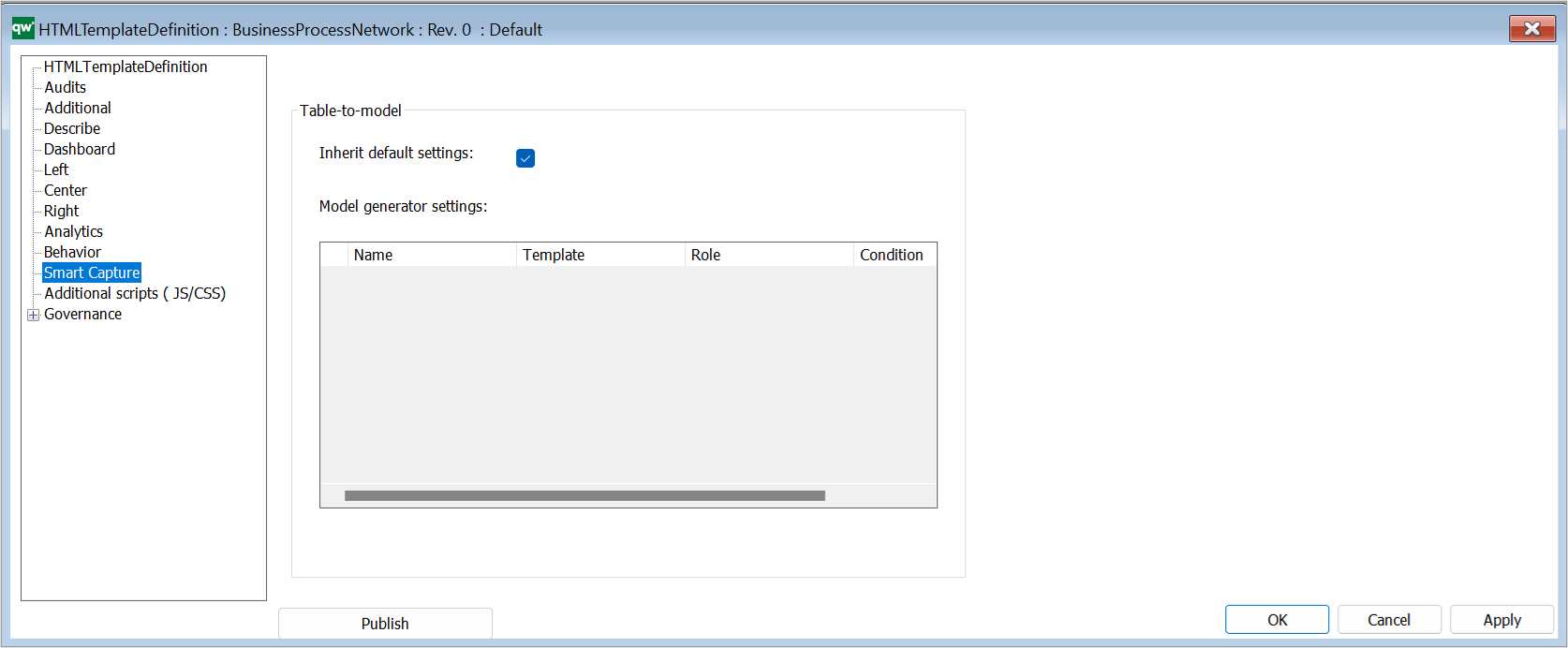
Table-to-model
- Inherit default settings: Tick the box to inherit the settings from the Smart Capture Settings on the HTMLPublisher
- Model generator settings: Insert specific HTMLModelGeneratorSettings to the template definition
Once you have made changes to the template, you should click “Apply” and “Publish” to implement the changes on the Web.
The HTMLTemplateDefinitions are included in the HTMLPublisher.