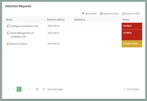
Introduction to KnowledgeScope
The KnowledgeScope template is an innovative QualiWare tool designed to configure the Generative QualiAI. It is structured to streamline the process of creating intelligent and context-aware response diagrams. By leveraging the KnowledgeScope, businesses can harness the power of AI to generate diagrams that are not only accurate but also tailored to the specific nuances of their operations.
Key Features:
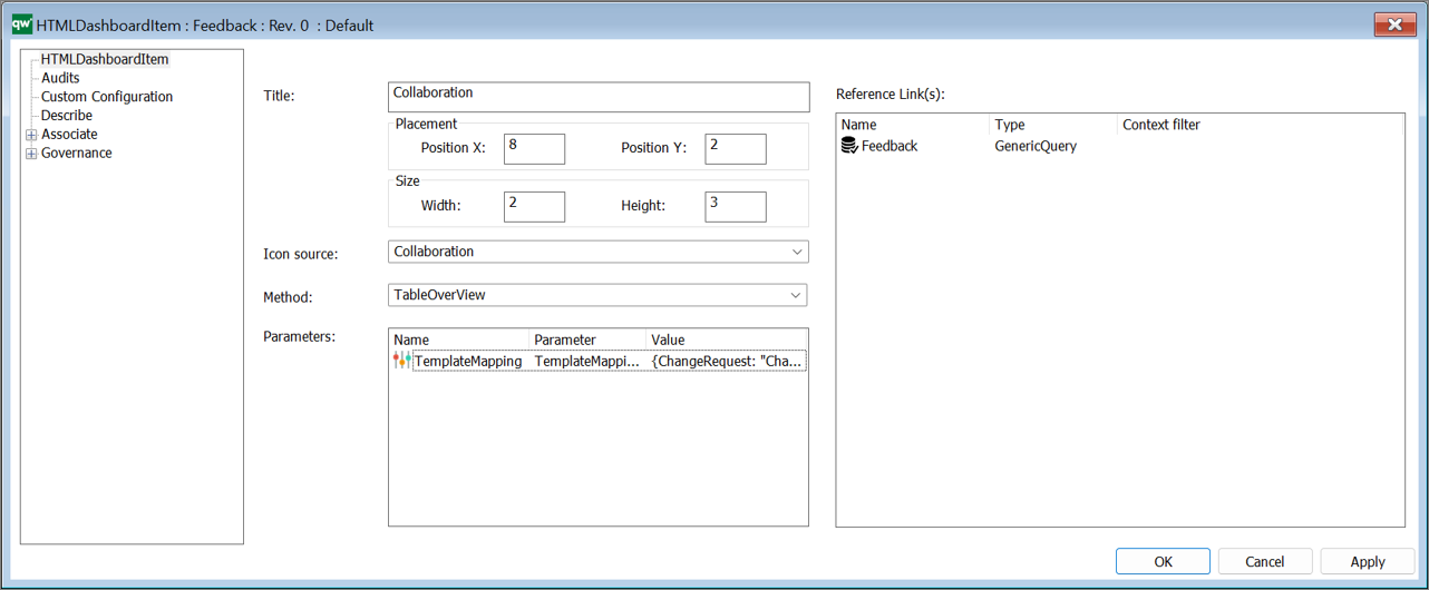
- Configurable Sections: The KnowledgeScope has configurable sections, such as AIKnowledgeScope, Context, Prompting, and Response, which allow you to determine the content of the diagrams created with the AI.
- AI-Driven Diagram Generation: Leverages QualiWare’s AI capabilities to produce diagrams informed by the context and prompting provided.
Section Details
KnowledgeScope
This primary section offers a succinct overview of the template’s purpose, along with a business definition and a selection of example diagrams for reference.
- Short Description: Concisely articulates the purpose of the KnowledgeScope.
- Business Definition: Provides a broad context of the business or a specific business space, if detailed in the definition.
- Example Diagram List: A curated list (recommended to be 1 or 2) of diagrams from your repository which exemplify the desired outcome, aiding the AI in context understanding.
Context
The Context section is the backbone of the template, influencing the AI’s understanding and generation process.
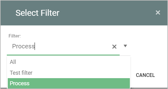
- Context Dropdown Menu: Offers four methods to establish context for content generation:
- Current Selected Object: Targets the object currently selected in the web-modeler.
- Current Diagram: Utilizes the open diagram in the current tab.
- Select from List: Employs the selected context from the “Link Context” function.
- Context Undefined: Provides flexibility for open context definition via text input or object selection.
- Context Templates Text Field: Lists available templates serving as potential context sources for the KnowledgeScope.
- Knowledge Structure: Comprises two subfields—Ontology and Root Definition
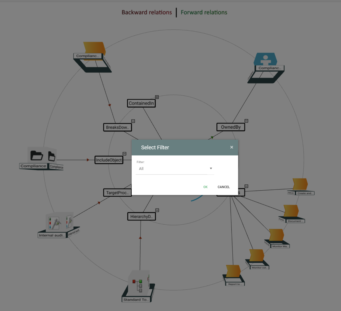
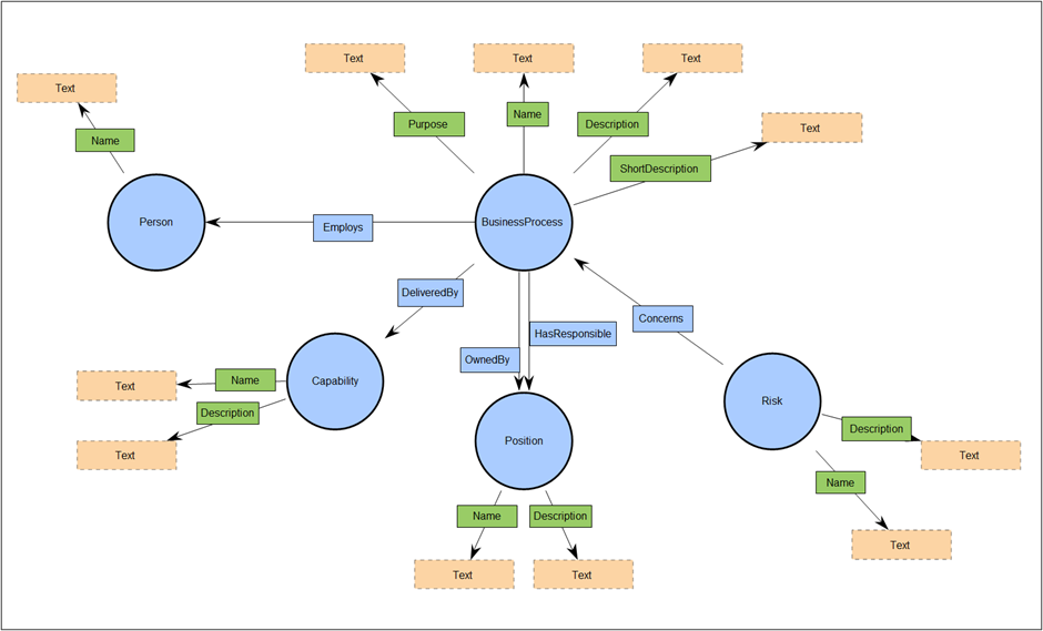
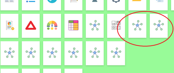
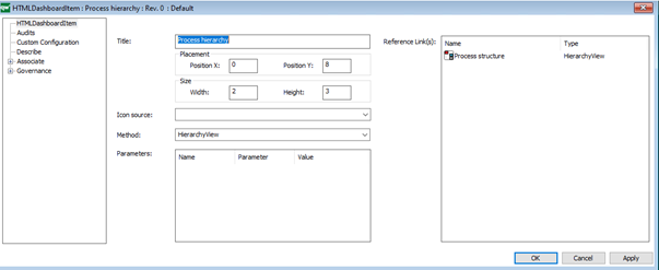
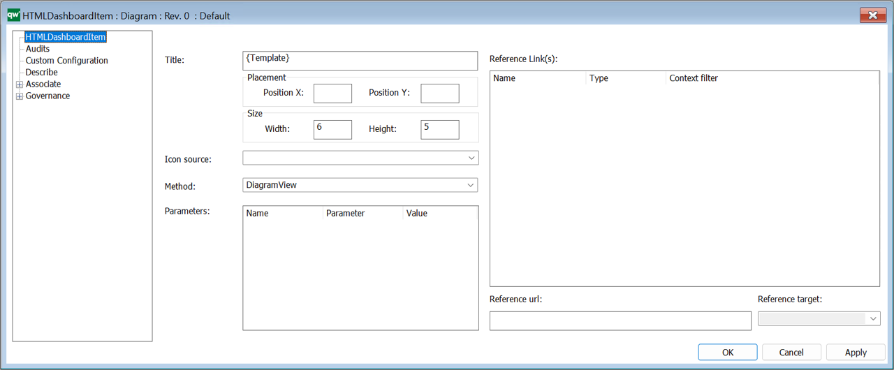
- Ontology: This field is dedicated to defining the ontology that governs the data to be accessed from the Context Templates. Users should link to a pre-defined ontology, using the template “OntologyDiagram:owl” in QualiWare. This format helps the AI understand what data is relevant and should be considered during the generation process. For example, if using the BusinessProcess template, the Ontology field should point to an ontology diagram that outlines the necessary data to be accessed from the BusinessProcess context.
- Ontology Example: ‘BusinessProcess’ The accompanying image illustrates an ontology with ‘BusinessProcess’ as the root. Use this as a guide to link your context templates to your ontology. Proper linkage ensures that AI-generated content aligns with your business framework.
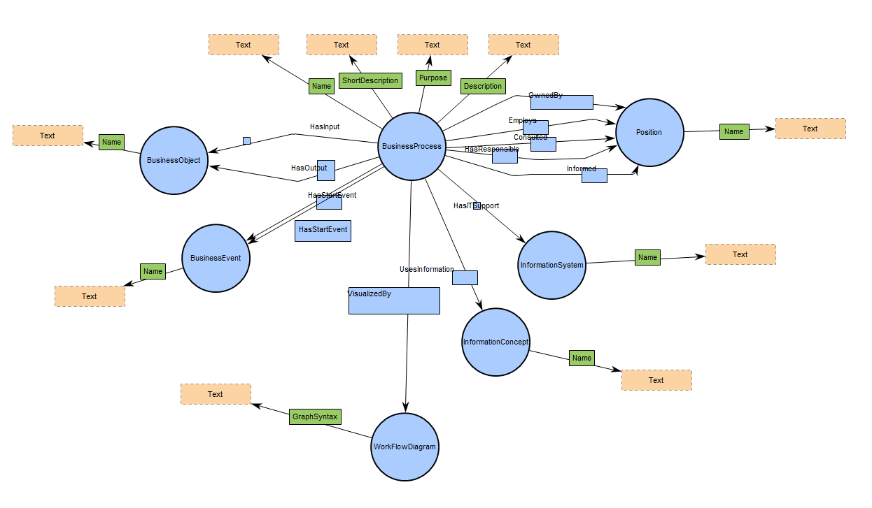
- Root Definition: Root definition is crucial as it marks the starting point for the AI’s data extraction from the ontology. When multiple context templates are used, there must be a corresponding root for each, and all roots should be contained within the same diagram. This ensures that the AI has a clear entry point to begin its contextual data interpretation for each template. The roots collectively form a map of data points that the AI uses to extract information relevant to the generation of the new content.
Prompting
This section allows users to input additional knowledge characteristics and set the randomness level of AI responses.
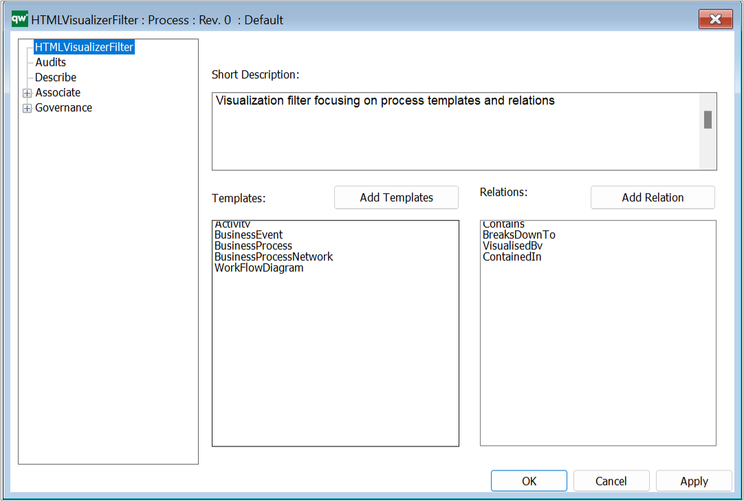
Template Naming Conventions
Proper naming of templates is critical for ensuring seamless functionality within the KnowledgeScope. Adhering to QualiWare’s naming conventions allows the AI to accurately recognize and apply the correct templates during diagram generation. Here’s what to keep in mind:
- Exact Match Requirement: Name all templates precisely as they appear in QualiWare, with correct capitalization and spacing. For example, use “WorkFlowDiagram,” not “workflow diagram” or “Work Flow Diagram.”
- Consistency Is Key: Uniform naming across all sections of KnowledgeScope ensures that the AI correctly interprets and utilizes the templates.
- Verification: Double-check template names for typos or discrepancies before finalizing the KnowledgeScope configuration.
Accurate template naming enables the AI to understand and execute your instructions effectively, ensuring the generated diagrams meet your exact specifications.
Response
In 10.10, the Response section does more than describe the diagram you want. It can also
orchestrate how the AI structures, creates, and links objects by using a Response Ontology.
This makes AI outputs directly actionable in both the Web-Modeler and outside the Web-Modeler.
Response Basics
- Response Type: The overall format to return (e.g., “Diagram with objects” or “Object edits”).
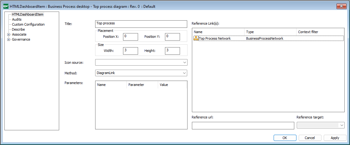
- Response Diagram Type: The exact diagram template to use (e.g., WorkFlowDiagram). Use QualiWare’s exact template names.
- Response Symbols & Connection Types: Which symbol templates and connection templates are allowed in the response.
- Response Diagram Layout: The preferred presentation/layout rules for the generated diagram.
- Response Template Descriptions: Short descriptions that clarify intent or lesser-known templates.
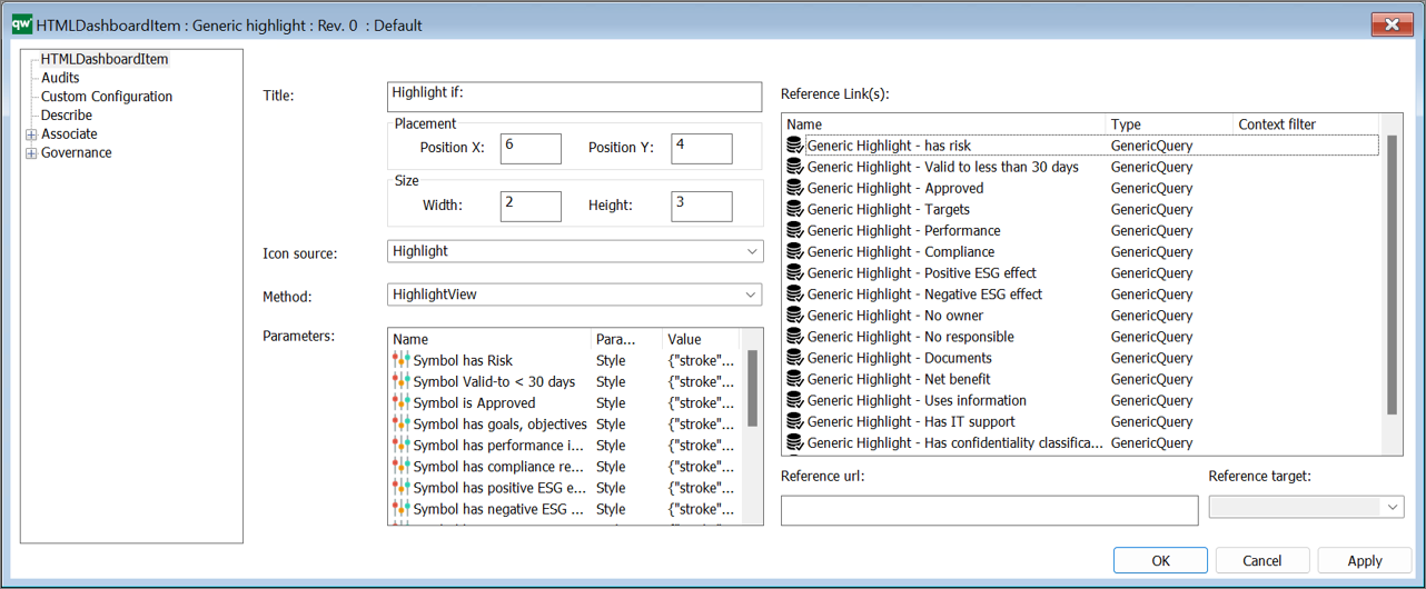
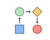
- Response Ontology
A Response Ontology defines the appearance and structure of the AI output. It tells the AI
what the root object is, which attributes it may populate, which linked objects may be created,
and which connection templates must be used between them. In other words, it is the contract the AI must follow when creating or editing content.
When do I need a Response Ontology?
- Not required for simple, single-object attribute edits
(e.g., update BusinessProcess.Description).
- Required whenever the response creates or links related objects
(e.g., “Add a new Owner to BusinessProcess”). The ontology specifies which attributes are linkable,
the exact connection names, and which templates may be linked.
How to model a Response Ontology
- Choose the response root. Pick the root class the AI should build around
(e.g., BusinessProcess).
- Declare allowed symbols. Add the exact QualiWare templates the AI may create/edit
(e.g., Position, Capability, Risk, Person).
- Add labeled connections. Use connection labels to state the attribute/relationship name on the root or child
(e.g., BusinessProcess — OwnedBy → Position, BusinessProcess — DeliveredBy→ Capability,
Risk — Concerns → BusinessProcess).
Include the exact connection template to use.
- Specify rules. For each Template, define:
- Required attributes the AI must provide (e.g., Name, Description).
- Validate naming. All template and connection names must be the exact QualiWare names (capitalization/spacing included).
Tip: The Response Ontology describes the output structure. It is separate from the Context Ontology
(which describes the input data to read). They can mirror each other but don’t have to.
Runtime behavior (10.10)
- Inside the Web-Modeler: When you ask the AI to create or link objects, the Response Ontology
drives what is created and how it is linked in the generated diagram.
- Outside the Web-Modeler: The same ontology governs edits and new links from the diagram view.
- Spreadsheet preview: Before applying changes, you’ll see a preview listing all objects to be created/edited
and how they will be linked. This is always shown outside the Web-Modeler, and shown inside when editing/adding links.
Example: Add an Owner to a BusinessProcess
Input: “Add a new Owner to the BusinessProcess ‘Perform Overhaul’ named ‘Process Owner A’.”
- Response Ontology fragment: BusinessProcess — Owner → Position
Position requires Name;
- Result: AI creates Position: “Process Owner A” and links it to
BusinessProcess: “Perform Overhaul” via the Owner relationship, following the declared connection template.
Utilization Guide
This template is structured for ease of use, guiding users through a step-by-step configuration for the Generative QualiAI. For precise diagram generation, it is recommended to provide detailed and accurate information in each section, aligning closely with your business’s operational context and requirements.


