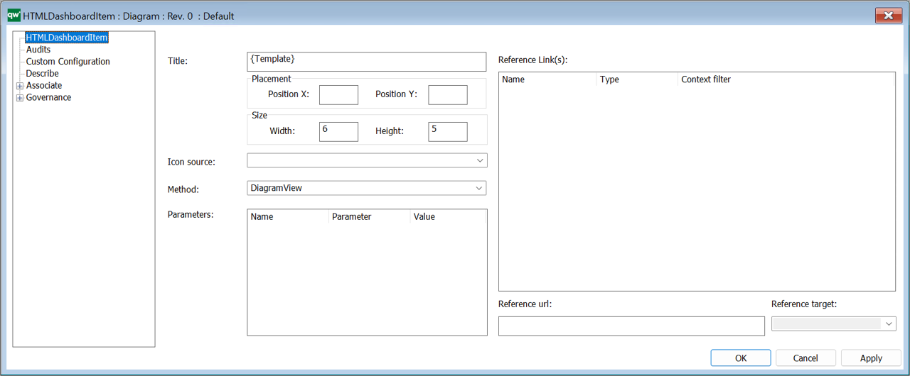
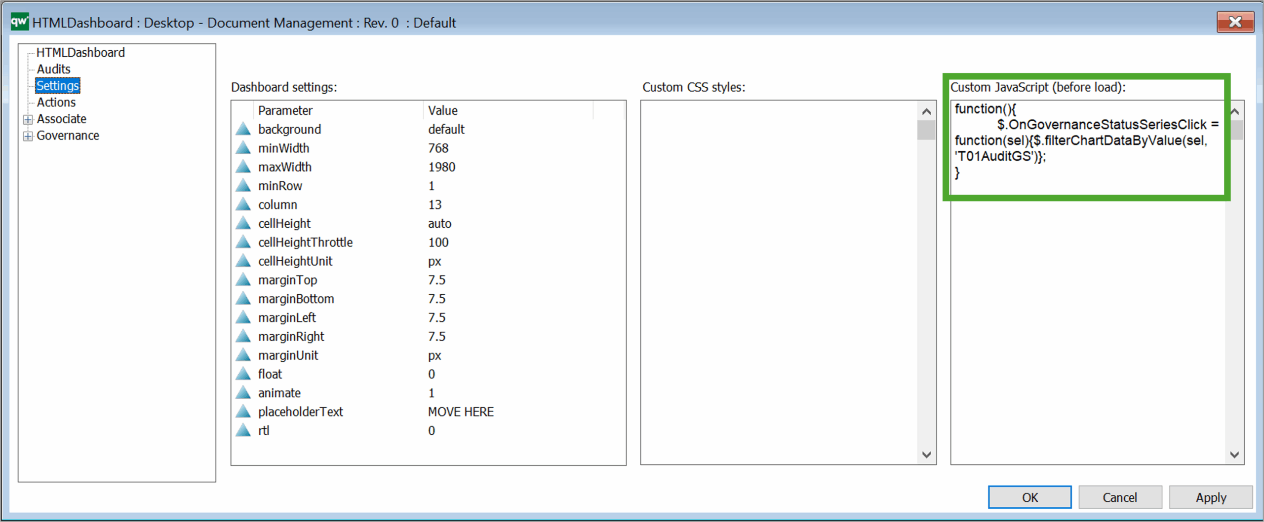
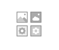
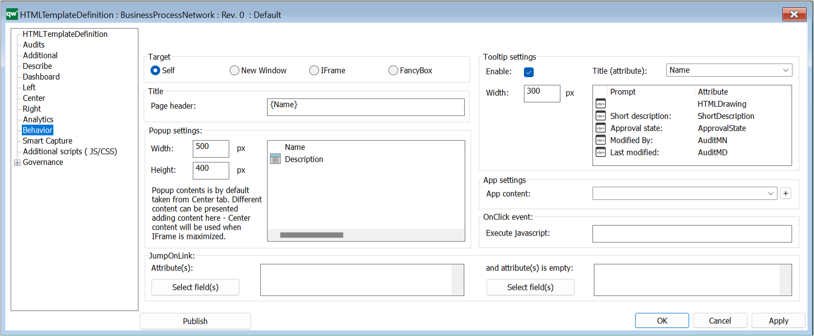
The HTMLFeature is used to configure different settings in the Web-front end.

The template can be used to pre-defined features (such as the Smart Importer or PowerPoint Generator) and other advanced customized features (JSScripts).
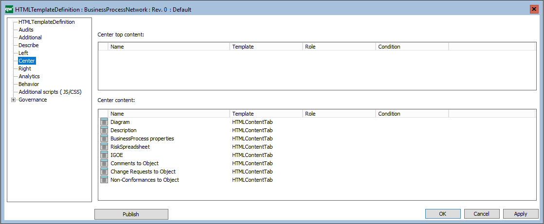
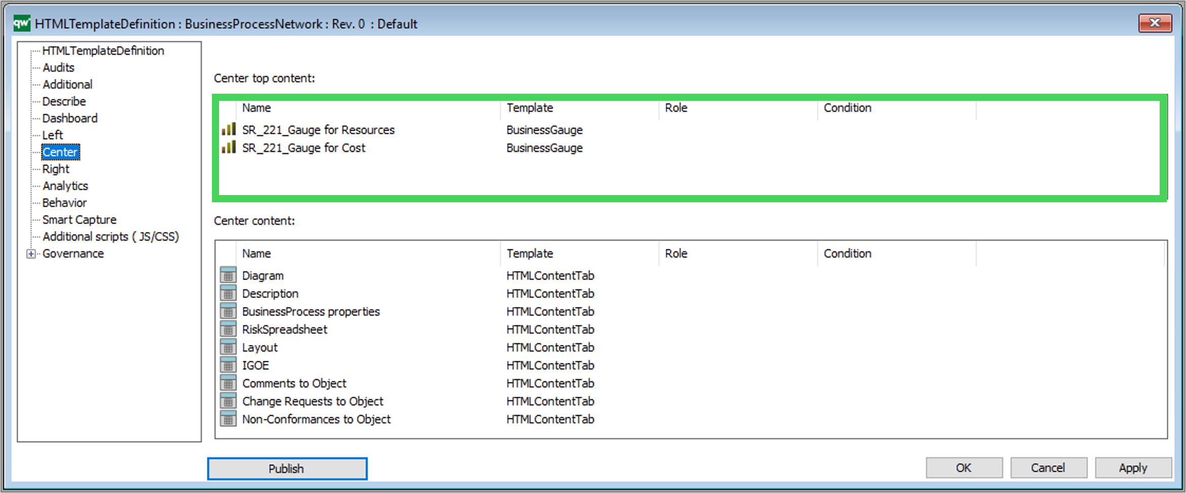
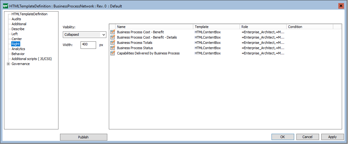
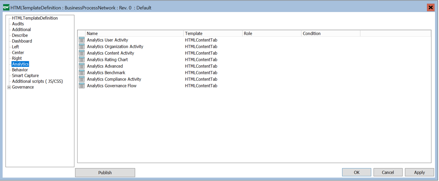
A subset of the Features can be configured.
The following (configurable) feature types are available:
- AskList (Create / Select / Update) (QualiWare 10.10)
- Hashtag
- ReferenceLink (QualiWare 10.10)
- WebForm
- WebModeler

In addition there is a Custom type that can be used to insert customised features.
Feature type – AskList (Create/Edit/View) (QualiWare 10.10)
There are 3 different types of AskLists features available, (used in the Getting Started Tile in the Desktop):
- Create
- Edit
- View
All of them have the same configuration and behavior. When clicked on the web front end, an ask list will be shown
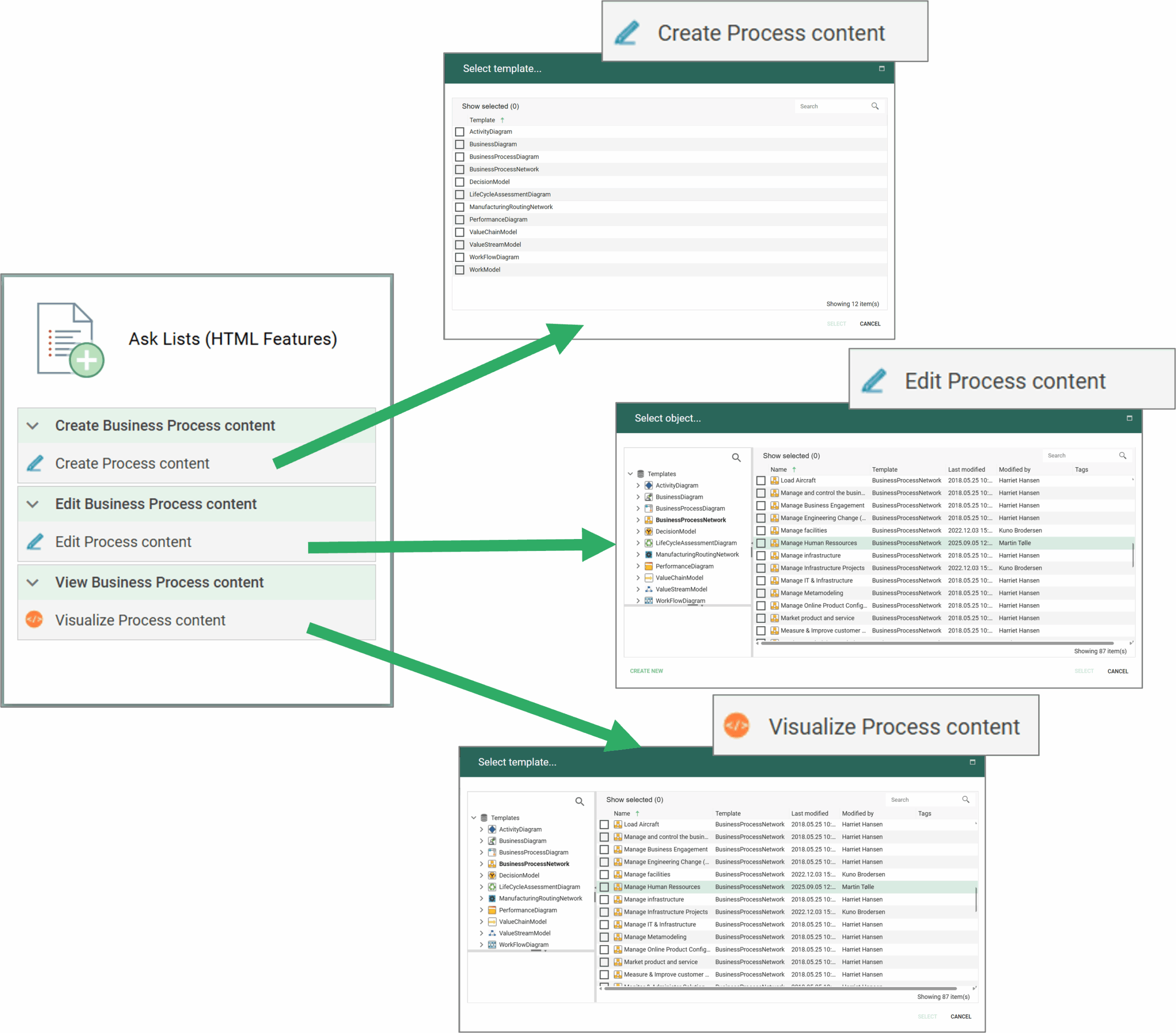
When a template is selected each of the types will have a different behavior:
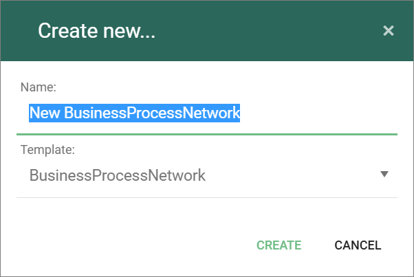
- Create will prompt a “Create New” dialog where the user can name the object
-
- When create is clicked the new object will open in the Web-Modeler (if it is a diagram) or in the editable Web-Dialog.
- Edit, will open the selected object in “edit-mode”, i.e. the Web-Modeler (if it is a diagram) or in the Web-Dialog.
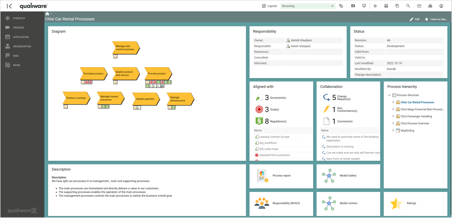
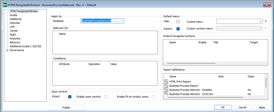
- View, will open the selected object in the Web Front End (as configured in the HTMLTemplateDefinition), e.g. the corresponding Dashboard associated to the selected diagram.

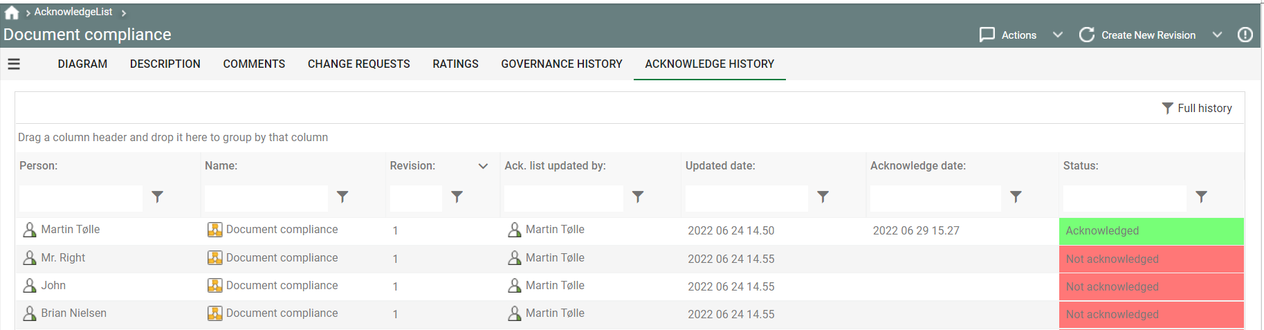
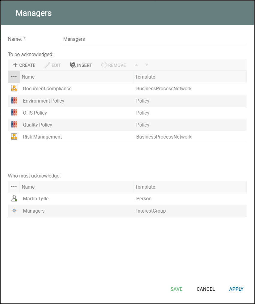
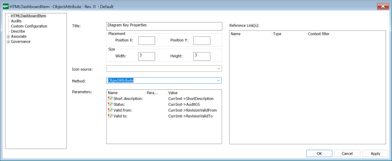
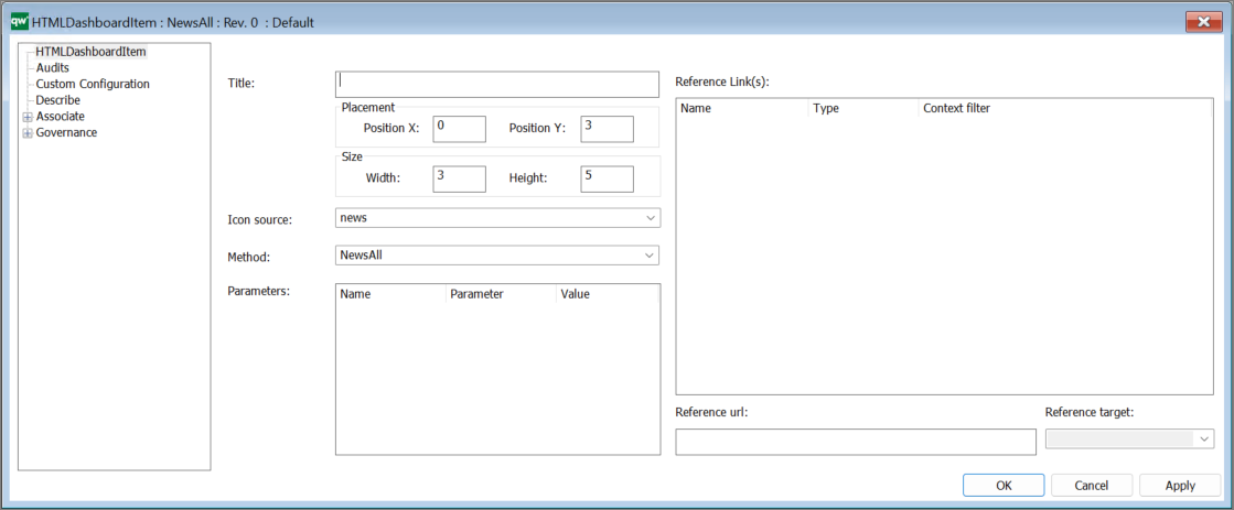
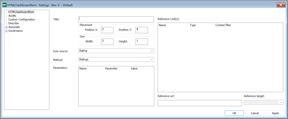
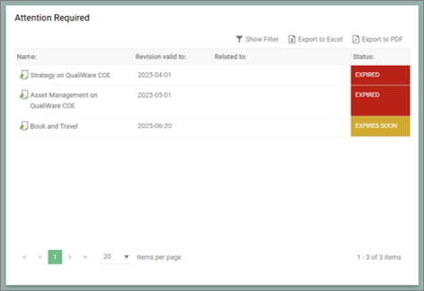
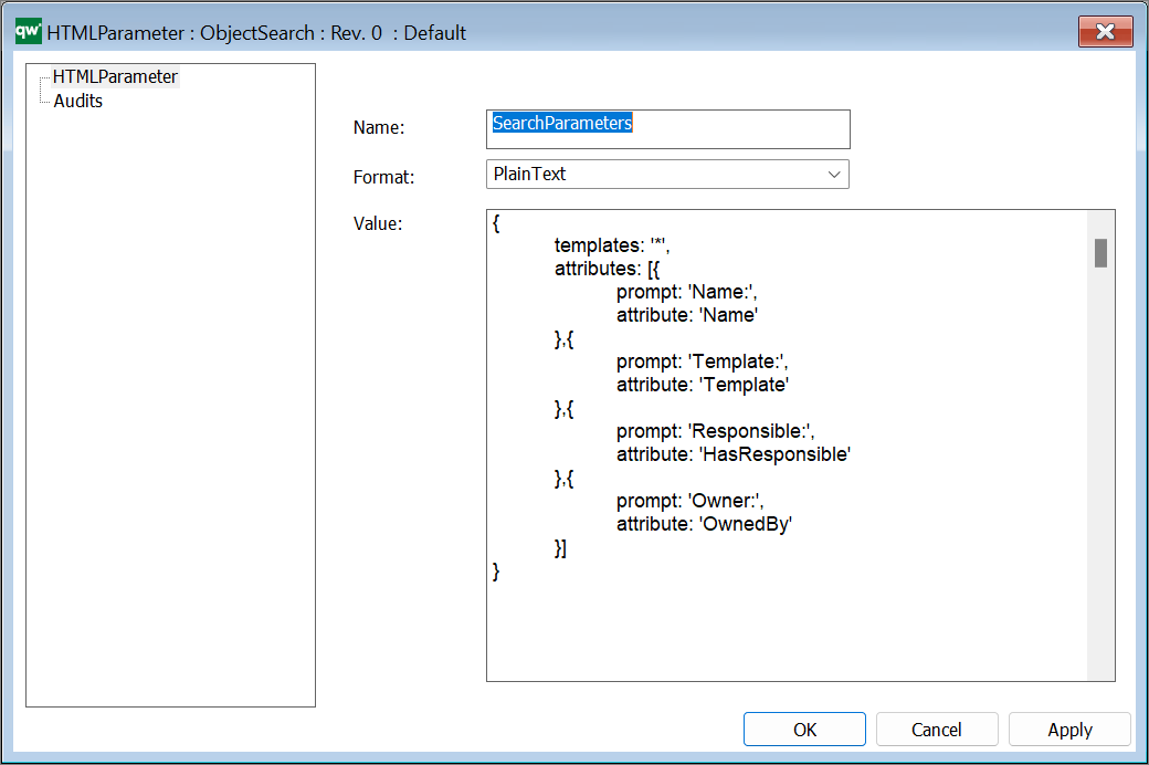
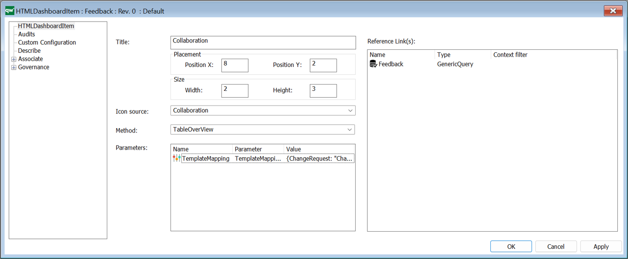
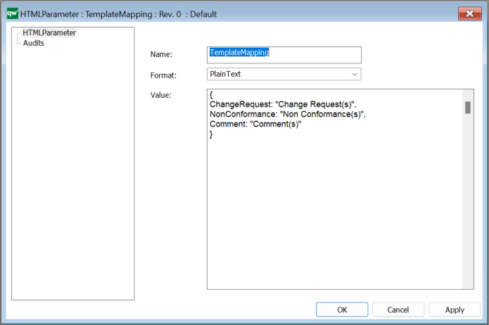
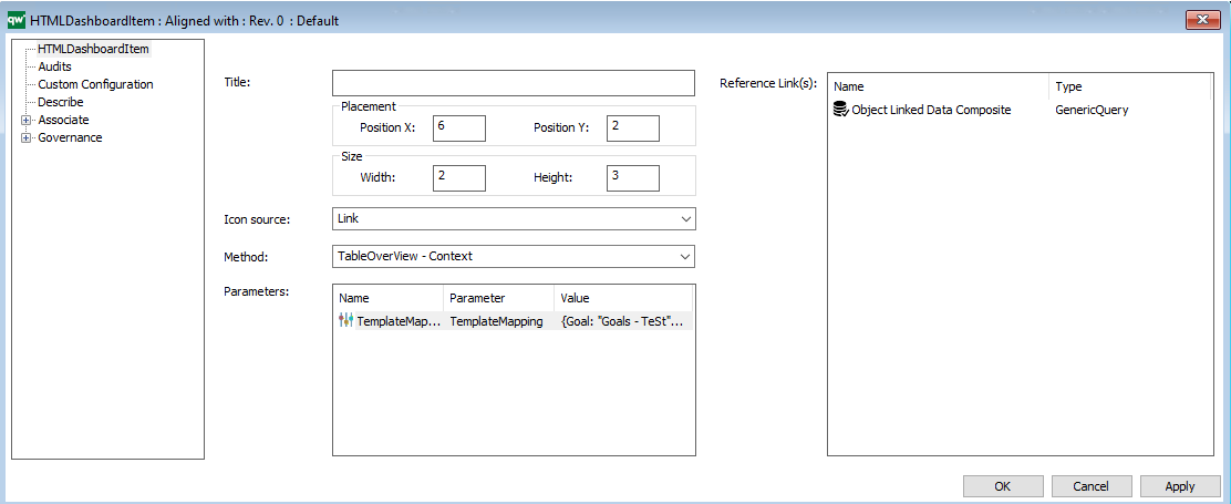
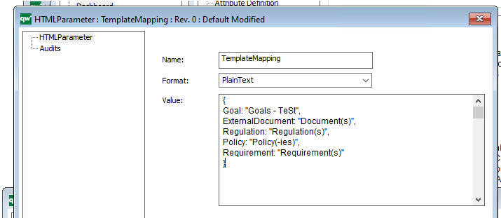
The content (List of templates) in the Ask List is defined by the referene parameter in the Feature, using a HTMLParameter object.
The Ask List will contain the templates listed in Value field, and contain the title as defined in the string.

Feature type – Hashtag
This type enables the hashtag feature in the ContextMenu in the Repository Explorer, to work with hashtags related to the object.

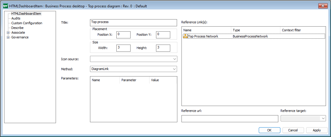
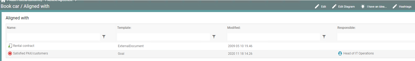
Feature type – ReferenceLink (QualiWare 10.10)
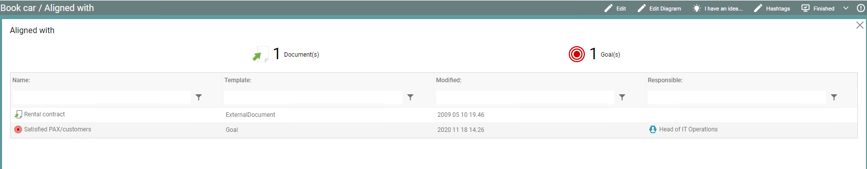
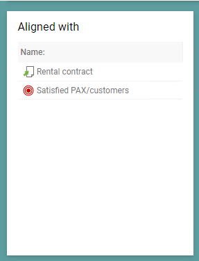
The ReferenceLink is used to link to external references and include them as link in HTMLDashboardItems (used in the Getting Started Tile in the Desktop).

The item will link to the reference link in the object inserted in the Reference link field. This could be an ExternalDocument, where the link is inserted in the File Details.
Feature type – WebForm
The WebForm is used to create new object, e.g. as a part of a ContextMenu in the Repository Explorer.

The example above creates a new object (ChangeRequest) and link it to the existing object with the link “Concern”.
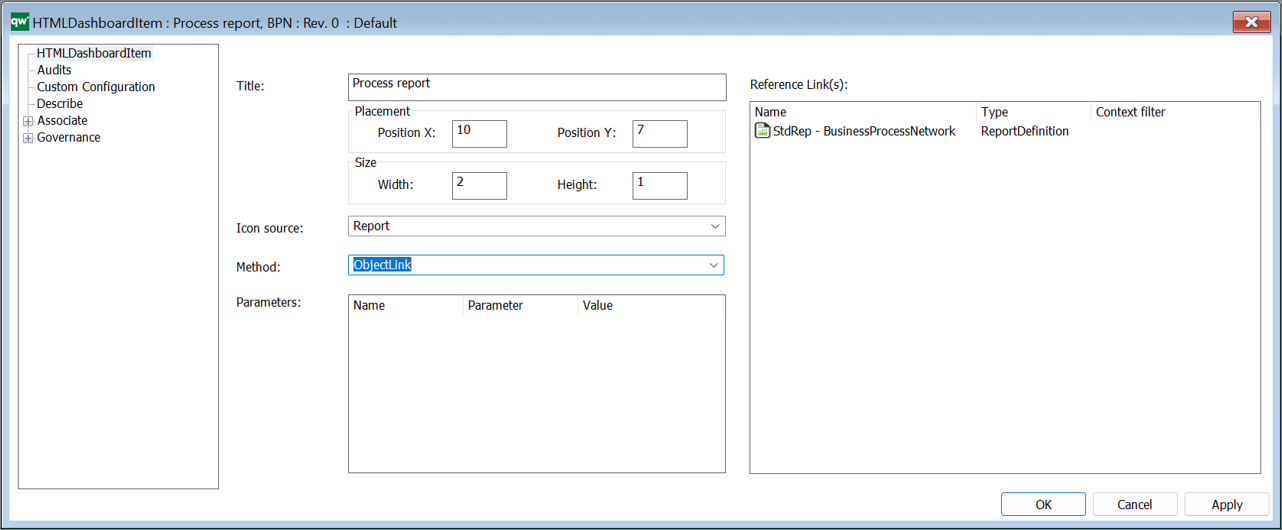
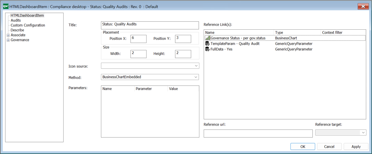
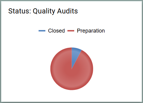
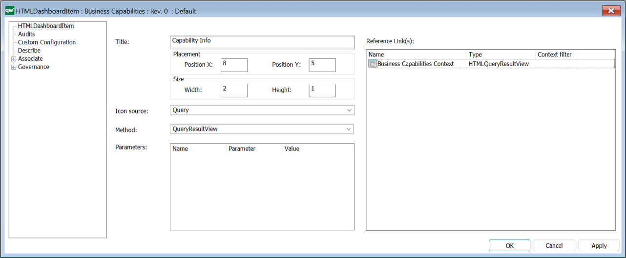
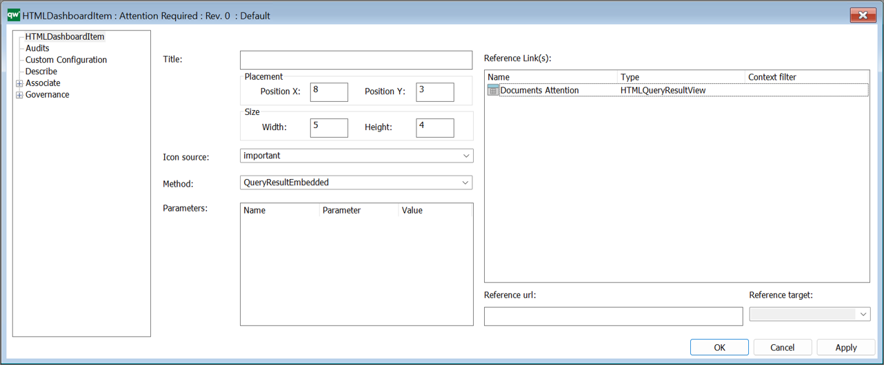
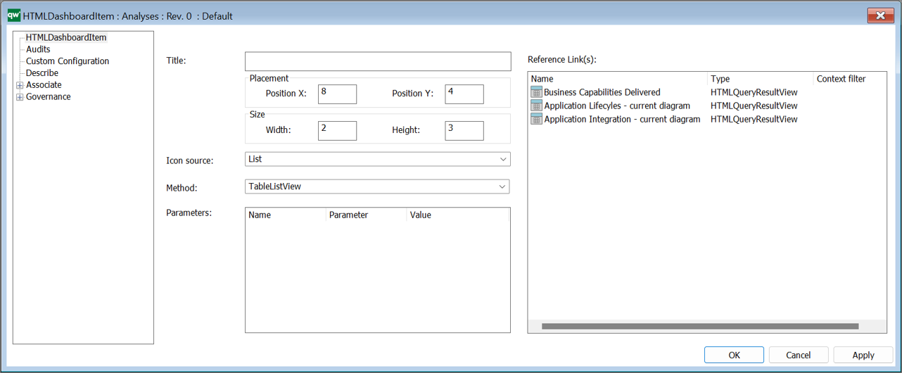
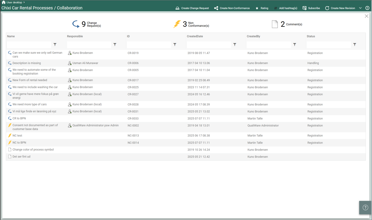
The WebForm can also be used as a part of a HTMLContentBox in a HTMLDashboardItem on a Dashboard.

The HTMLContentBox contains a HTMLFeature (WebForm) and a link to a HTMLQueryResultView.
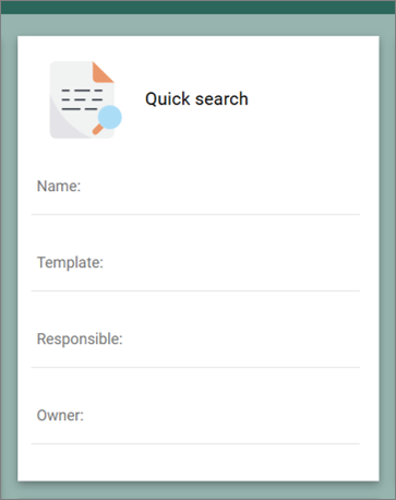
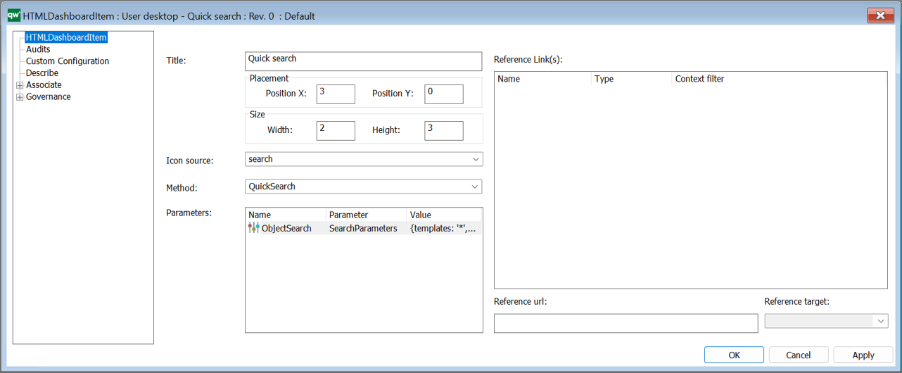
The content box shown on the web front-end as a part of a DashboardItem (example from the EDGY Enterprise Desktop).

Feature type – WebModeler
This type is used in the Repository Explorer in the ContextMenu to open the diagram in the webmodeler.


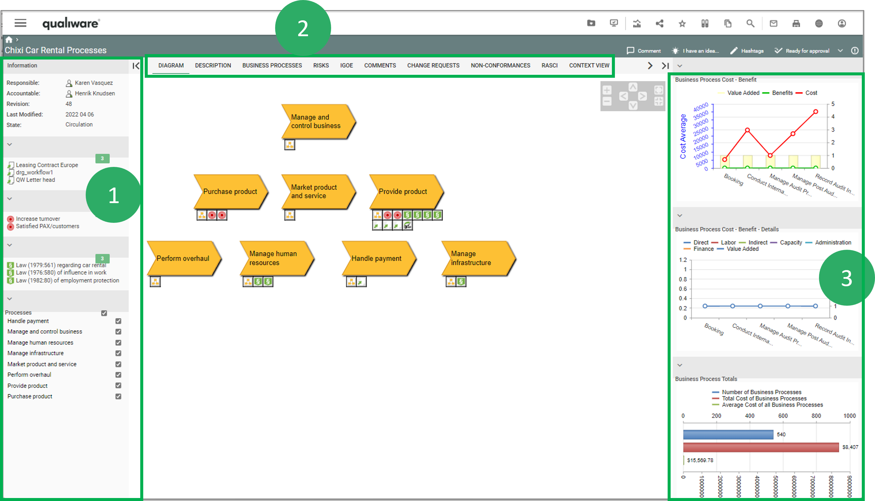
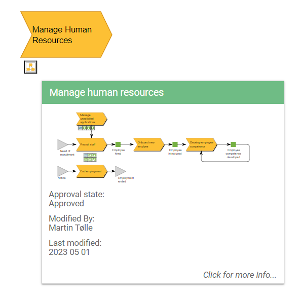 Example of a BusinessProcessNetwork tooltip appearing when a BusinessProcessNetwork is hovered on the web.