HTML Desktop

The HTMLdesktop-template is used to configure the content shown on a desktop on the collaboration platform on the web.

The content on a desktop is composed of HTMLTiles, and it is possible to specify filters for role and configuration.

The HTMLdesktop(s) are published to the web via the HTMLPublisher when they are included on the “Personal Page” tab (see below).  It is also in the publisher where it is possible to set filters for role and configuration for the desktops.

HTML Dashboard

The HTML Dashboard template is used to configure the dashboards introduced in QualiWare 10.8.

The Dashboard is setup up through a HTMLTemplateDefinition’s Dashboard tab:

Graphical user interface, text, application Description automatically generated

It is possible to have multiple Dashboards. In this case they will appear in the selection in the web:

Diagram Description automatically generated with medium confidence

The Dashboard-template contains a collection of DashBoardItems-templates.

Graphical user interface, text Description automatically generated

Furthermore, the Dashboard contains a Settings tab where the Dashboard can be adjusted.

Graphical user interface Description automatically generated

Each DashBoardItems contain 2 tabs relevant for configuring their behaviour.

HTMLDashboard tab:

Graphical user interface Description automatically generated

… And Custom Configuration

Graphical user interface, application Description automatically generated

Configuration of Dashboards

The Dashboard Setting tab contains the setting following table:

Graphical user interface Description automatically generated

Background: You can insert any HTML color, HEX or RGB. This field behaves like color in CSS.

Examples: rgb(204, 255, 229) #E5FFCC PaleGreen

minWidth and maxWidth: The dimensions of the dashboard.

minRow and column: minimum rows amount and columns

cellHeight and CellHeightThrottle: cellHeight- one cell height (default?: ‘auto’). Can be:

  • an integer (px) Example: 20
  • px, em, rem (ex: ‘100px’, ’10em’, ’10rem’)
  • auto – height will be calculated for square cells (width / column) and updated live as you resize the window
  • initial – similar to ‘auto’ (start at square cells) but stay that size during window resizing.

CellHeightThrottle: throttle time delay (in ms) used when cellHeight=’auto’ to improve performance vs usability (default?: 100).

marginTop, marginBottom, marginLeft, marginRight and marginUnit:

The margins can be set with integers or strings. Use marginUnit to define the unit. Example of units: “px” and “em”.

float: enable “floating” items (default: false). Enabling this allow items to be anywhere on the page.

When true:

A picture containing diagram Description automatically generated

When false, items “fall upwards” and stack:

A screenshot of a game Description automatically generated with medium confidence

animate: turns animation on to smooth transitions (default: true). This is used when editing the layout when items swap places.

placeholderText: placeholder default content (default: ‘MOVE HERE’). This is shown when user is in edit mode and dragging the items:

Shape Description automatically generated with medium confidence

rtl: “Right To Left”, Possible values are true, false, ‘auto’. This value has no effect.

In QualiTube, you can find videos about how to configure the Dashboards

HTML Dashboard Item

The HTML Dashboard Item template is used in the HTML Dashboard template to configure the dashboards introduced in QualiWare 10.8.

The DashboardItems can show many types of data in different ways which makes them a flexible tool.

Graphical user interface Description automatically generated

The icon source attribute allows you to select from a predefined list of symbols that are available for use.

A screenshot of a computer Description automatically generated with low confidence

Please refer to the DashboardItem Icon Source Cheat Sheet in the Appendix (below) for the keyword mapping list. The Method attribute (combined with the Parameters and Reference Link(s) attributes) determine the behaviour of the DashboardItem.

Example: Custom Image on a DashboardItem

It is possible to use a custom icon on a DashboardItem. The URL can be any image file supported by browsers and it must be fetched through HTTP/s protocol.

Put the image file in the GeneratedHTML folder in your IIS-application. In this example I have put the image into the Images-folder.

Graphical user interface, text, application, email Description automatically generated

Graphical user interface, text, application Description automatically generated

DashboardItem – ContextInfo

Using the ContexInfo-method will display information about the object.

Graphical user interface Description automatically generated with medium confidence

It is set up in the following way:

Graphical user interface, application Description automatically generated

Alternatively, it is possible to display the content of an already existing HTMLContentTable:

Graphical user interface, application Description automatically generated

DashboardItem – ObjectLink

Using the ObjectLink will open the object directly.

Example of using the ObjectLink-method to open a report:

Graphical user interface Description automatically generated

DashboardItem – RASCI

RASCI is not configurable.

Example of RASCI:

Graphical user interface, text, application Description automatically generated

DashboardItem – TableOverview – Context

The TableOverView – Context-method is used to display a list of objects based on a GenericQuery.

Examples:

Graphical user interface, application Description automatically generated Graphical user interface, text, application Description automatically generated

It is set up in the following way:

Graphical user interface, text, application Description automatically generated

The reference Link(s)-object is a generic query showing data about a collection of objects.

The parameter is HTMLParameter containing a mapping string. The mapping will only change the label shown on the web page.

Graphical user interface, text, application, email Description automatically generated

If the HTMLParameter is empty the count of different templates will be hidden:

Example of empty parameter:

Graphical user interface, text, application, chat or text message Description automatically generated

Graphical user interface, application Description automatically generated

DashboardItem – HierarchyView

The HierarchyView-method will show the Hierarchy based on the HierarchyView-object in the Reference Link(s).

Graphical user interface Description automatically generated

Example:

Graphical user interface, application Description automatically generated

It is not possible to configure the HierarchyViews presentation on the DashboardItem.

Appendix

DashboardItem Icon Source Cheat Sheet

(Empty) A picture containing text, screenshot Description automatically generated Ability Diagram Description automatically generated with low confidence Approve Icon Description automatically generated
Capability Chart, scatter chart Description automatically generated Change A picture containing icon Description automatically generated Chart A picture containing writing implement Description automatically generated
Collaboration Icon Description automatically generated Comment Icon Description automatically generated Context Chart Description automatically generated
Cost A picture containing toy, vector graphics Description automatically generated Cycle Icon Description automatically generated with medium confidence Dashboard A picture containing text, electronics, display, screenshot Description automatically generated
Deleted Icon Description automatically generated Edit Icon Description automatically generated Feedback Icon Description automatically generated
Heatmap A close-up of a smart phone Description automatically generated with medium confidence Highlight Box and whisker chart Description automatically generated with low confidence Image A picture containing icon Description automatically generated
Improvement Icon Description automatically generated Information A picture containing application Description automatically generated Items Icon Description automatically generated
Link Icon Description automatically generated List A picture containing tool, screenshot Description automatically generated People Chart, icon, bubble chart Description automatically generated
Plan Icon Description automatically generated Process A picture containing funnel chart Description automatically generated Query Icon Description automatically generated
Rating A picture containing text Description automatically generated Report Chart, funnel chart Description automatically generated Risk Icon Description automatically generated
Score Chart Description automatically generated Spreadsheet Shape Description automatically generated Visualization Chart, scatter chart Description automatically generated

In QualiTube, you can find videos about how to configure the Dashboards

HTML Visualizer Filter

The HTMLVisualizerFilter template is used to create customized filter(s) to use in the 3D Visualizer on the web.

Click “Add Templates” to select the templates to be included in the filter.

Click “Add Relation” to insert the relation to be included in the filter.

Once a HTMLVisualizerFilter is created it becomes available in the Explore and Local Explore menu.

HTML Context Menu Item

Settings for the HTMLContextMenuItem
(relevant from version 10.2)

HTMLContextMenuItem sample:

Context menu item
List of items to who in the context menu

Menu Image:
Not supported

Role access
General role access for all items in the context menu.

Context menu items

The context menu supports GovernanceStateFeature and HTMLContextMenuItem. Adding a GovernanceStateFeature means adding an action to the context menu. Adding a HTMLContextMenuItem will create a sub menu in the context menu.

Context

  • The context defines where the context menu should be activated from. HyperLink means the menu will be available on objects in the repository explorer. Template means the context menu will be available when a template name is shown in the treeview part of the repository explorer. (Toolbar is not supported)

Role

  • Ability to select role-based access to the menu item.

Condition

  • Additional condition for showing the menu item. E.g. Template == RepositoryFolder

Sample list of context menu items containing one sub menu and several items with conditions set:

Settings tab on HTMLContextMenuItem

The settings defined on this tab will apply to the whole context menu. If a HTMLContextMenuItem is used as a sub menu, then only Visual name is used.

Visual name

  • Used to define the display name when used as a sub menu

Active on

  • Currently only Left Click is supported

Icon on web

  • Not used here.

Target

  • Only Dropdown supported.

Notification Template

A notification template is used for sending standard emails and notifications on the QualiWare app. – and with GovernanceGetMethods the data can be dynamically taken from the relevant object.

Type: Check if the notification is an email of notification in mobile App

Priority: Priority set on the email

Condition: It is possible to add a condition (or a list of conditions) that needs to evaluate to true before the notification is send.

To: Who is the receiver of the notification – it can be a static written email or use a GovernanceGetMethod

Subject: What is the subject header of the email notification – GovernanceGetMethod can be used again to retrieve data dynamic from the object

Message: Text of the email notification– GovernanceGetMethod can be used again to retrieve data dynamic from the object

Signature: Signature on the email

Insert a Dynamic Value (governance get method) in the text

There is a whole set of Governance Get Methods included in the available standard governance workflows.

Right click to insert a governance get method in the text in an email field.

Once you have selected “Insert Dynamic Value” a list of GovernanceGetMetods come up, and you can select the method.

If you have expanded the text editor (F8), you can right-click and select “Insert Link” to choose the GovernanceGetMethod.

Notification Templates – Mail Setup

Mail Setup: You setup the mail in the QEF Admin Console and insert it into this field.

Email Domain Filter: If you want to filter which emails it is allowed to send to, select the Domains here.

Delivery Options:

  • “Do not wait to send (fast)”: which means that emails (notifications) will be sent immediately. If something goes wrong in sending the email, and you haven’t set up the QCL Engine service “EmailSender” in the HTMLPublisher, then the email will never be sent.
  • “Use ‘HTTP Sender Service’”: will only send emails if the EmailSender QCL service has been added to the HTMLPublisher.


Model Presentation

The ModelPresentation is an attempt to make it easier for the end-user to understand the meaning of the model when viewing it on the Web.

The ModelPresentation consists of a series of models or model parts shown in a sequence on the web. The sequence may include pictures, sound, video or text to explain the view of the model.

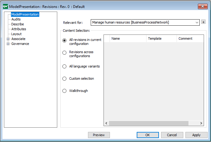
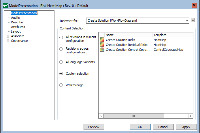
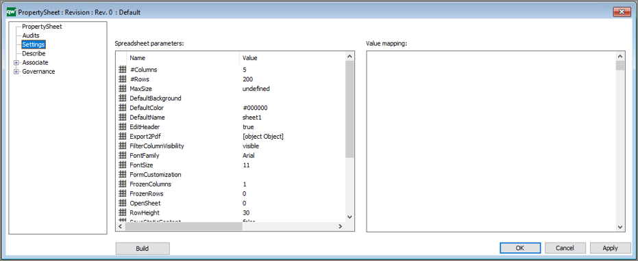
From the main settings, you can configure the scope of the presentation:

  • Relevant for:
    • Here you map the model that is subject to the presentation
  • Content Selection:
    • Here you select the content of the presentation (All revisions, Revisions across configurations, All language variants, Custom selection, Walkthrough)

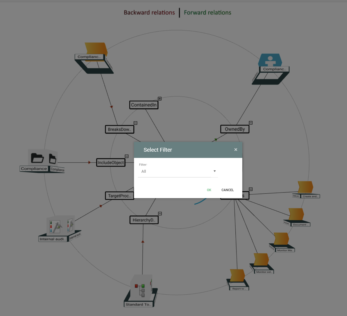
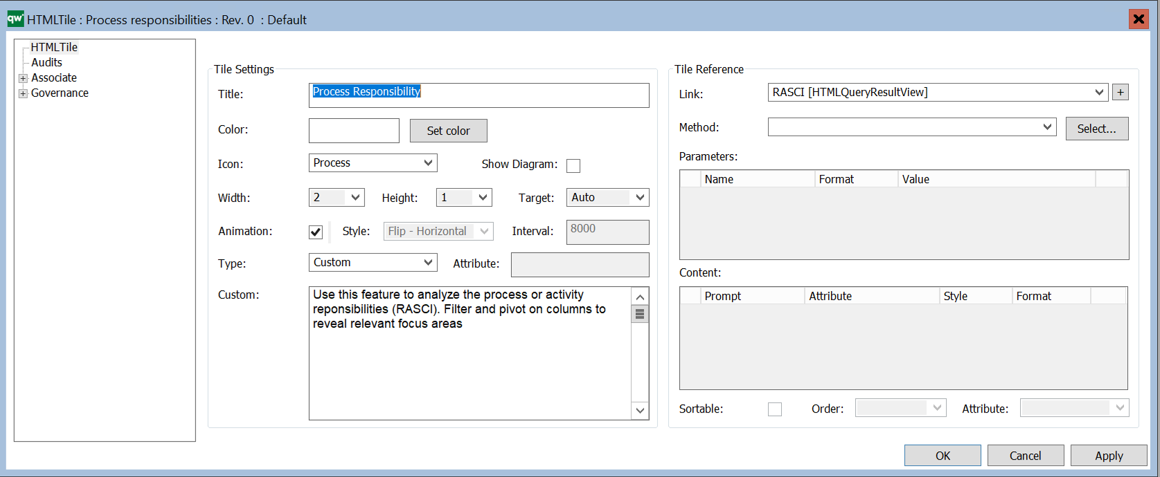
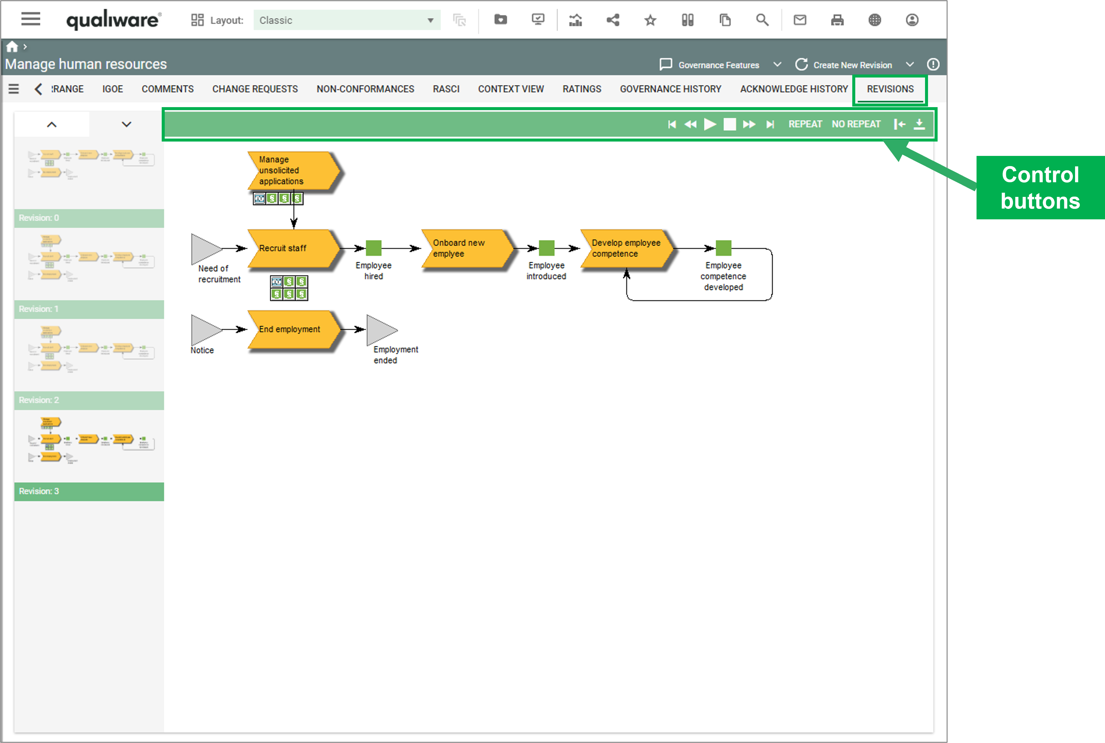
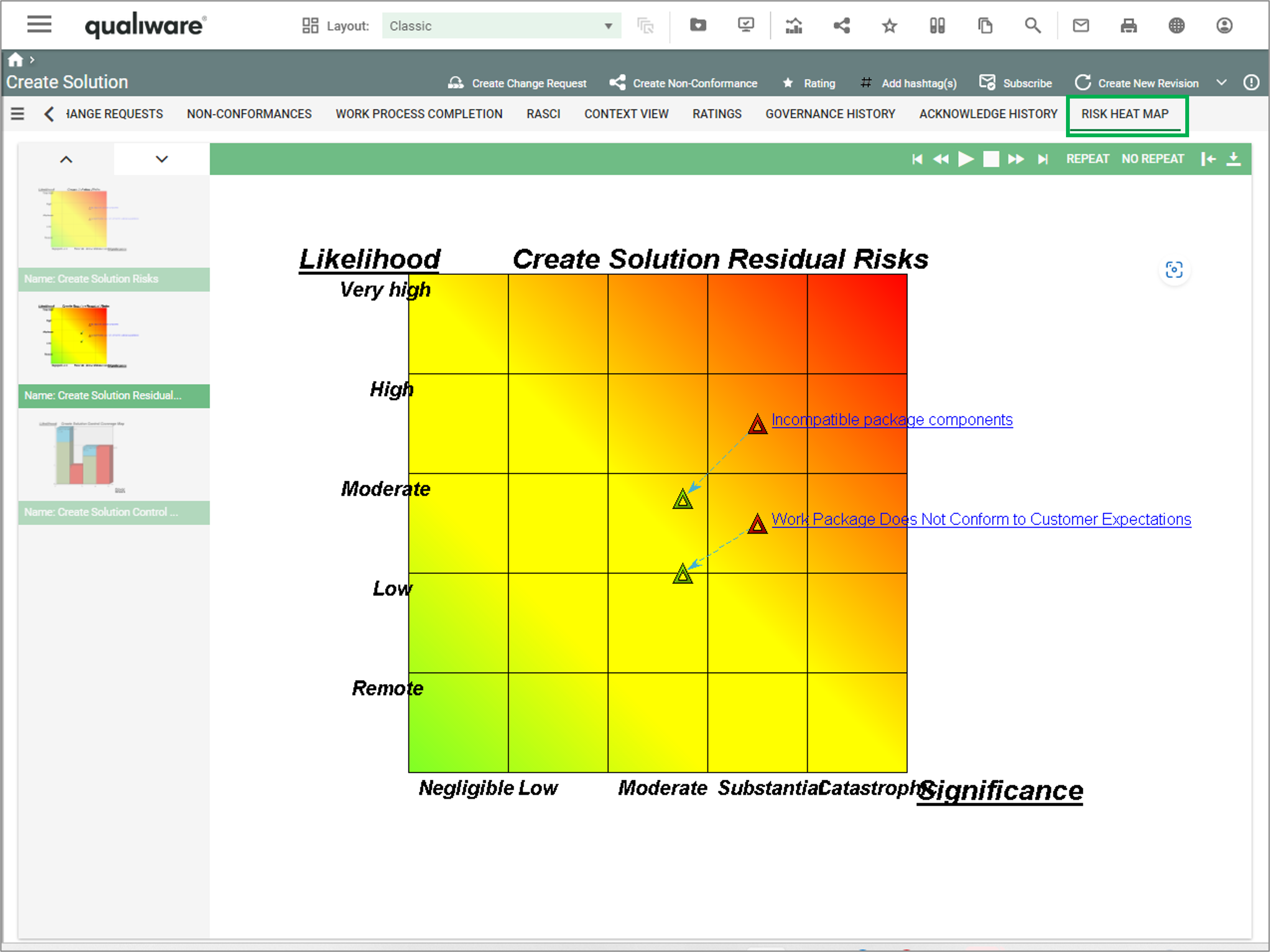
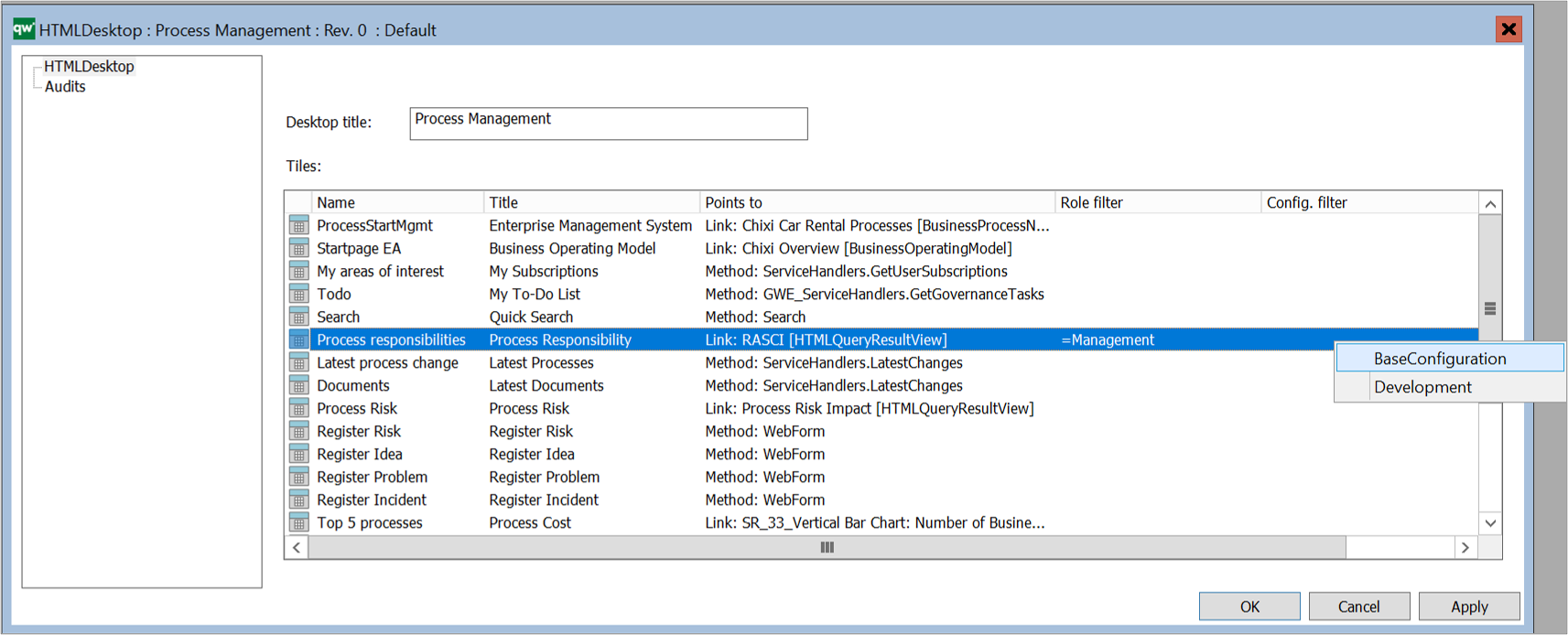
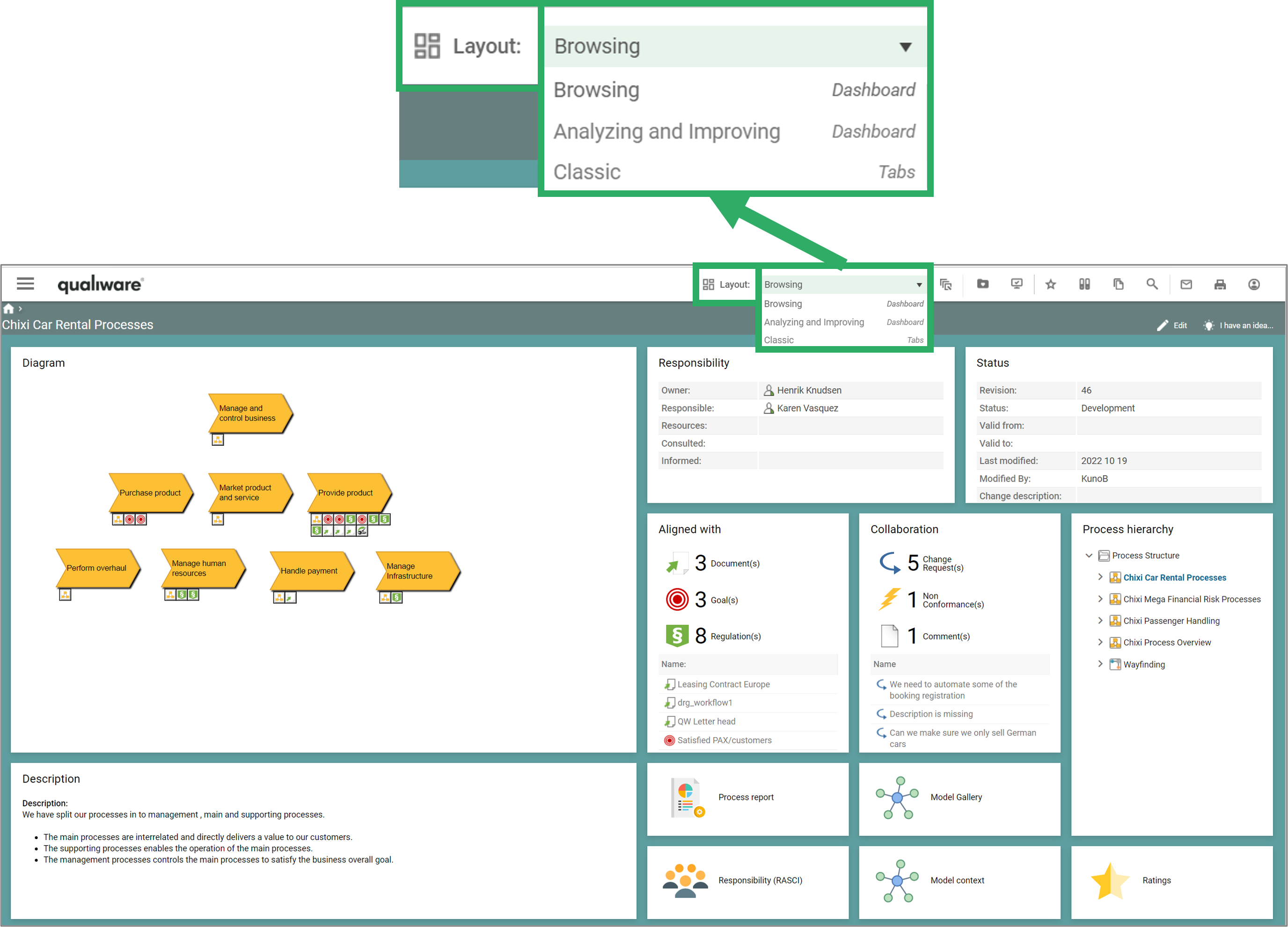
Once the ModelPresentation is created and associated with e.g. a diagram in the “Relevant for”, the presentation becomes available on the web, as a tab in the classic view.

The presentation gives the user a standard set of “video control buttons”, so it is possible to jump forward, backward, stop the automatic sequencing of pictures and so on.

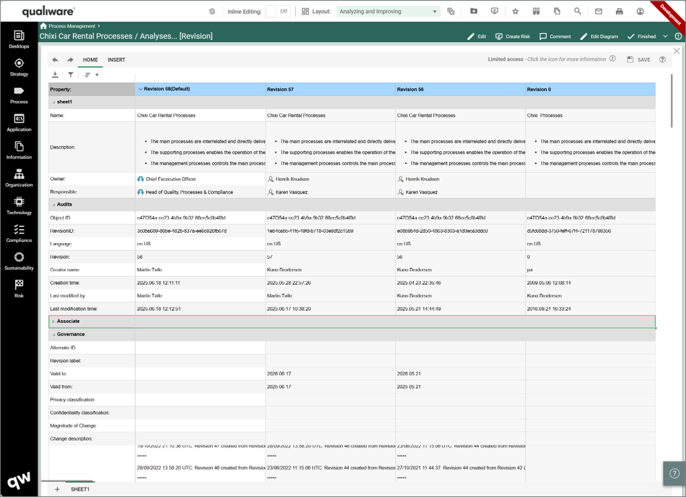
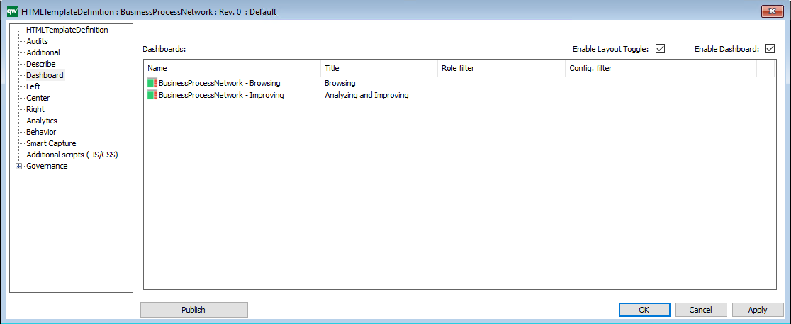
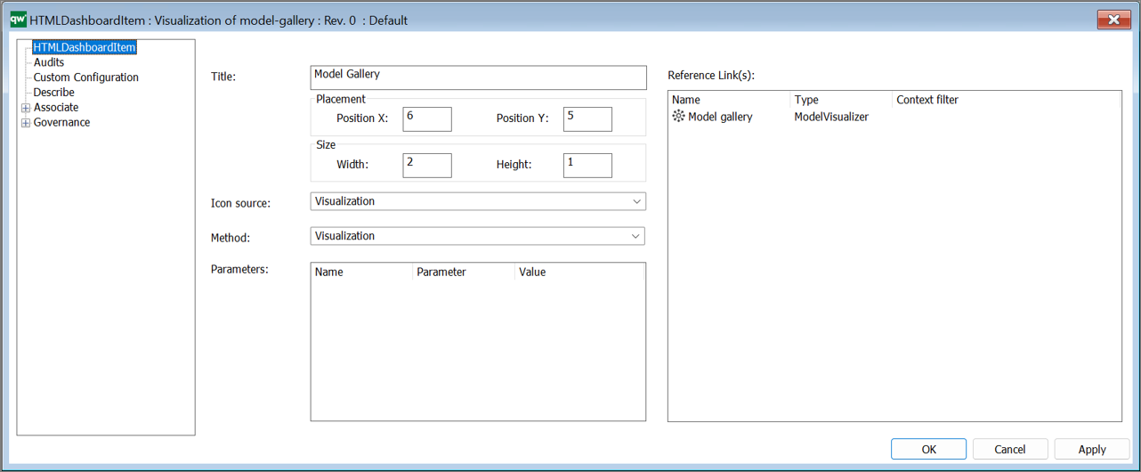
This example shows a definition of a ModelPresentation that fades through the all revisions of the BusinessProcessNetwork.

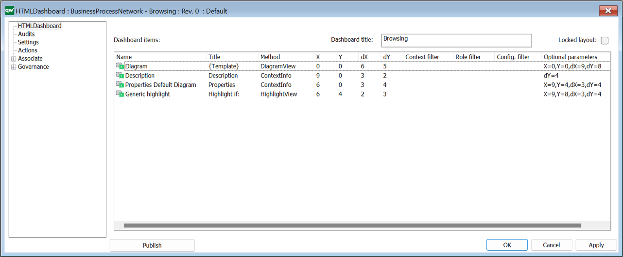
The custom selection is a selection of diffrent models, which can be shown in the model presententer in relation to content selected in the “Relevant for”:

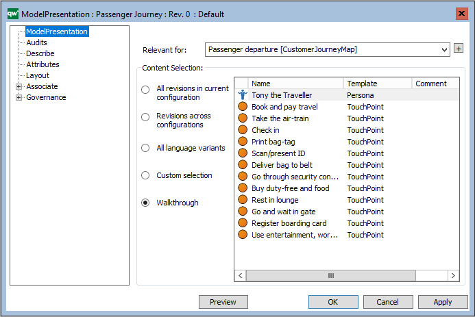
Another example of a ModelPresentation is the illustrated walkthrough of a diagram. Here it is a CustomerJourneyMap that shows the journey of a persona interacting with our enterprise. Each interaction is illustrated by a TouchPoint, and the ModelPresentation includes real life explanation, photos, etc. to illustrate the journey.

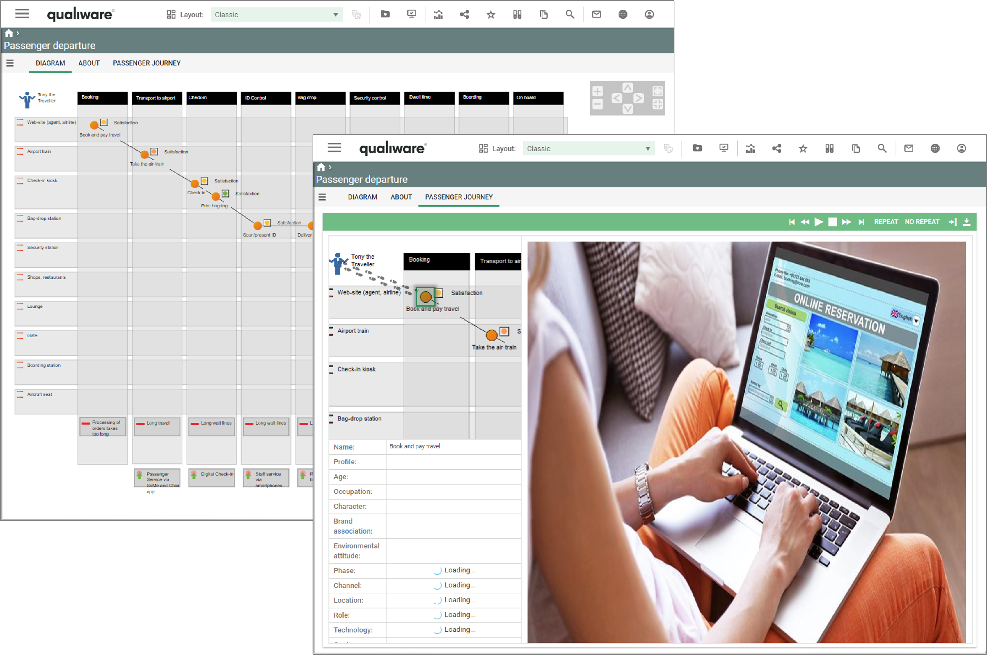
As illustrated in the example above with the customer journey, it is possible to show pictures and video associated to the object.

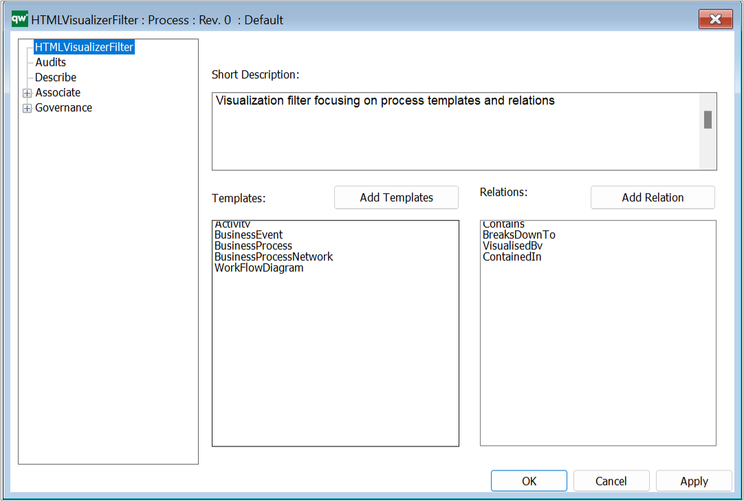
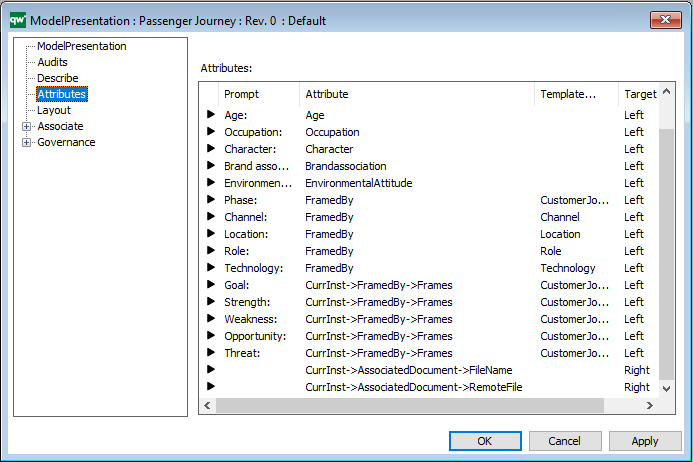
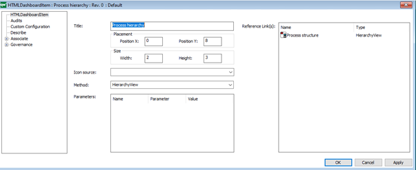
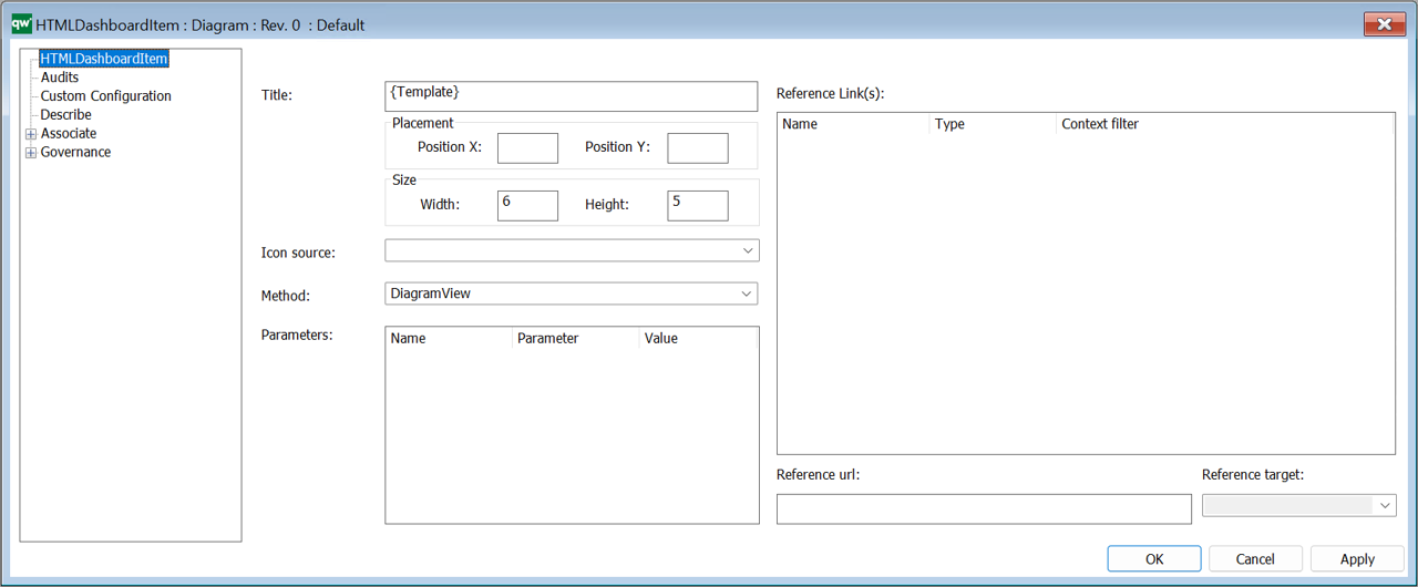
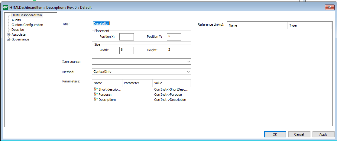
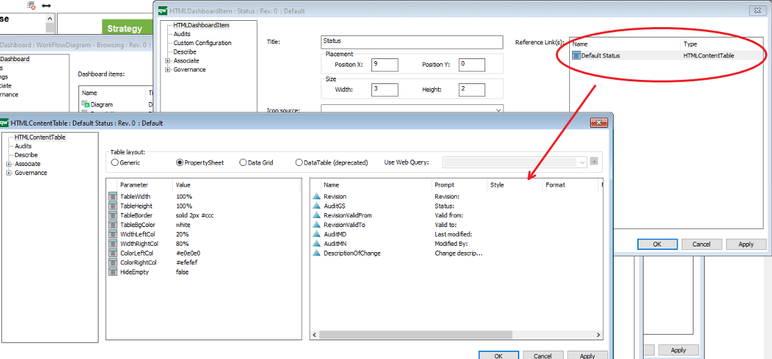
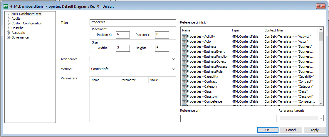
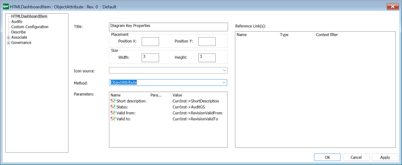
You can specify what attributes should be shown where in the “Attributes” tab.

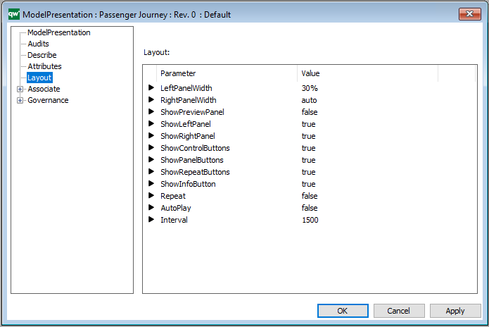
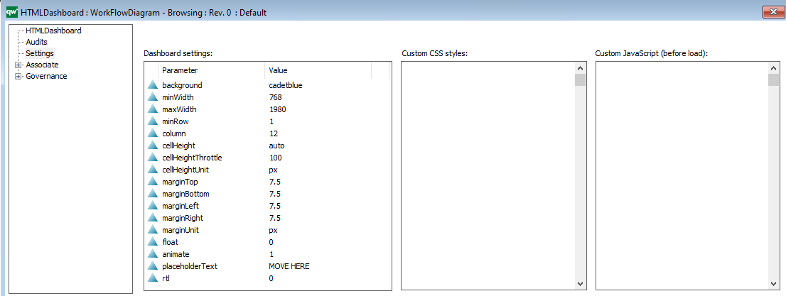
You specify the layout of the presenter on the “Layout” tab.

HTML Tile

The HTMLTile template is used on one or more HTMLDesktop(s) on the collaboration platform.

It is possible to configure the appearance and nature of the tile via the HTMLTile-template.

Among many things you can specify the title, color, size, description text, as well as link it to other content in the repository, e.g. a diagram or a HTMLQueryResultView.

Example of a tile on the web:

HTML Template Definition

The HTML template definition defines how and what information is displayed on the web for each template-type.

In QualiWare 10.8 a new Dashboard layout has been introduced. You can create one or multiple dashboard(s) for a diagram template-type. The dashboard(s) are associated on the Dashboard Tab:

The Dashboard are configured using the templates:

The “Left”, “Center” and “Right” tabs specifies the content on the classic diagram workspace, shown on the example below.

The left window (1) of a diagram workspace is configured on the Left tab, using HTMLContentBox and other HTML-templates:

The Center tabs (2) of a diagram workspace in configured on the Center tab, using HTMLContentTab and other HTML-templates :

The right window (3) of a diagram workspace is configured on the Right tab, using HTMLContentBox and other HTML-templates :

On the Analytics tab, you can configure which “Social Behavior Warehouse” tabs should be available on the model.

The Behavior tab, specifies the behavior of a template, e.g. how should a link to an object of the template behave when clicked.

Target: This is how the link will open when clicked.

  • Self: This will open the object page in the same browser window.
  • New Window: This will open the object page in a new browser window or tab depending on the browser setup.
  • IFrame: This will open the object in an iFrame pop-up window using the Popup Settings configuration.
  • FancyBox: This will open the object in a Fancybox pop-up window using the Popup Settings configuration.

Title: This specifies what should be shown as the title of the object being shown.

  • Page header: The header of the page or popup window of the object. This can be static or dynamic text. Dynamic text is indicated by curly braces and will be evaluated client side in JavaScript.

Popup settings:

  • Width: The width of the popup window.
  • Height: The height of the popup window.
  • Popup content: A list of HTMLContentTables or HTMLContentTabs contains information about what is shown in the popup window. If nothing is specified here, the HTMLPublisher will use the information specified in the Center tab of the template definition.

JumpOnLink: JumpOnLink functionality can be used to forward the user if certain criteria are met. This is typically used when e.g. a BusinessProcess can be broken down in to subprocesses. It allows the user to jump directly to one of the subprocesses without having to open the properties of the BusinessProcess first.

  • Attribute(s): This is an attribute that is part of the object that this template definition is for. When the user clicks on the object, this attribute will be used to calculate where the user is taken to on click.
    • If the attribute contains exactly one link then the user will be taken to the target of that link when clicking the object.
    • If the attribute contains more than one link, then jumping is disabled.
    • If more than one jump attribute is defined, then the whole set of resulting links are evaluated. If only one link is available in the set, then jumping happens. If more than one link is available in the set, then jumping is disabled.
    • E.g. BusinessProcess can be set up to jump on BreaksDownTo. When the user clicks a BusinessProcess the user will be redirected to the link in the BreaksDownTo attribute (if only one link is available).
  • And attribute(s) is empty:
    • If the specified attribute is not empty the JumpOnLink functionality will be ignored. The attribute specified here should be different than the attribute for JumpOnLink.
    • E.g. BusinessProcess can be set up to jump on BreaksDownTo when ShortDescription is empty. If ShortDescription has content then the BusinessProcess will follow the behavior specified in Target settings.

Tooltip settings: The tooltip is used to display information about the object when a user hovers the object link.

Example of a BusinessProcessNetwork tooltip appearing when a BusinessProcessNetwork is hovered on the web.

  • Enable: Enable or disable the tooltip feature.
  • Title (attribute): The attribute that should displayed at the top of the tooltip.
  • Width: The width of the tooltip window.
  • Tooltip content: A list of attributes to be displayed in the tooltip window.


App settings:

  • App content: This specified what should be shown in the app. It links to a HTMLContentTable.
    • If nothing is specified for the template then the app will look for the settings for DefaultDiagram/DefaultObject template definitions and use those.
    • If nothing is specified on the template definition for the template or for DefaultDiagram/DefaultObject the all attributes are shown.

OnClick

  • Execute javascript: This can be used to execute a JavaScript function when the object is clicked.

On the Smart Capture tab, you can link Model Generator Settings to the template definition. The settings are used for the table to model feature in the web-modeler (introduced in QualiWare 10.8).

Table-to-model

  • Inherit default settings: Tick the box to inherit the settings from the Smart Capture Settings on the HTMLPublisher
  • Model generator settings: Insert specific HTMLModelGeneratorSettings to the template definition

Once you have made changes to the template, you should click “Apply” and “Publish” to implement the changes on the Web.

The HTMLTemplateDefinitions are included in the HTMLPublisher.

HTML Publisher

The HTMLPublisher Template contains all settings regarding the configuration of the Web. It collects all the settings for the collaboration platform on the web.

The HTML publisher setting can be accessed in QLM via the HTML icon on the Standard toolbar in QLM.

or by using the shortcut CTRL+H.

The HTMLPublisher collects all settings for the web.

From the HTMLPublisher tab, it is possible to specify:

  • Menu settings
  • Styling, including Logo in the top left corner
  • Available Configuration(s) on the web
  • Languages
  • Additional settings and IIS settings

  • The Template Definitions tab includes the Template Definitions with HTML-settings for the selected templates, and thereby the “look and feel” for how the selected templates is presented on the web

  • Available Navigation Buttons on in the Top right menu

The Model Generator Settings for the table to model feature in the web-modeler (introduced in QualiWare 10.8) is setup through Smart Capture Settings tab: