HTMLContextMenuItem are used in a HTMLContextMenu to create a ContextMenu in the Repository Explorer.
Settings for the HTMLContextMenuItem
(relevant from version 10.2)
HTMLContextMenuItem sample:
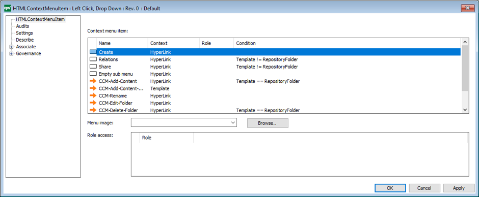
Context menu item: List of items to who in the context menu
Menu Image: Not supported
Role access: General role access for all items in the context menu.
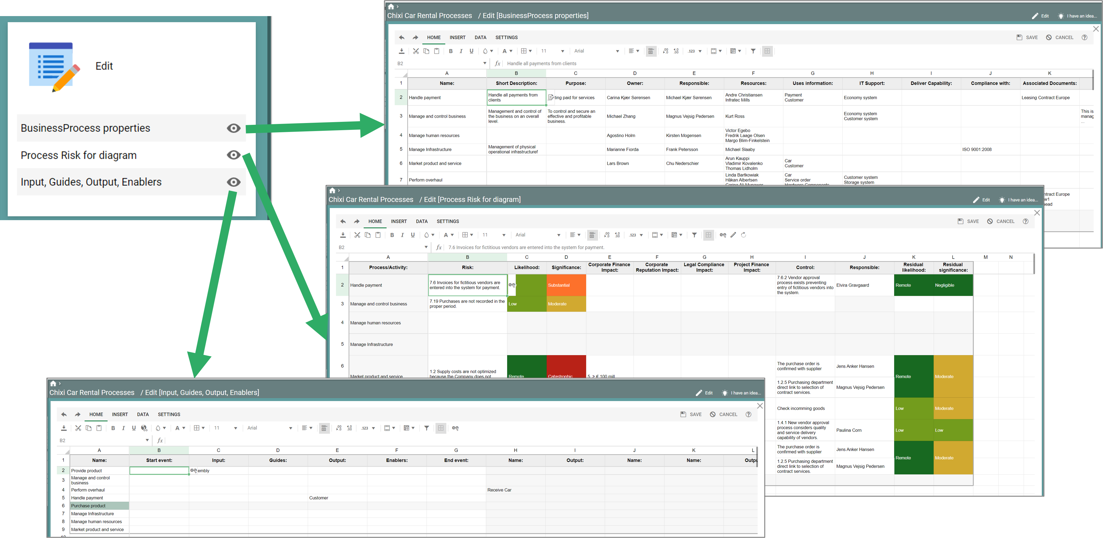
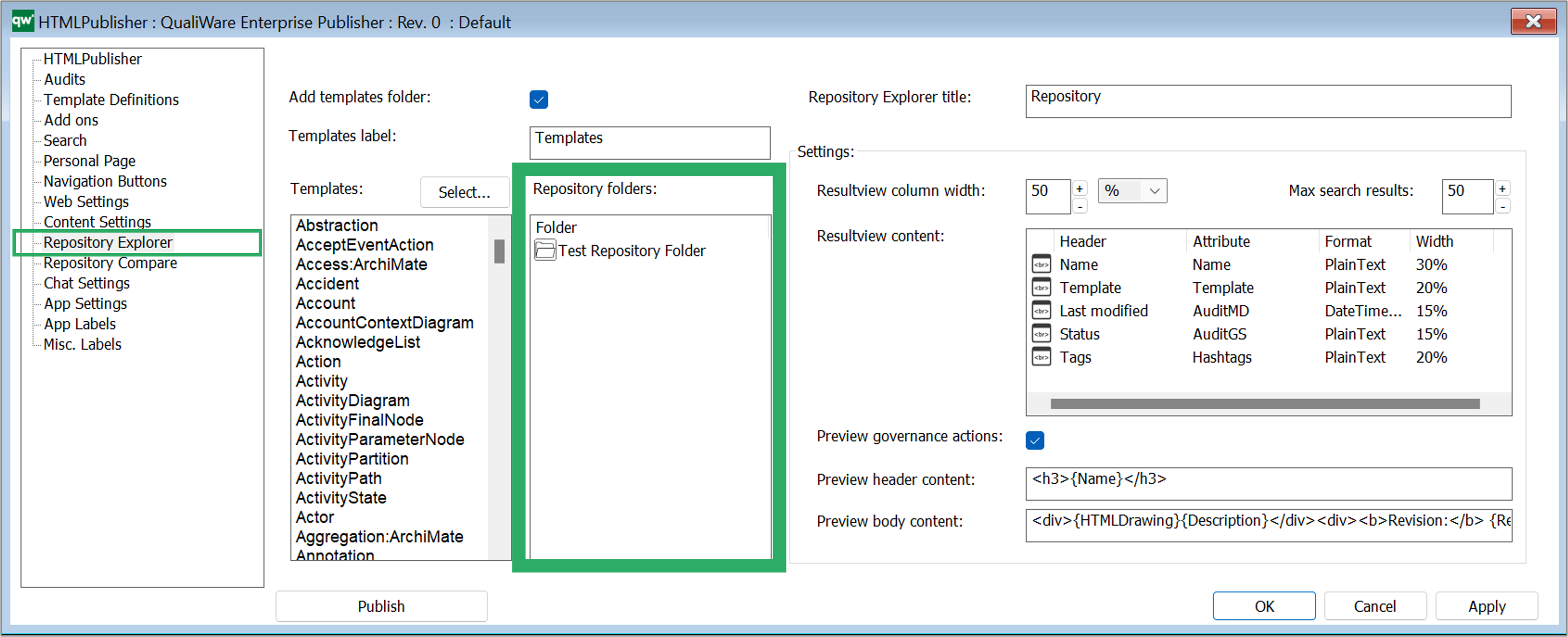
Context menu items:
The context menu supports GovernanceStateFeature and HTMLContextMenuItem. Adding a GovernanceStateFeature means adding an action to the context menu. Adding a HTMLContextMenuItem will create a sub menu in the context menu.
- Context
- The context defines where the context menu should be activated from. HyperLink means the menu will be available on objects in the repository explorer. Template means the context menu will be available when a template name is shown in the treeview part of the repository explorer. (Toolbar is not supported)
- Role
- Ability to select role-based access to the menu item.
- Condition
- Additional condition for showing the menu item. E.g. Template == RepositoryFolder
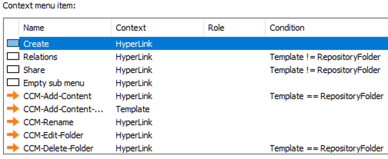
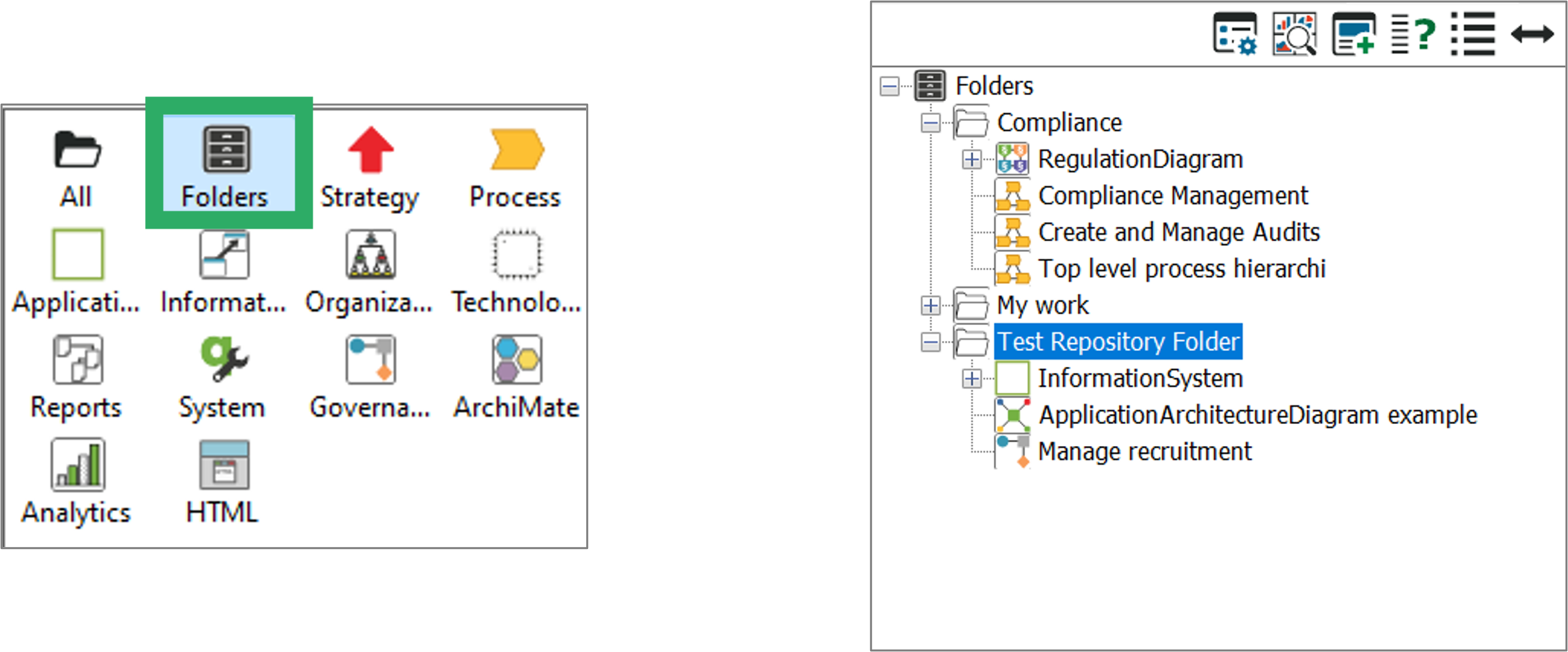
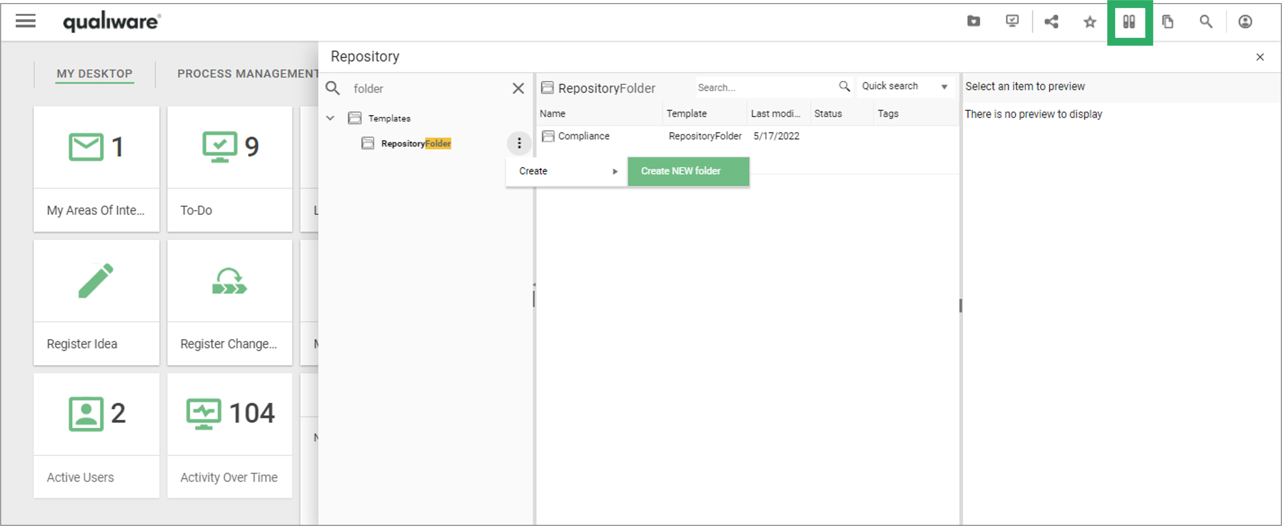
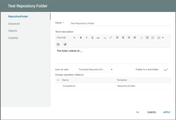
Sample list of context menu items containing one sub menu and several items with conditions set:
Settings tab on HTMLContextMenuItem
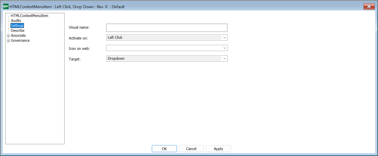
The settings defined on this tab will apply to the whole context menu. If a HTMLContextMenuItem is used as a sub menu, then only Visual name is used.
Visual name
- Used to define the display name when used as a sub menu
Active on
- Currently only Left Click is supported
Icon on web
- Not used here.
Target
- Only Dropdown supported.
