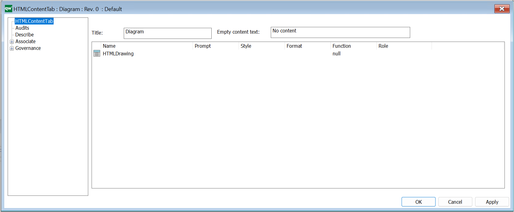
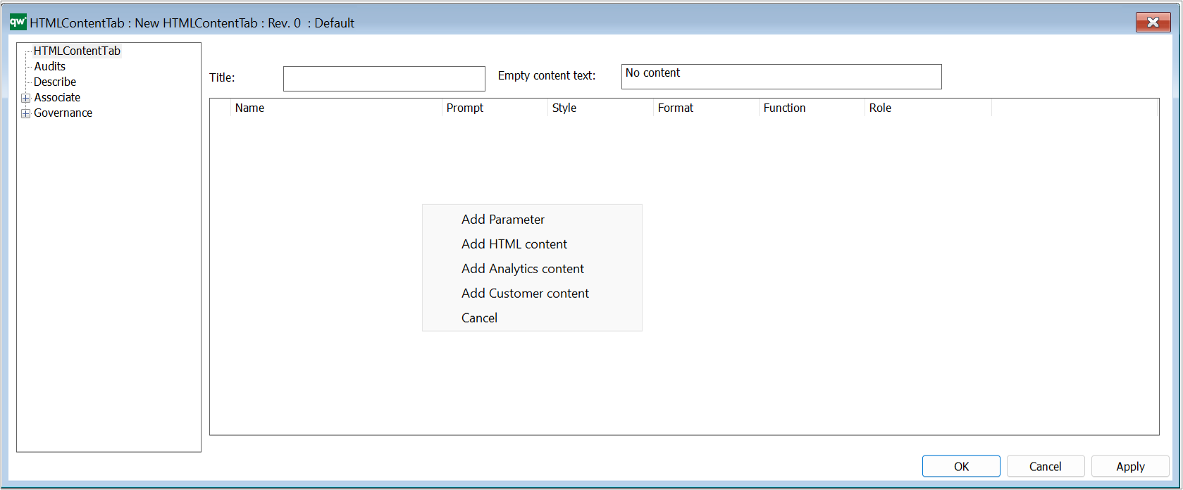
HTMLQueryResultView is a way to query for a list of objects to be displayed.
A HTMLQueryResultView (also known as QRV) is a table that is used to present the result of a query in the web solution. It is often accessed from the leftmenu, or in a HTMLContentTab.
For a video guide to HTMLQueryResultView see our QueryDesign journey.
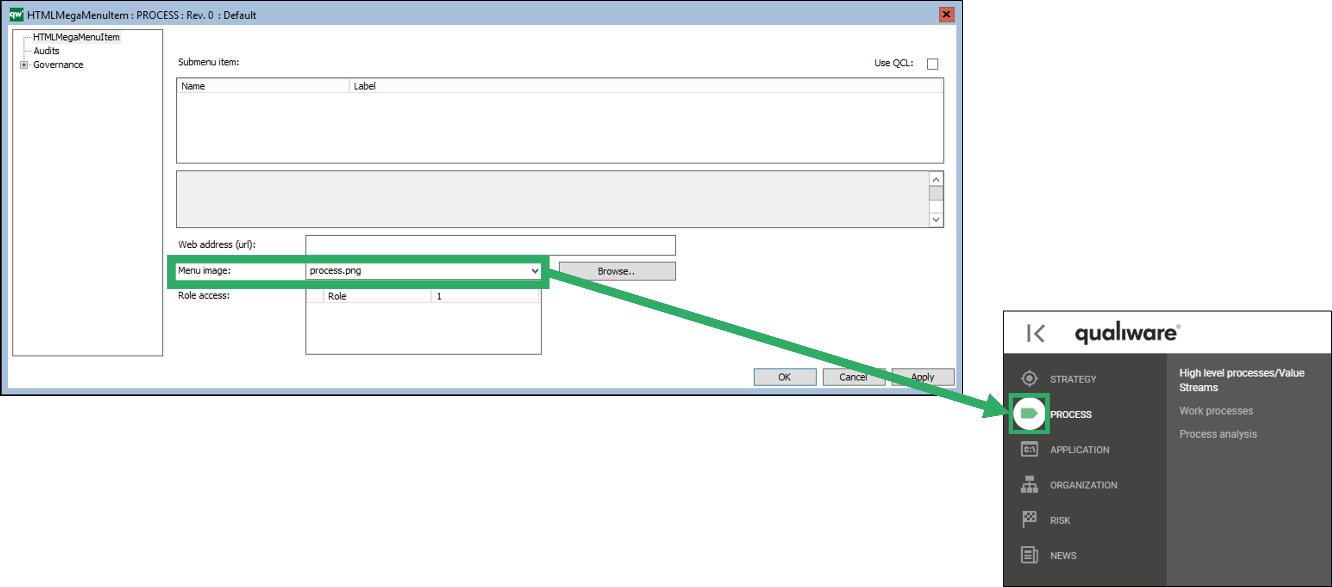
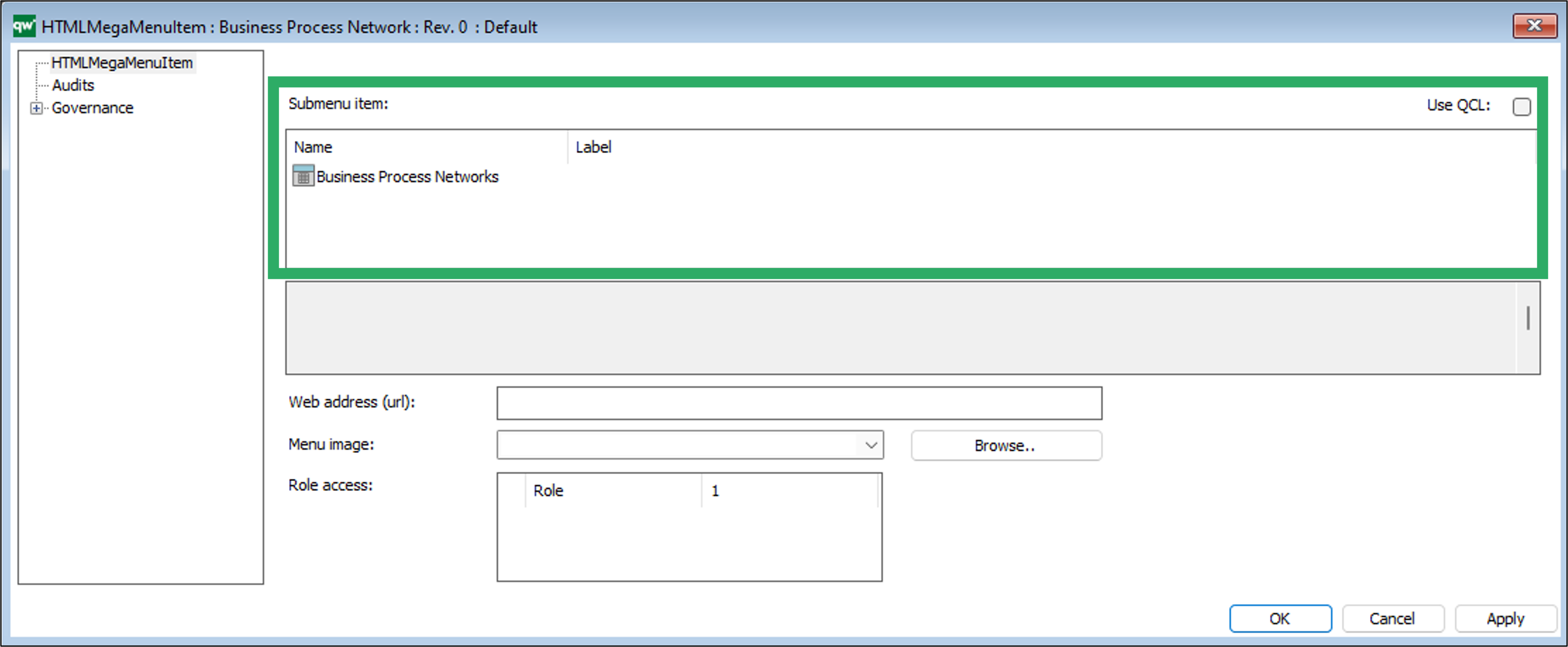
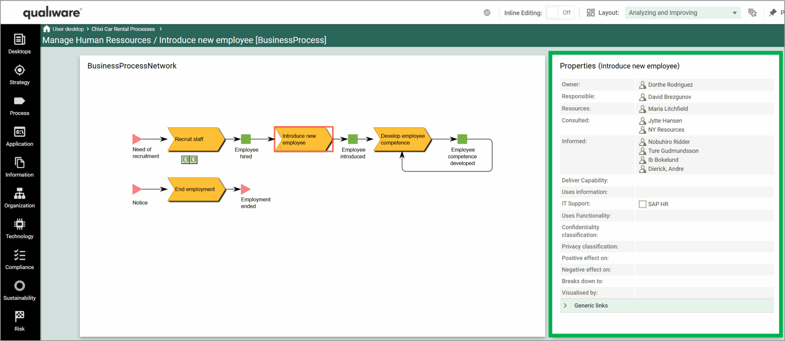
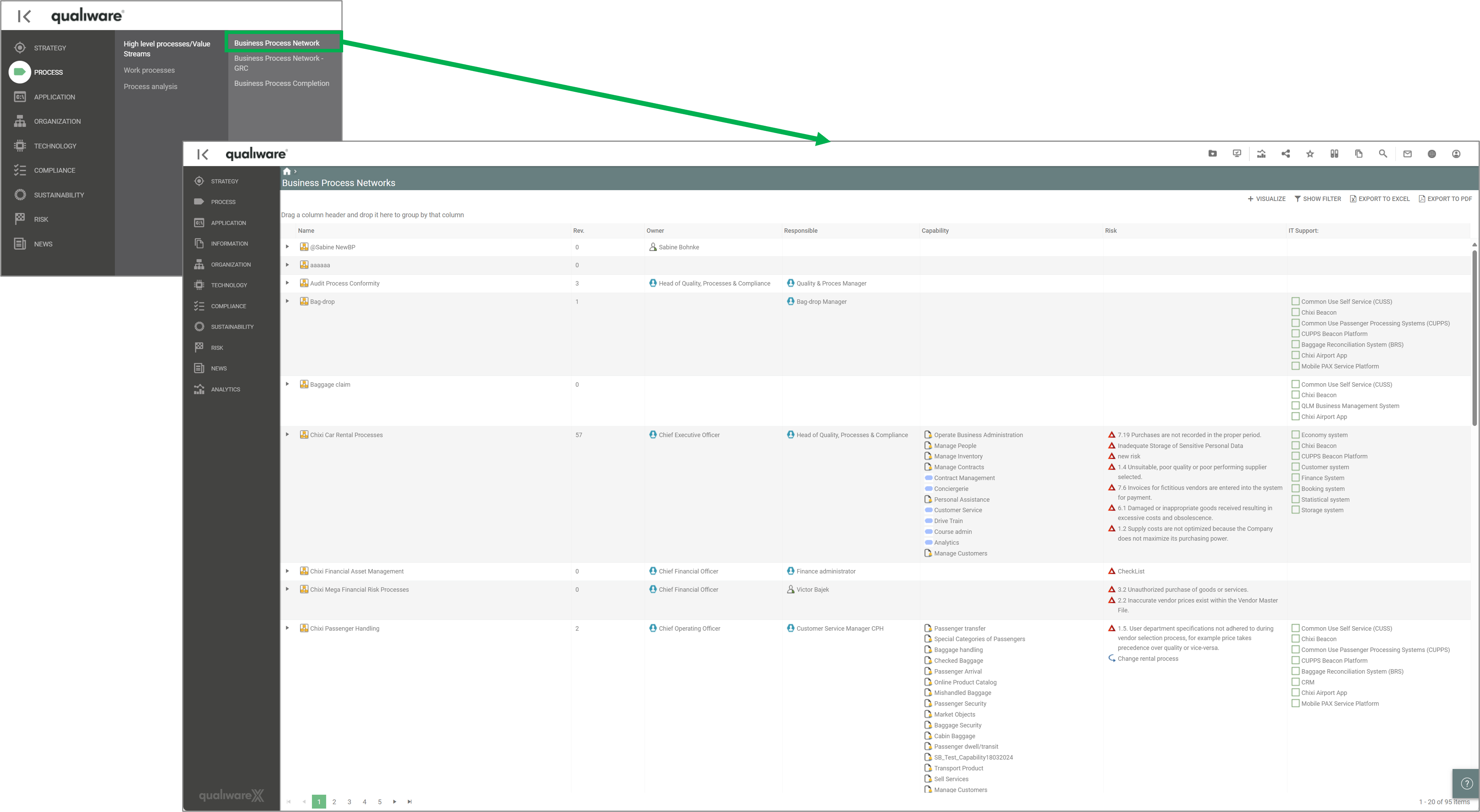
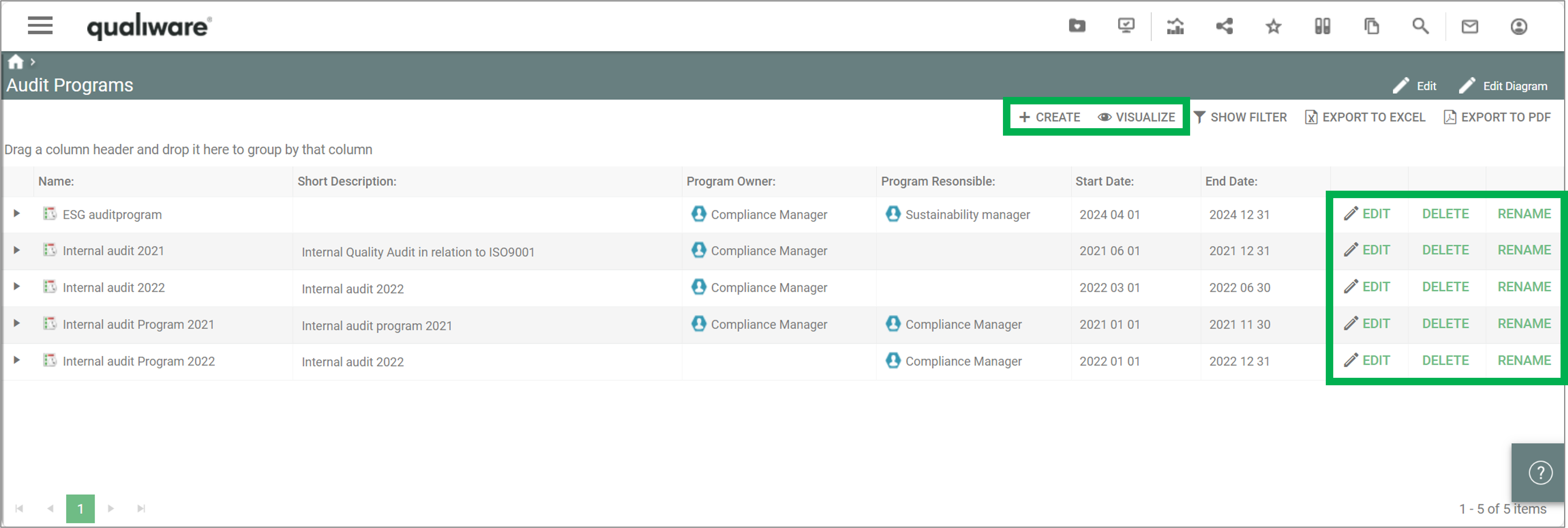
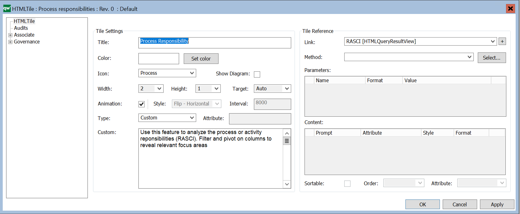
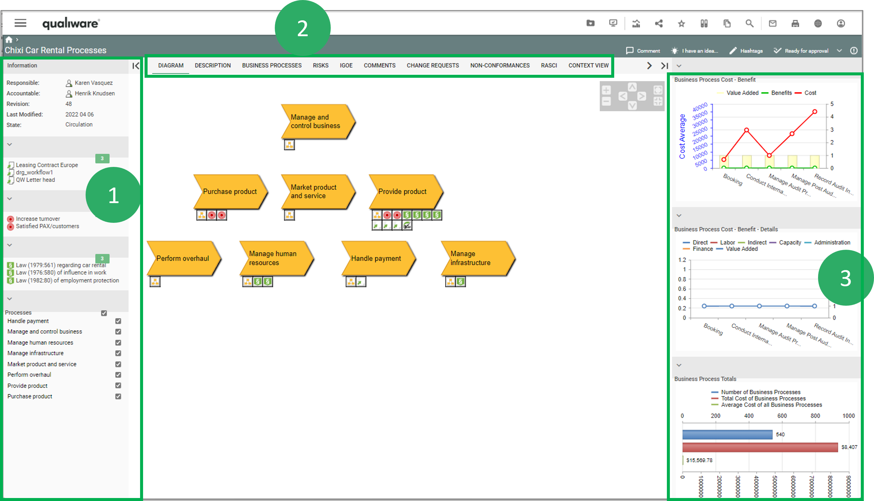
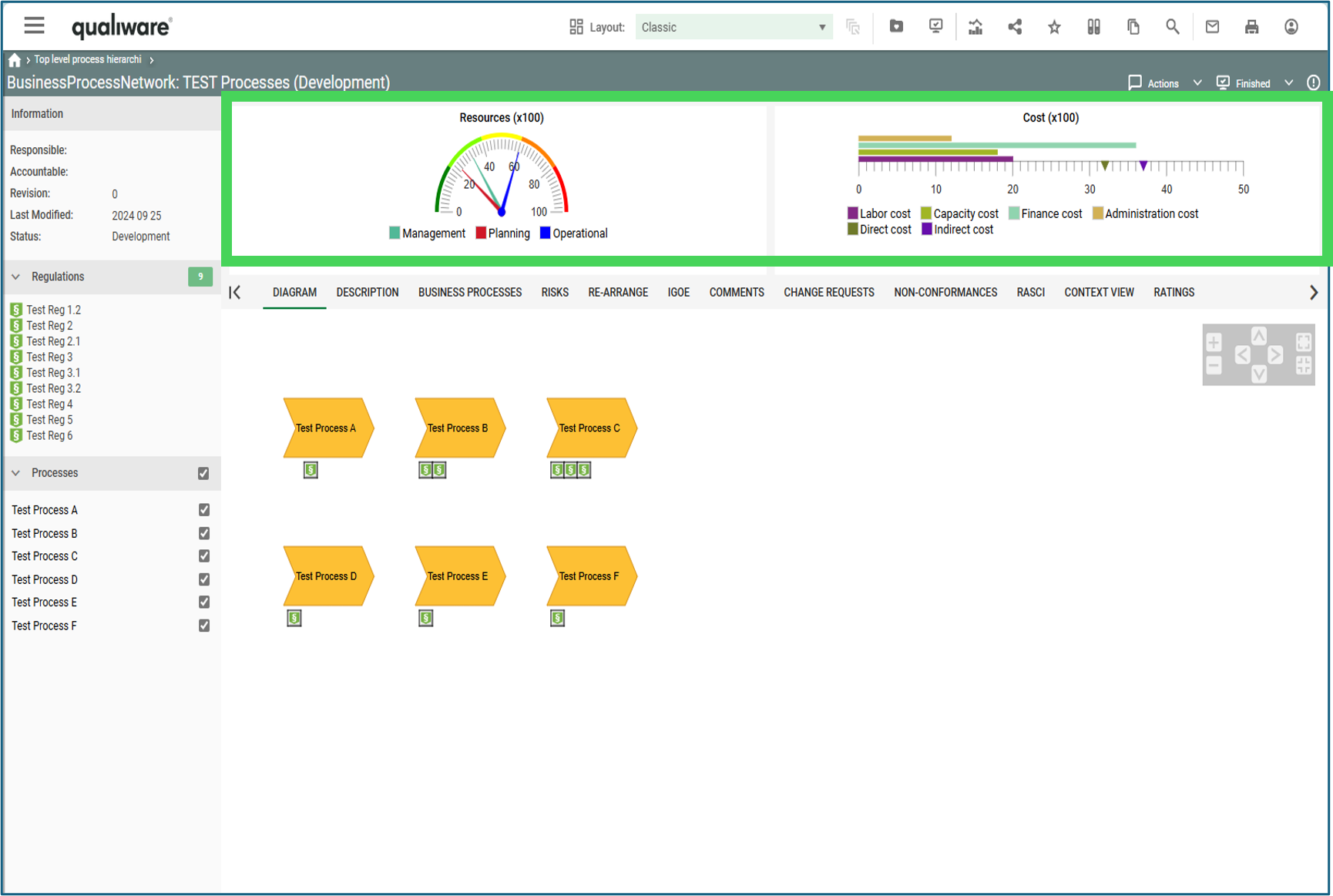
An example of a QRV is the list of BusinessProcessNetworks available in the standard left menu.
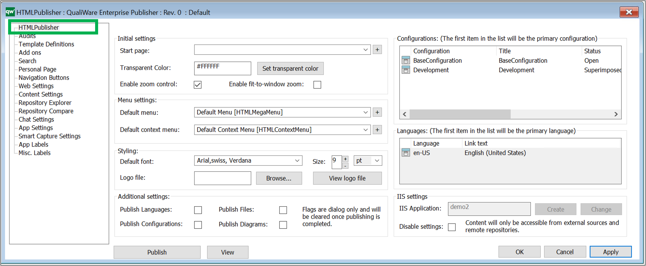
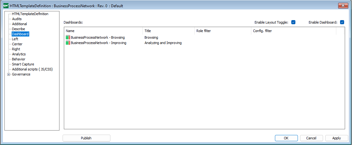
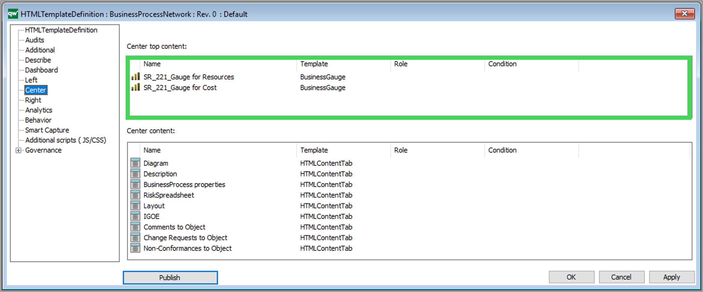
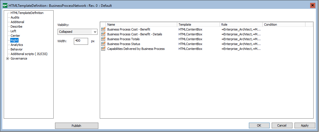
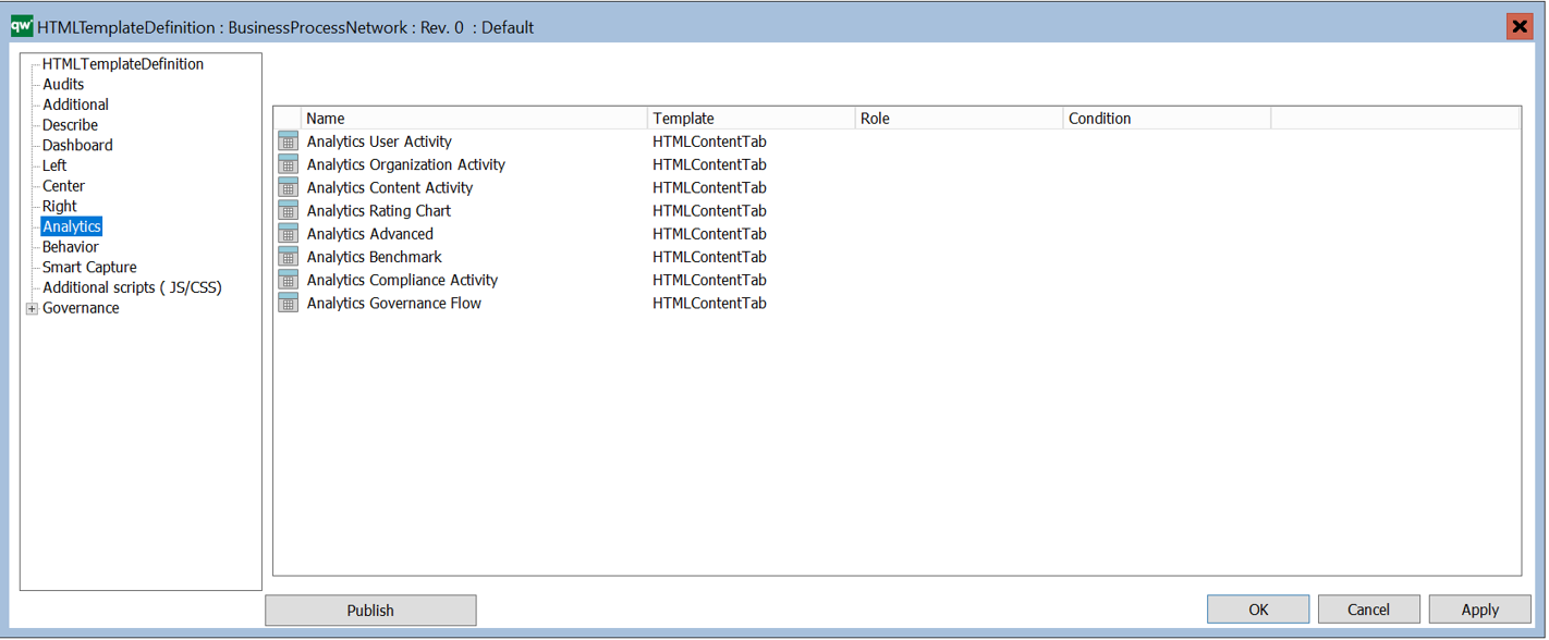
The QRVs are configured in the QLM windows client, using the HTML QueryResultView Template.
The template contains three ways of defining the view of the data: Explorer, Select, and MultiLink.
The Explorer is the essential part of the QRV, and it is descibed in detail below. The Select and MultiLink settings are used by Client Side WebForms.
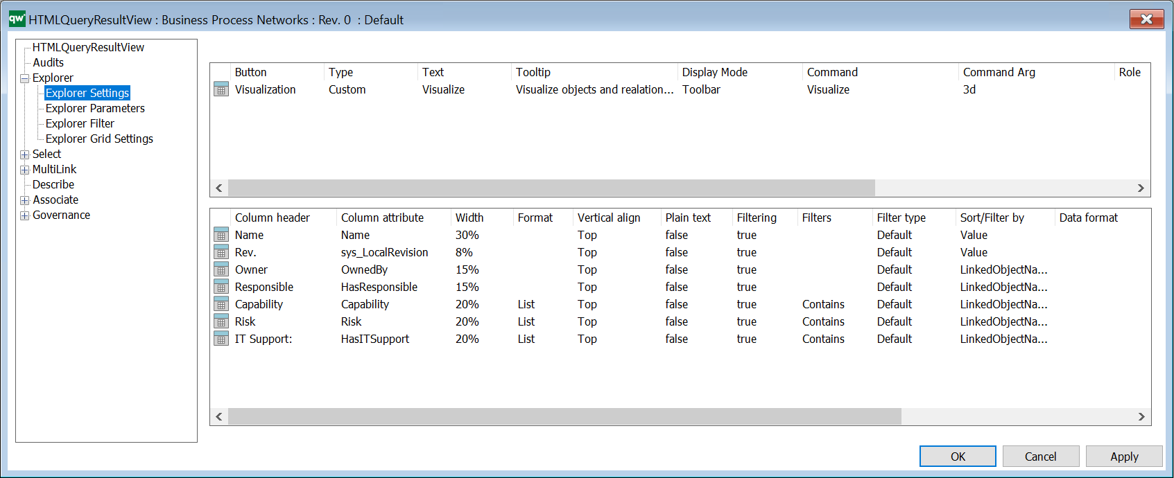
Explorer Settings
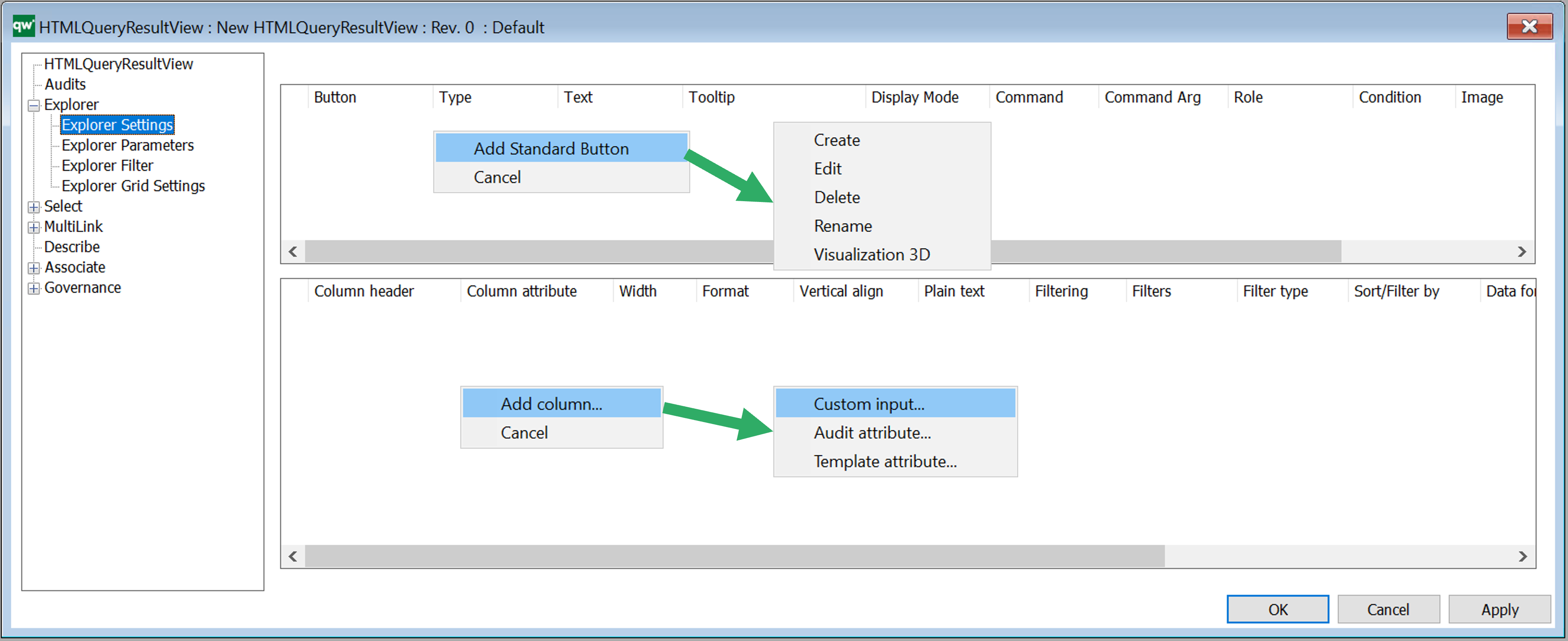
Explorer Settings are used to configure how data is displayed in a table on web. The Explorer QRV is a table meant for being displayed using the full size of the page. So the table will be the main content. It can also be used as an embedded content table for displaying content related to the main content, e.g. show an overview of Risks related to a BusinessProcessNetwork.
Buttons
Buttons can be used to add options for handling the content of the table. There is a set of standard buttons available to quickly add functionality for the most common actions. The standard buttons can be added be right clicking in the button window, cf. figure above. It is also possible to create custom functionality.
Standard buttons
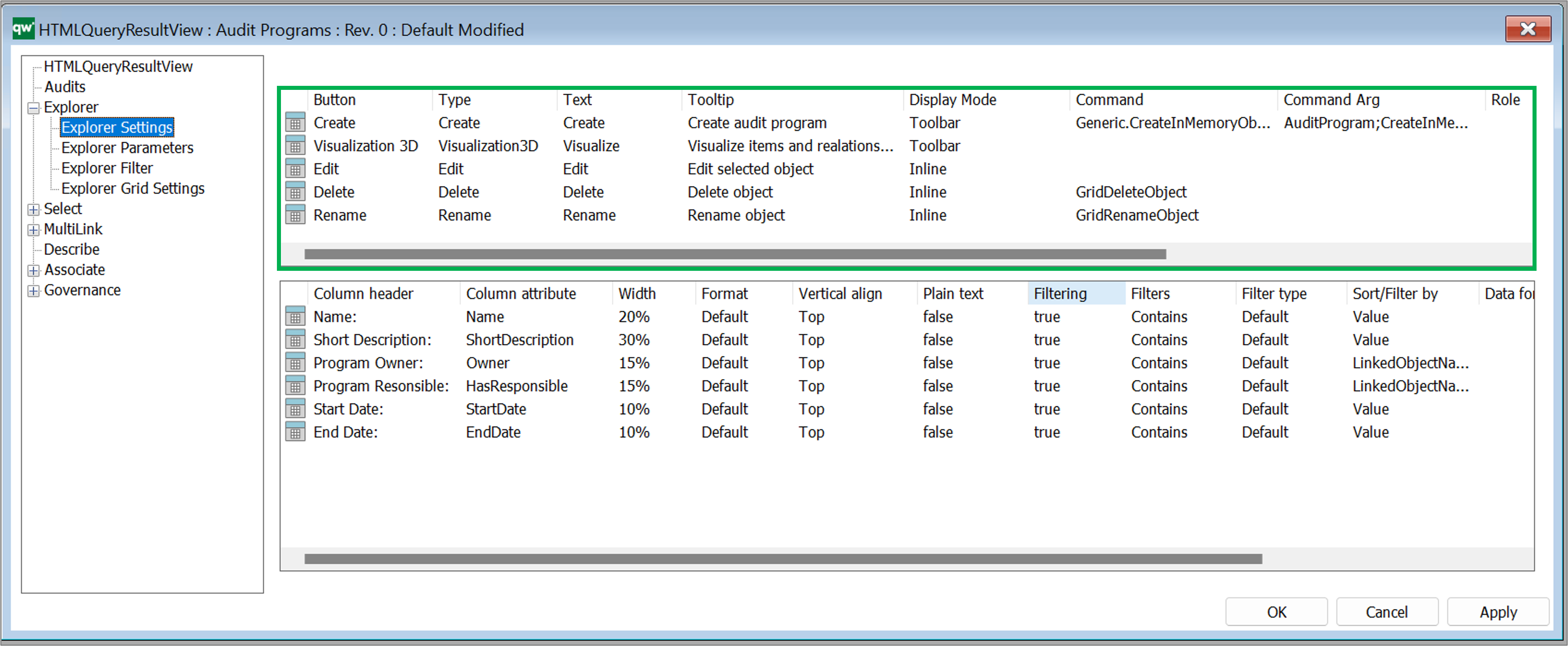
- Create: Enables the user to create a new object of the template associated to the QRV in the filter settings
- Edit: displays an Edit button to the right of each object in the QRV
- Delete: displays a Delete button to the right of each object in the QRV
- Rename: displays a Rename button to the right of each object in the QRV
- 3D Visualize: add a visulisation button to the QRV.
Available settings for buttons:
- Buttons
- Client Side Grid: Create, Edit, Delete, Rename, Visualization 2D, Visualization 3D, Cluster, Custom.
- Server Side QRV: Create, Edit, Delete, Rename, Export, Custom (For Client Side Grid: Export functionality is handled by grid settings)
- Text: The text displayed on the button.
- Tooltip: Tooltip with more information to the user.
- Display Mode: Where to display the button.
- Empty value: Button is displayed same as Toolbar.
- Toolbar value: Button is displayed in the toolbar of the QRV.
- Inline: Button is displayed in a column in the right side of the QRV. One button is displayed per row (object) of the table.
- Command: Command associated with the button
- Command Arg: Argument associated with the command
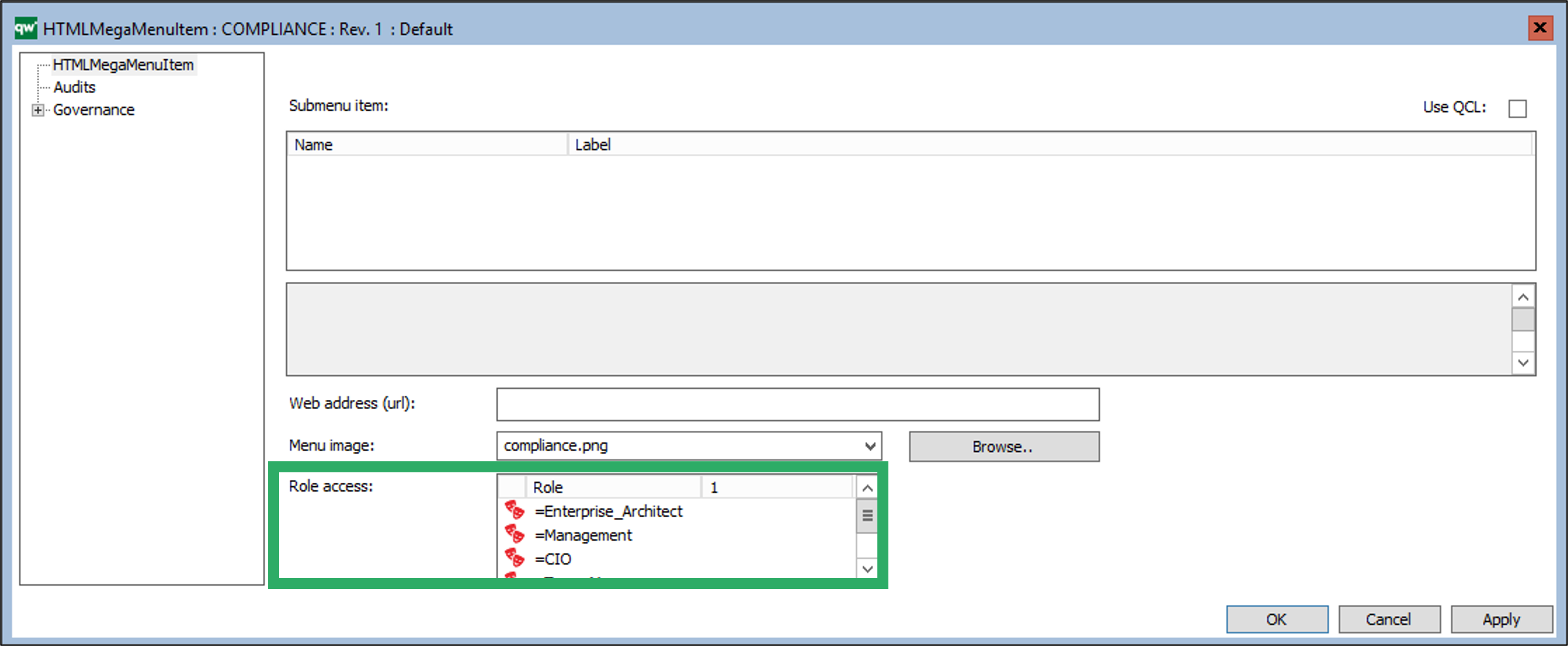
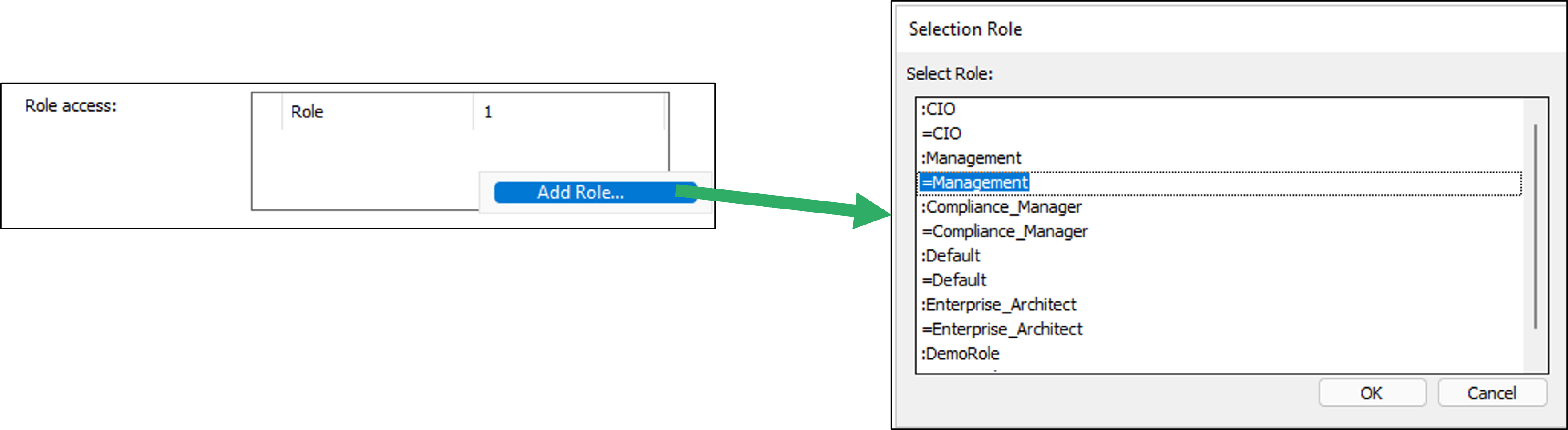
- Role: You can configure the button to be available for one or more roles in the repository
- Condition: You can specify a condition for when the button shoudl be available
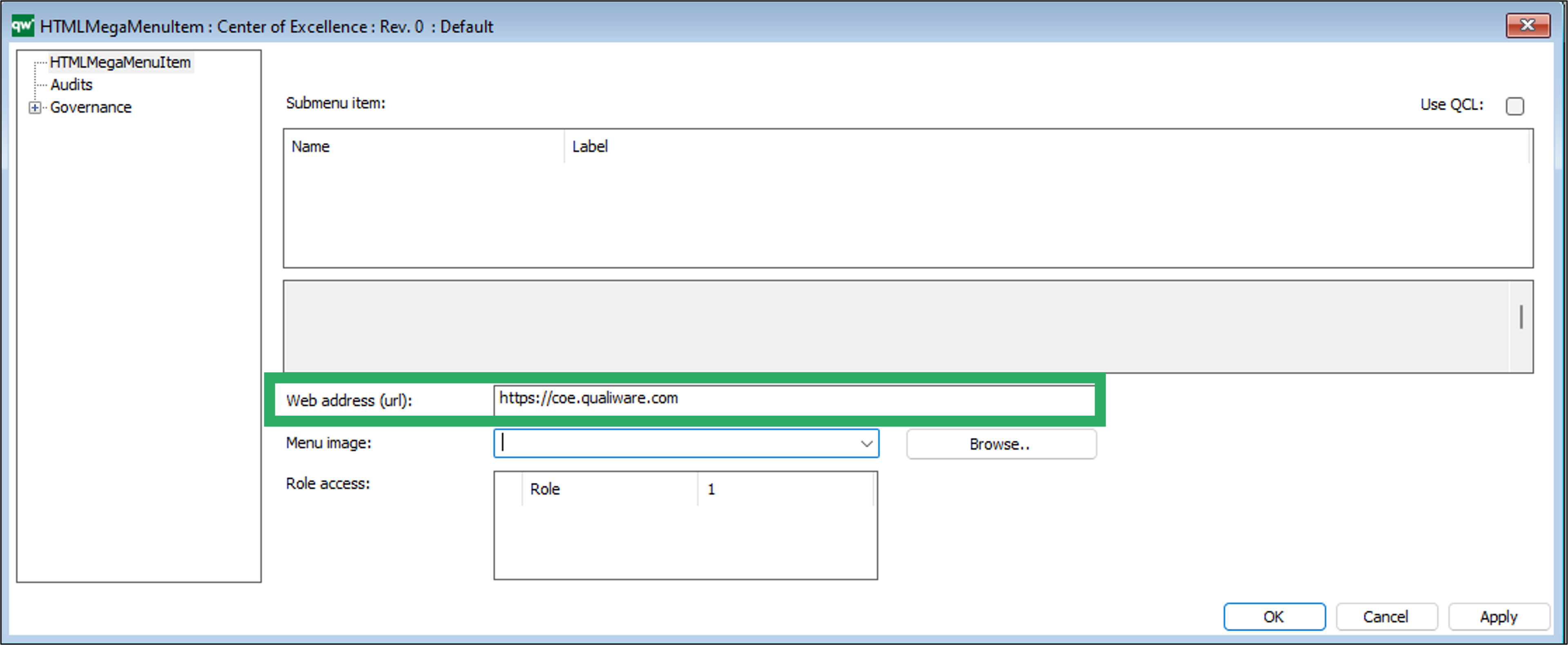
- Image: You can configure an icon for the button.
- Export Type: Defines if it should be possible to export the content of the table.
- Possible values: Csv, Excel, Custom
Columns
Right click the window to add a column. Press F2 to get available option (see figure above).
- Custom input…: choose this option to insert text ‘manually’
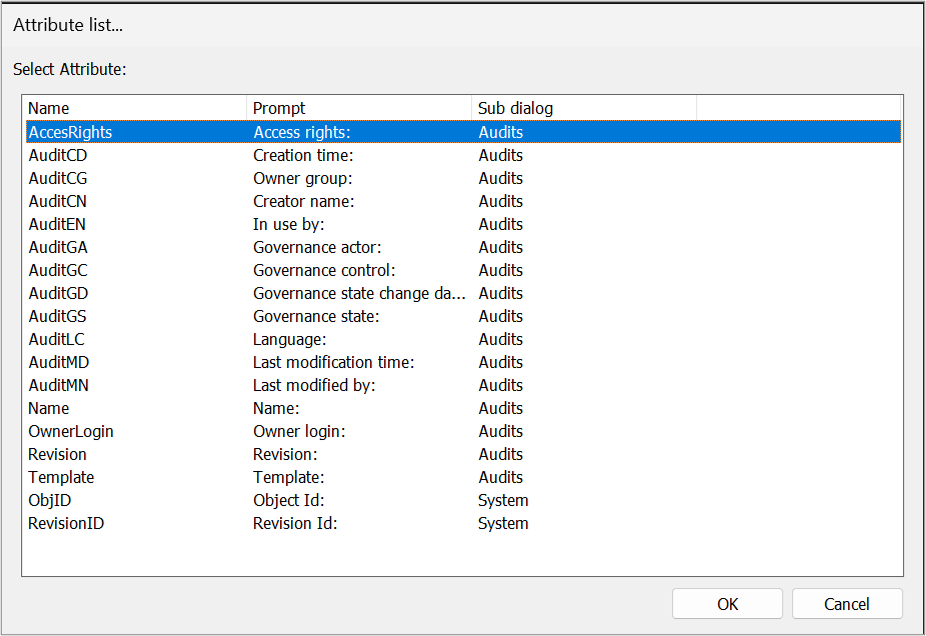
- Audit attribute…: choose this to select an audit attribute from the attribute list
- Template attribute…: select a template from the list to choose a template specific attribute for the Query
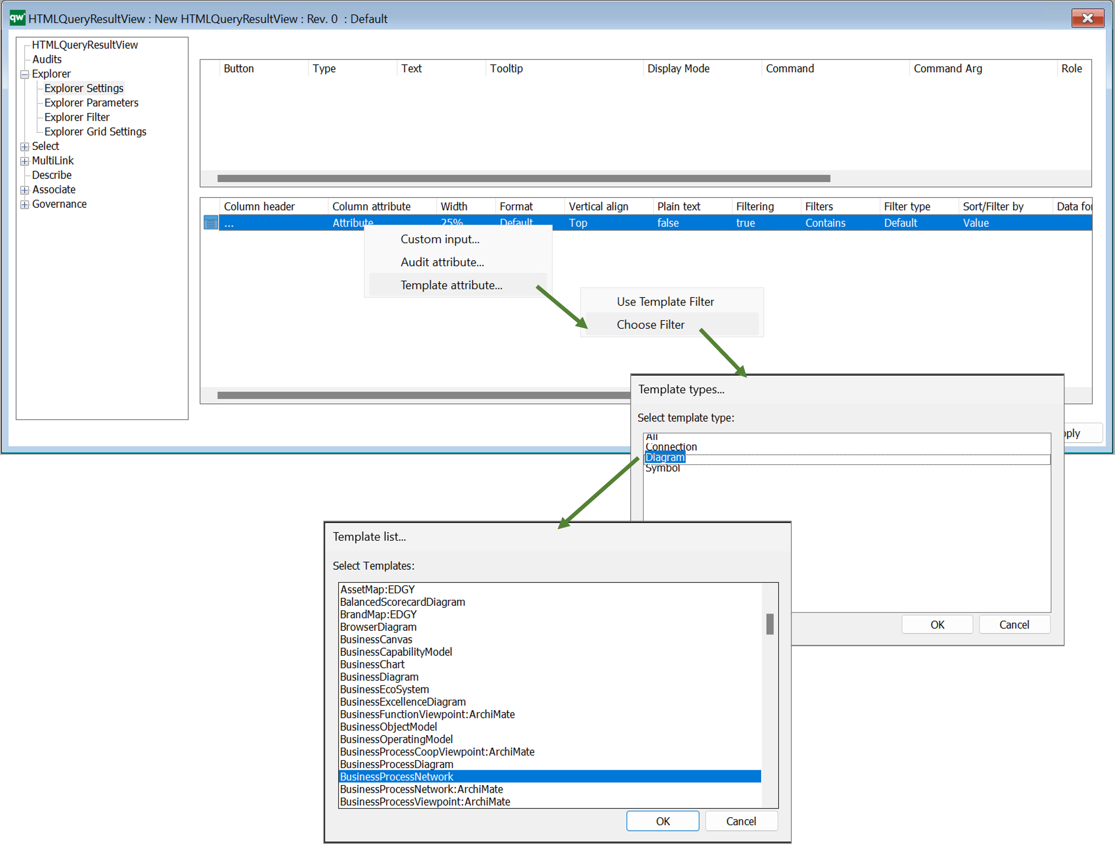
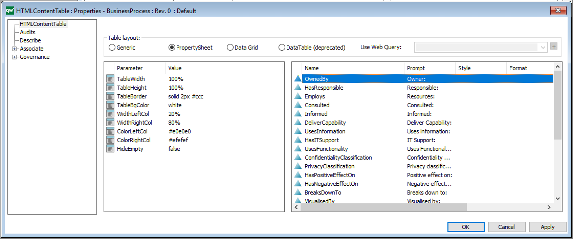
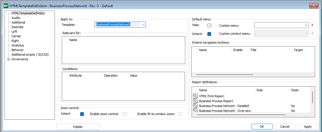
Once you have selected a template you will get the full list of attributes available. It is possible to expand the window to see and sort by attributes of the different sub dialogs of the object, see example below with the BusinessProcessNetwork
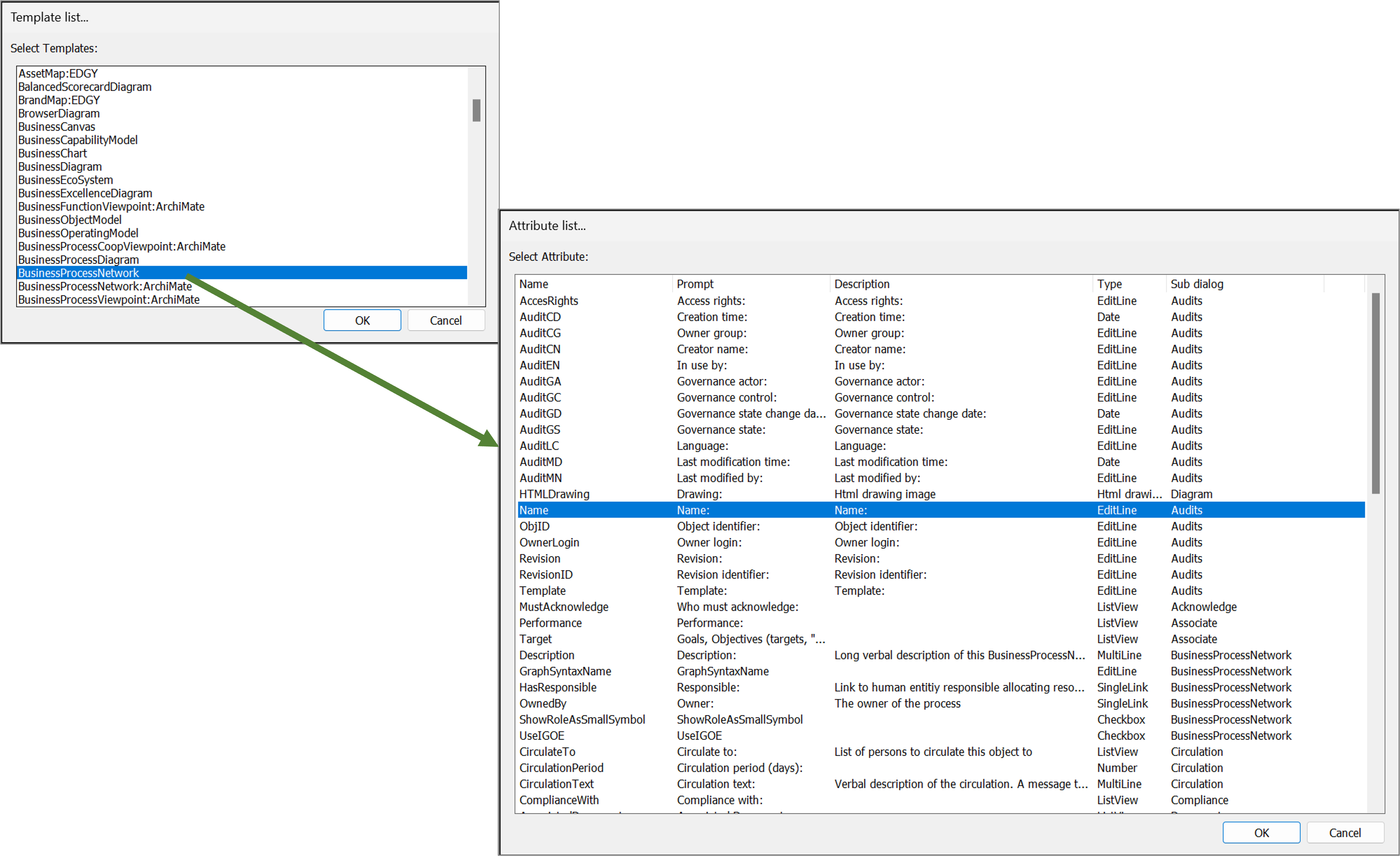
Once you have selected the attribute it will appear in the column list.
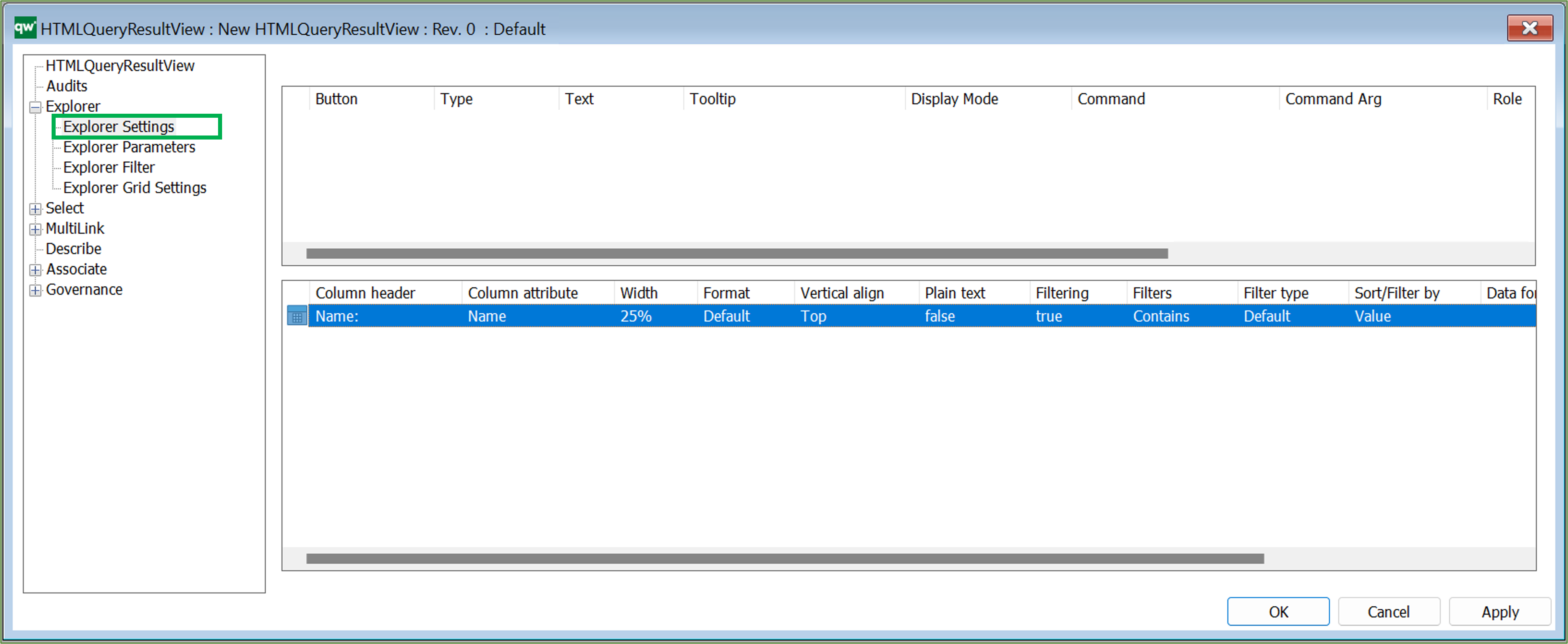 It is possible to configure which columns are in the table along with basic settings for the content, when it is displayed on the web.
- Column header: The text of the header for the column, to be displayed when presented on the collaboration web.
- Column attribute: The attribute of the column. This one is combined with the column filter in Explorer Filter to define the content for the column.
- Width: Width of the column. It can be defined using pixels or percentages.
- Using pixels can produce a horizontal scrollbar if total width of all columns exceed the content width.
- Percentages will be the percentage of the total width of the table. If all column widths are defined in percentages, the total width of the table will not exceed 100%.
- Format: If cells of the column can contain more than one link (MultiLink or multiple SingleLinks), then the format can be defined as List to diplay the links in list format.
- Possible values: Default, List
- Vertical align: Vertical alignment of the content of each cell in the column.
- Possible values: Top, Middle, Bottom.
- Plain text: If the content of each cell in the column should be displayed as plain text. This can be used in cases where the content is links. When content is plain text it is not clickable.
- Filtering: specifies if the column is filterable
- Filters:
- Between; NotBetween; Contains; DoesNotContain; EqualTo; NotEqualTo; StartsWith; EndsWith; IsEmpty; NotIsEmpty; GreaterThan; GreaterThanOrEqualTo; LessThan; LessThanOrEqualTo
- Filter type:
- Sort/Filter by:
- Value; Auto; LinkedObjectName
- Data format: Define the format for the content of the cells in the column.
- For simple formats, define the format directly in this field.
- For advanced formatting, define which value mapping should be used. Read more about value mapping in the Explorer Grid Settings.
- Script: You can insert a script
- Link value / Ref. attr:
Explorer Parameters
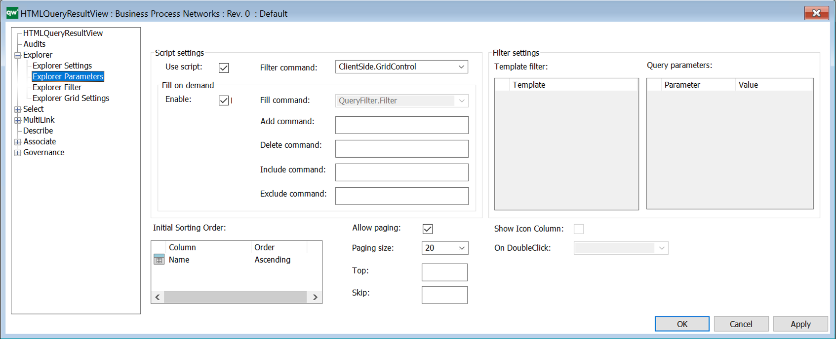
Parameter settings
- Use script: Select to use script
- Filter command:
- Client Side options: Choose ClientSide.GridControl to display data in a client side table. This is the recommended setting. When choosing ClientSide.GridControl, the Explorer Filter options will be enabled.
- Server Side options: There are a list of predefined commands available for fetching and displaying data in a server side table.
- Fill command: Commands for the different actions. (Disabled for Client Side Grid)
- Filter settings: Here you specify Template filter and Query parameters (Disabled for Client Side Grid.)
- Initial sorting order: Defines the initial sort order of the data in the table. Available options are calculated from the columns set in Explorer Settings.
- Allow paging: Allows dividing the result in multiple pages
- Paging size: The number of items on each page of the table.
- Show icon column: The first column of the QRV will show an icon for the object of the row. (Disabled for Client Side Grid.)
- On doubleclick: Defines which action will be executed on double clicking a row. Options are calculated based on buttons defined for the QRV. (Disabled for Client Side Grid.)
Explorer Filter
Configure the filters for content of the table.
Row filter: Defines what each row of the table should represent.
- Most simple filter is a template, i.e. show one Activity per row.
- Advanced filter could be show one BusinessProcess where the current user is responsible for the BusinessProcess per row. The filter is used as a WHERE clause in a QSQL statement.
Column filter: The column filter specifies content of a table column. Each column specified on the Explorer Settings tab should be present in the column filter.
To add a column filter right click the window and select from the list of attributes defined in the Explorer Settings above. It will insert the basic settings for the columns (it will loop already defined columns and insert one filter per column).
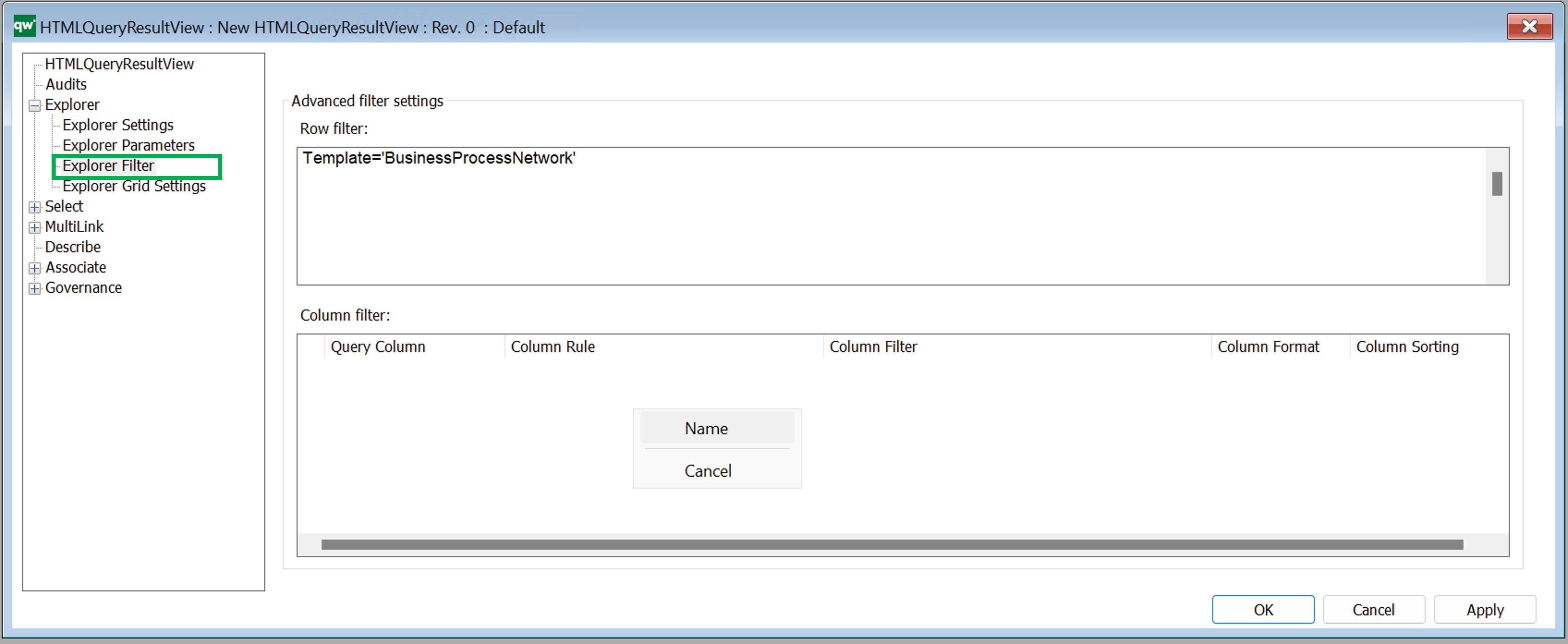
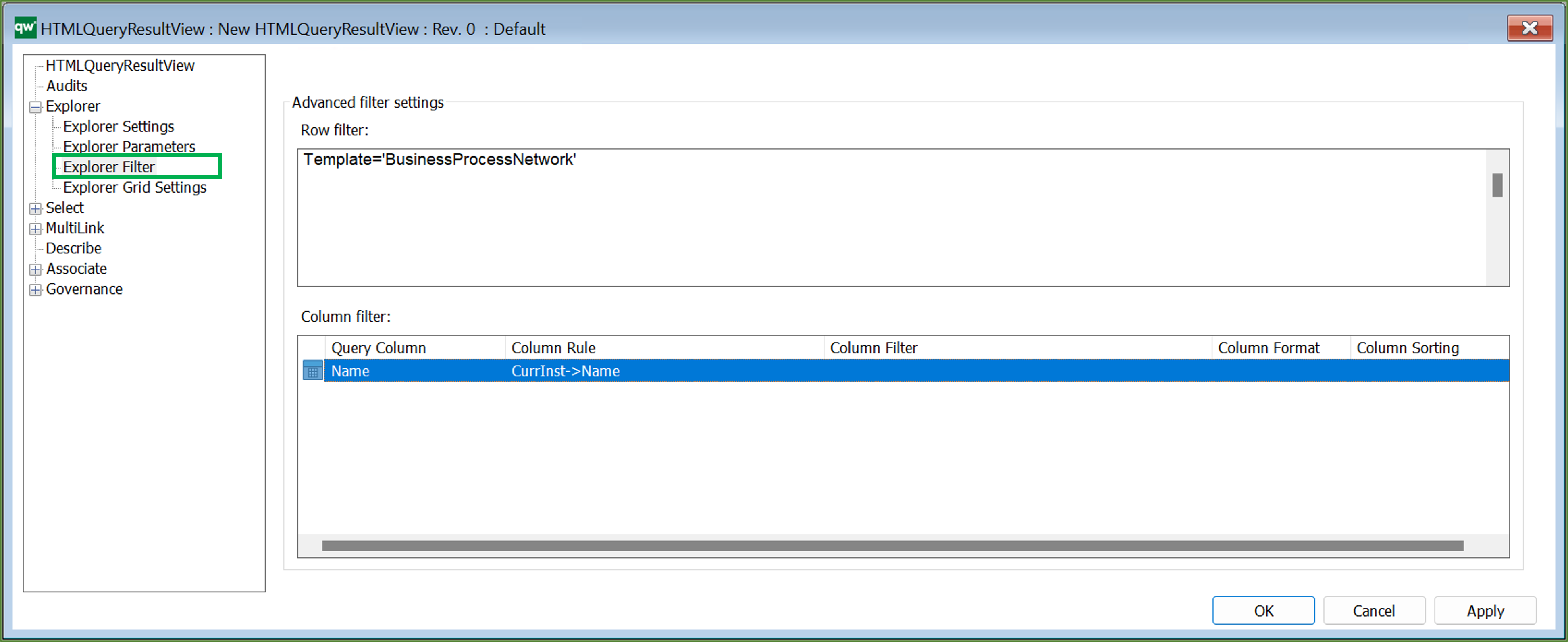
- Query Column: This should match a column attribute from the Explorer Settings tab. This is what created the link to the column settings.
- Column Rule: The content of the column. This can be a simple connection like an attribute on the object, e.g. Name. Or it can be a more advanced connection like an attribute on an object linking to the row object, e.g. CurrInst-<Concerns->HasResponsible.
- Column Filter: This will filter the content specified in Column Rule. If Column Rule uses an advanced connection, it can be useful to filter on the template of the resulting content, e.g. only show ChangeRequests. Example: CurrInst-<Concerns=’ChangeRequest’ Having a Column Rule of CurrInst-<Concerns can result in a list of both ChangeRequests and Risks (and other templates) and that might not be what is wanted.
- Column Format: The format of the content. This will have impact on how the content is displayed.
- Column Sorting: If the content of a cell contains multiple links, then the sorting can be set to define in which order the links will be shown.
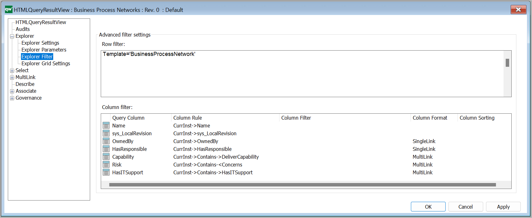
Example of a QRV from the standard, showing all BusinessProcessNetworks in the repository:
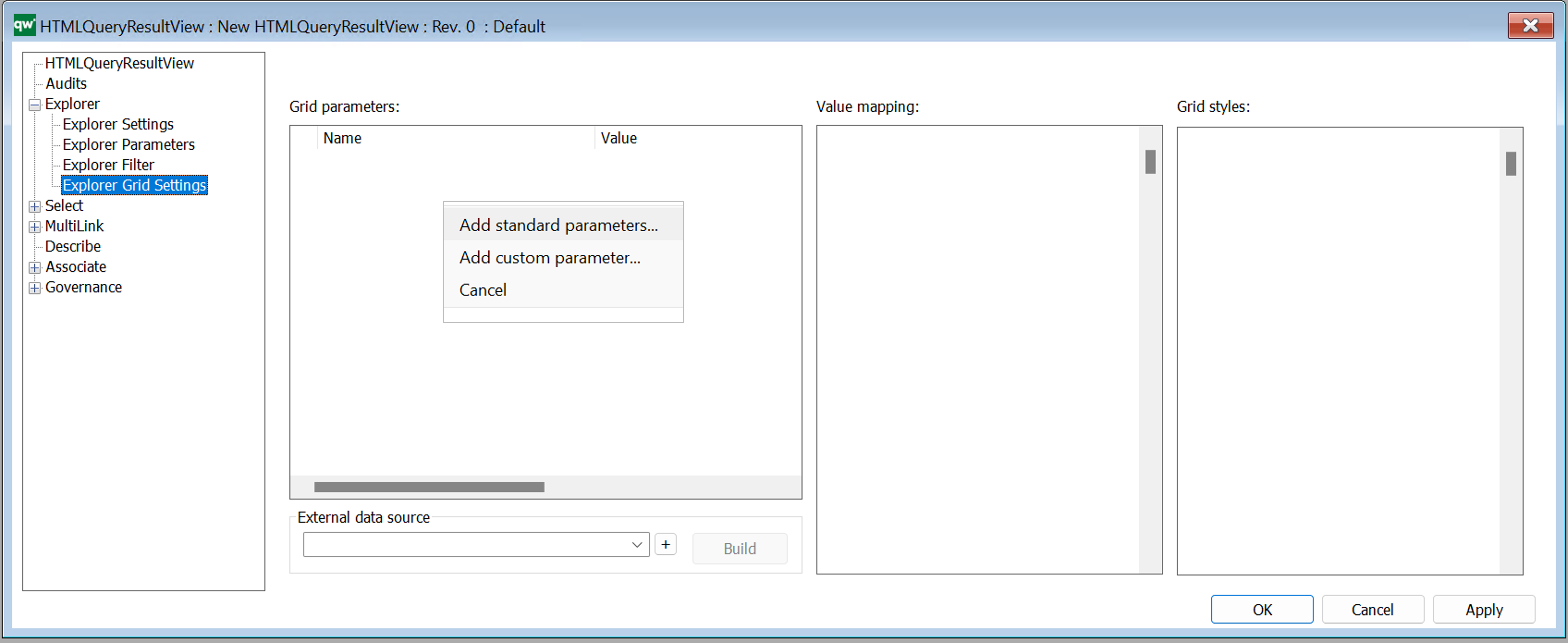
Explorer Grid Settings
Grid parameters
Configure settings for how the table is displayed and if further options should be available to the user.
Right click the window to add standard parameters.
 Standard Grid parameters (standard settings).
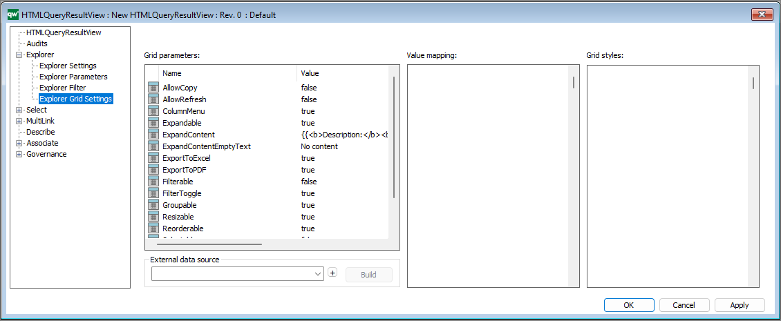
- AllowCopy: If it should be possible to copy content of the table.
- AllowRefresh: If a button should be shown to allow the user to refresh content of the table.
- ColumnMenu: If a column menu for sorting and show/hide column should be available to the user.
- Expandable: If each row should be expandable to display more information about the row object.
- ExpandContent: The content that will be shown when expanding the row. Simple markup can be used to format the information.
- ExpandContentEmptyText: If content is not available when expanding the row, this text will be displayed.
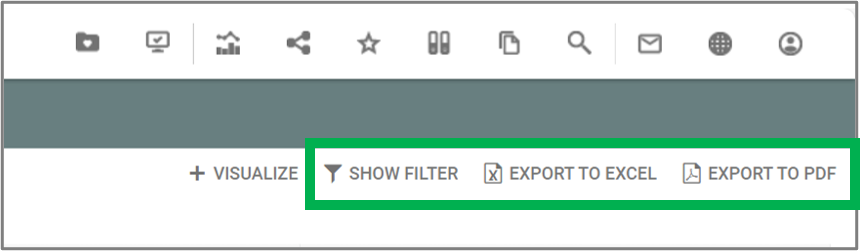
- ExportToExcel: If button for exporting the content of the table to Excel should be available.
- ExportToPdf: If button for exporting the content of the table to PDF should be available.
- Filterable: If it should be possible to filter each column of the table. Each column will have an input in the column header for defining a filter.
- FilterToggle: If it should be possible to show/hide the filter inputs for the columns.
- Groupable: If it should be possible to group columns by dragging and dropping a column to the top area of the table.
- Resizable: If the width of the columns should be resizeable.
- Reorderable: If it should be possible to reorder the columns by dragging and dropping a column. The order of the columns will be reset when reloading the table.
- Selectable: If rows should be selectable.
- Sortable: If the columns should be sortable by clicking the column header.
- TableValued:
It is possible to adjust the values by pressing F2 and write e.g. true or false to enable/disable the different parameters.
I.e. the parameters determines what is enabled in relation to the QRV list on the web-view, including the content in the toolbar in the upper right corner.
(The Visualize button in the toolbar is added through the standard buttons under the Explorer Settings.)
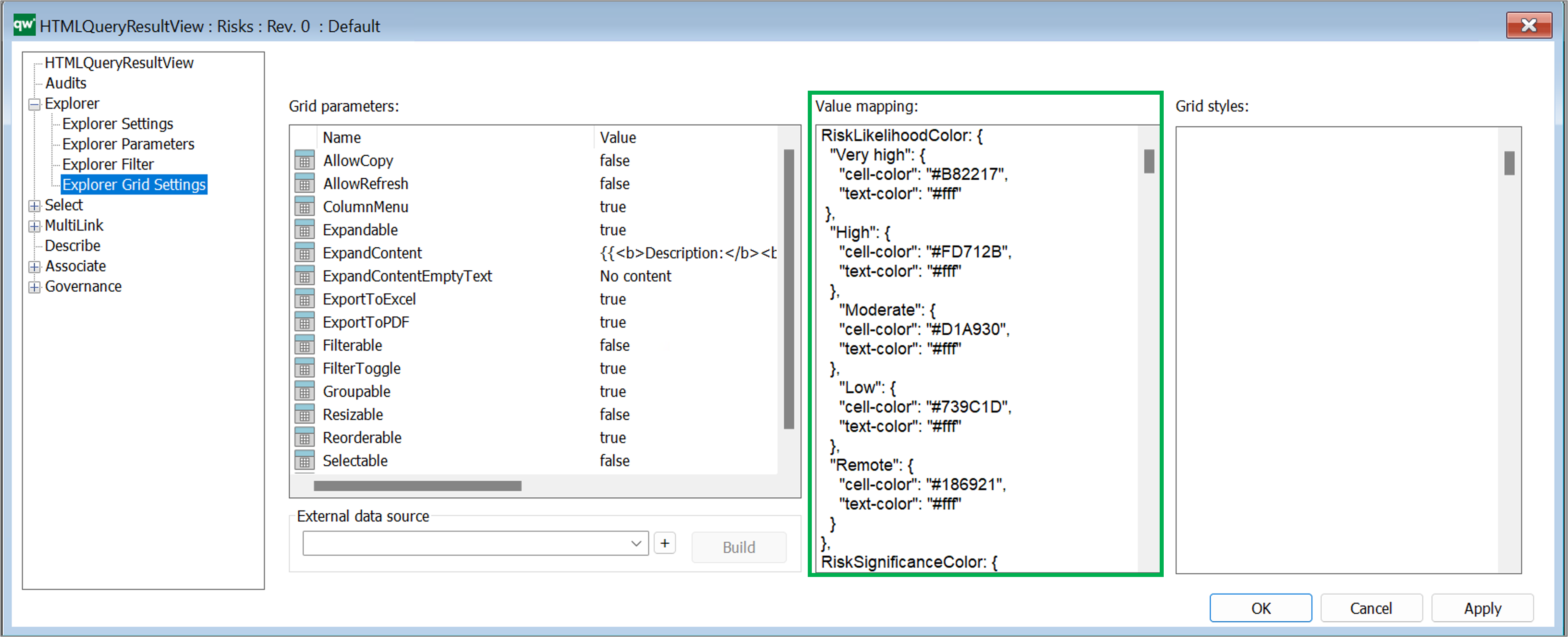
Value mapping
In some cases it wil be necessary to map content of a cell before it is shown in the cell. This is useful when content of a checkmark or radio button should be displayed. Content of checkmarks and radio buttons are saved as empty, 0 and 1 in the database which is not useful information to a user. Value mapping can be used to display empty and 0 values as No, False, or similar and 1 as Yes, True, and simliar.
Value mapping is defined as a JSON object and can contain mapping information for multiple columns of the table.
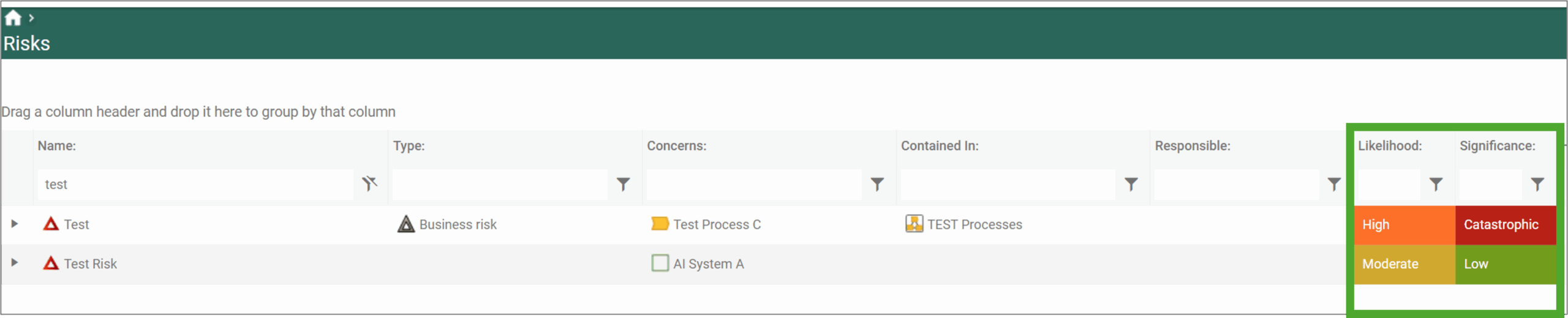
Example of a value mapping used to color risk likelihood according to their value:
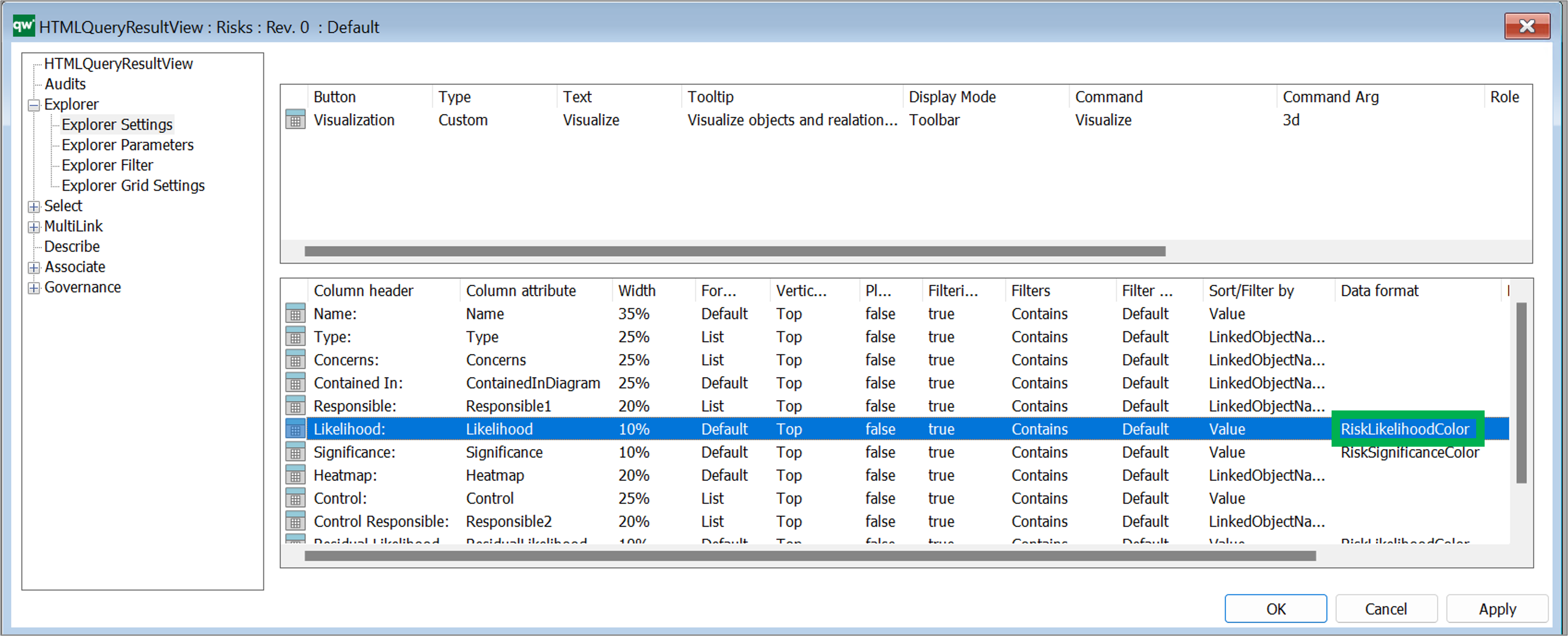
Once the value mapping have been defined they can be related to the coloumns in Explorer Settings view:
Grid styles
If specific styling is needed based on on values in the table but values are not needed to be formatted, then grid styles can be used to define styles for the grid. Grid styles use standard CSS.
External data source
It is possible to define an external data source (GenericQuery) for defining more advanced way of getting data to be displayed in the table. When using an external data source, most settings in the QRV object will be set when using the Build button. The Build button examines the settings of the linked GenericQuery and defines settings for the QRV object.
If the GenericQuery is updated, then the QRV object should be rebuilded by using the Build button. The rebuilding will update columns defined by the GenericQuery but will attempt to keep any settings that have been changed in the QRV object. E.g. grouping columns, width of column and similar.
When using an external data source, some settings will be disabled in the QRV object. These settings will be controlled by the GenericQuery.
Read more about Query Design and GenericQuery here.
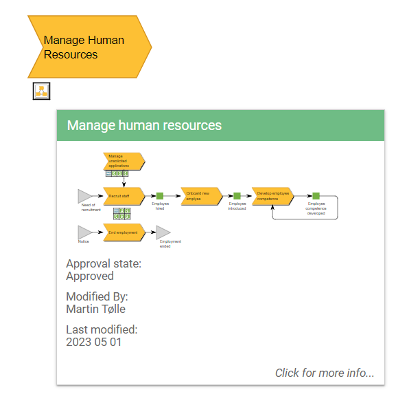 Example of a BusinessProcessNetwork tooltip appearing when a BusinessProcessNetwork is hovered on the web.